What Color Do Purple and White Make When Mixed? (Lavender / Pastel Purple)
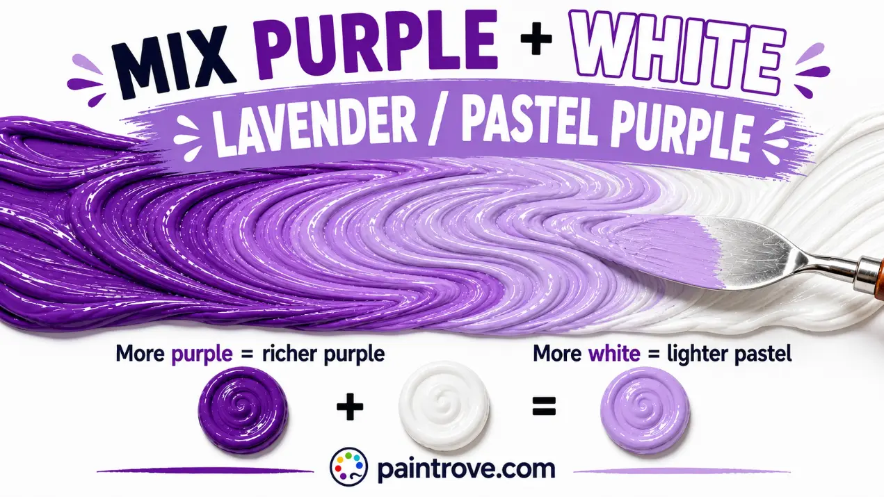
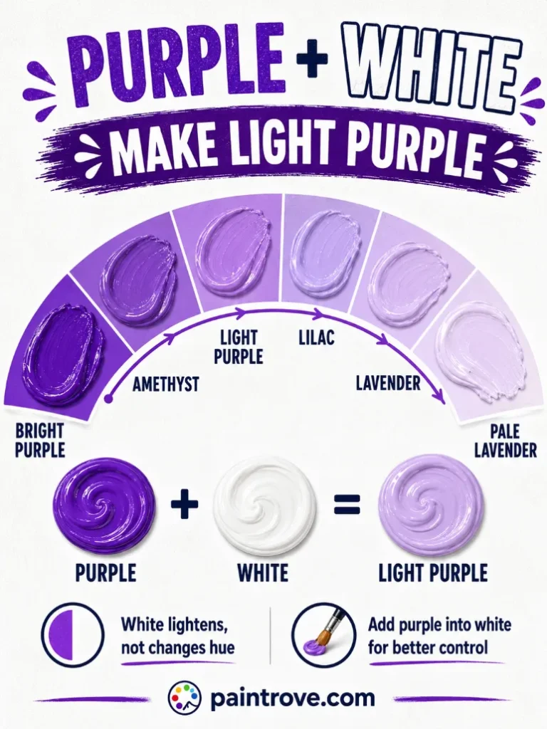
What Color Do Purple and White Make When Mixed? Mix purple and white together and you get light purple, most commonly lavender at hex #E6E6FA or lilac at hex #C8A2C8. The exact result depends on your starting purple: a blue-leaning purple gives cool lavender and periwinkle, while a red-leaning purple gives warmer lilac and mauve. The more white you add, the paler and softer the result.
Adding white to any color creates what artists call a tint, and purple takes tints beautifully. This is the opposite experience to darkening purple, where black tends to overwhelm and dull it. White does the reverse: it lightens purple while keeping much of its character, which is why lavender and lilac still read as recognisably purple rather than washed-out gray.
This guide covers the exact ratios with hex codes, how your purple’s undertone changes the outcome, the full range of pastel purples, and how to avoid the one mistake that turns a good tint chalky.
Why Purple and White Make Lavender
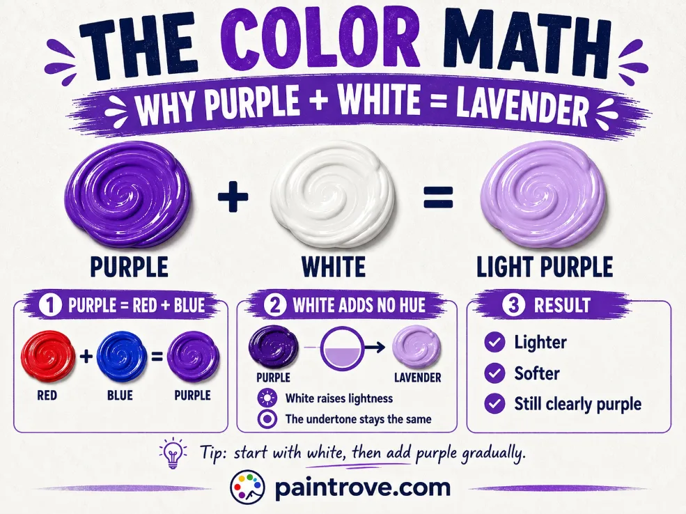
White is not a hue. It carries no color of its own; it simply reflects nearly all light. When you mix white into a color, you are increasing how much light the mix reflects, which the eye reads as a lighter, paler version of the original.
In color theory terms:
- Adding white to a color makes a tint (lighter). Purple plus white gives lavender.
- Adding black makes a shade (darker). Purple plus black gives eggplant, as covered in purple and black mixed.
- Adding gray makes a tone (muted). Purple plus gray gives dusty mauve.
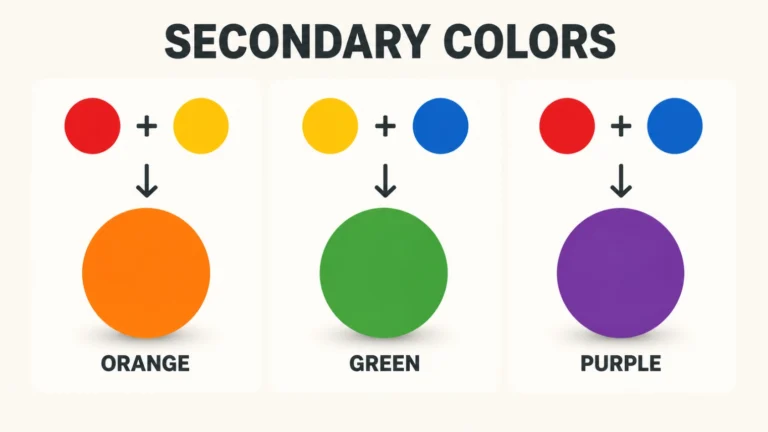
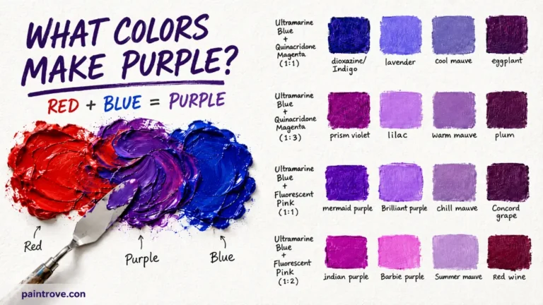
Purple itself is a secondary color, made from red and blue, as covered in what red and blue make. White lightens the whole mix without disturbing that red-blue balance, which is why the underlying character of your purple survives the process. A cool purple stays cool as it lightens; a warm one stays warm. For the full picture of the parent color, see what colors make purple.
Your Purple’s Undertone Decides the Result
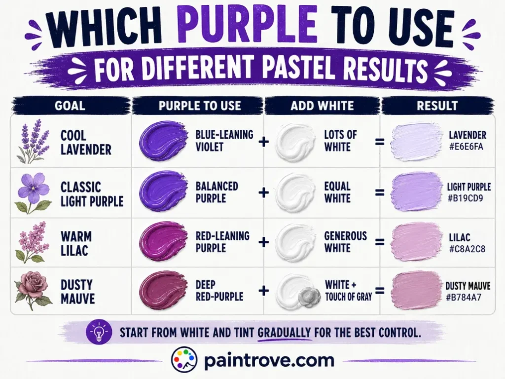
This is the part most quick answers skip, and it is the single most useful thing to know. Purple and white do not make one color. The undertone of your starting purple decides which pastel you land on:
| Starting purple | Lightened result | Hex code |
|---|---|---|
| Blue-leaning purple (violet) | Lavender, cool and airy | Hex #E6E6FA |
| Balanced purple | Light purple | Hex #B19CD9 |
| Red-leaning purple | Lilac, warmer and pinker | Hex #C8A2C8 |
| Deep red-purple | Mauve, dusty and soft | Hex #E0B0FF |
| Blue-violet | Periwinkle | Hex #CCCCFF |
| Muted purple | Dusty heather | Hex #B0A3B8 |
So if you want cool lavender, start with a violet or blue-leaning purple such as one mixed from ultramarine and a cool red. If you want warm lilac, start with a red-leaning purple, the kind covered in pink and purple mixed and red and purple mixed. Trying to force a cool lavender out of a warm purple with white alone will not work; you need to adjust the base first.
Purple and White Ratios and Hex Codes
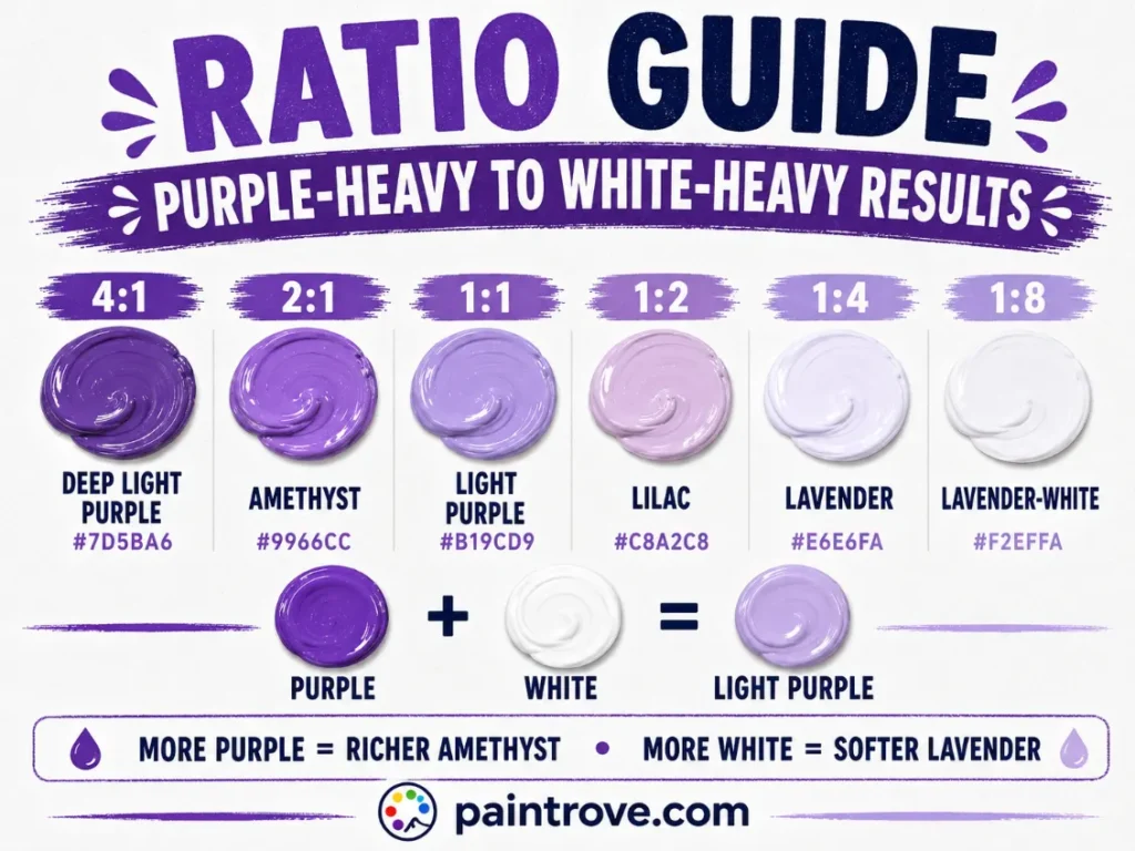
White is powerful in the other direction from black: it lightens fast, and a little makes a big visible difference. Here is the working chart:
| Ratio (Purple : White) | Resulting shade | Hex code |
|---|---|---|
| 4 : 1 | Deep light purple | Hex #7D5BA6 |
| 2 : 1 | Amethyst | Hex #9966CC |
| 1 : 1 | Light purple | Hex #B19CD9 |
| 1 : 2 | Lilac | Hex #C8A2C8 |
| 1 : 4 | Lavender | Hex #E6E6FA |
| 1 : 8 | Palest lavender-white | Hex #F2EFFA |
| 1 : 2 plus a touch of gray | Dusty mauve | Hex #B784A7 |
Practical notes:
- Add purple to white, not white to purple. This is the reverse of the usual advice, and it works because purple is very strong. Starting with white and tinting it up gives you far more control and wastes less paint.
- Go gradually. It is easy to add more purple; it takes a lot of white to undo an overshoot.
- Mix thoroughly before judging, and test on white paper. Pastels look different against different backgrounds.
- Acrylics dry slightly darker, so mix a touch lighter than your target.
Every Pastel Purple You Can Make
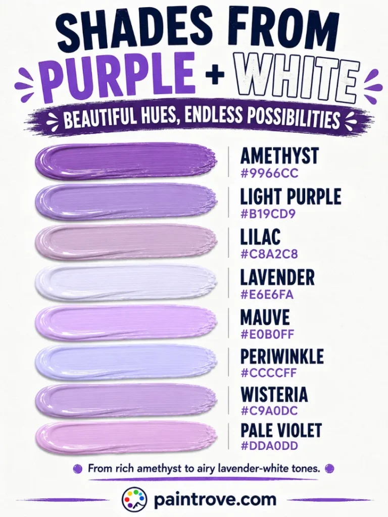
Purple plus white covers a wide, useful family of soft colors. The reference table with hex codes in plain text:
| Shade | Hex code | How to mix it |
|---|---|---|
| Lavender | Hex #E6E6FA | Blue-leaning purple plus lots of white |
| Lilac | Hex #C8A2C8 | Red-leaning purple plus white |
| Light purple | Hex #B19CD9 | Balanced purple plus equal white |
| Mauve | Hex #E0B0FF | Red-purple plus white |
| Periwinkle | Hex #CCCCFF | Blue-violet plus generous white |
| Amethyst | Hex #9966CC | Purple plus a little white |
| Wisteria | Hex #C9A0DC | Purple plus white, slight pink lean |
| Orchid | Hex #DA70D6 | Magenta-purple plus white |
| Thistle | Hex #D8BFD8 | Muted purple plus white |
| Heather | Hex #B0A3B8 | Purple plus white plus a touch of gray |
| Pale violet | Hex #DDA0DD | Violet plus white |
| Iris | Hex #B5A8D5 | Blue-purple plus white |
Why White Works Better on Purple Than Black Does
Worth stating plainly, because it surprises people who have tried both: white treats purple far more kindly than black does.
Adding black to purple tends to kill its saturation almost immediately, leaving a flat, muddy dark that barely reads as purple at all. Adding white lightens purple while preserving much of its vividness. A one-to-one purple and white mix still looks unmistakably, cheerfully purple. The color does not turn truly pastel and delicate until white heavily outnumbers the purple.
The reason is that white simply raises the amount of light reflected across the board, which lightens the color without muting the hue relationship underneath. Black, by contrast, absorbs light unevenly across pigments and drags saturation down with it.
The practical takeaway: if you want a range of purples for a project, mixing lighter is easy and reliable. Mixing darker requires more care, and is usually better done with blue or a dark red than with black.
The One Mistake: Chalky Pastels
There is a limit, though. Push white too far and pastel purple turns chalky: dusty, flat, and slightly dead, like colored powder rather than paint. It usually happens when white makes up so much of the mix that there is barely any pigment left to carry the color.
Three fixes:
- Add a touch of the original purple back. Often all it takes to restore life.
- Use a small amount of a stronger, more saturated purple such as dioxazine, which holds its character even when heavily diluted with white.
- Add a whisper of the mix’s dominant parent. A little more red for lilacs, or a little more blue for lavenders, brings back the undertone that the white washed out.
For genuinely delicate pastels, another route entirely is to start from pink rather than white, which is red already carrying white. That approach is covered in pink and blue mixed, the shortcut recipe to lavender.
Purple and White in Light and Print
Everything above describes paint. Other systems behave differently.
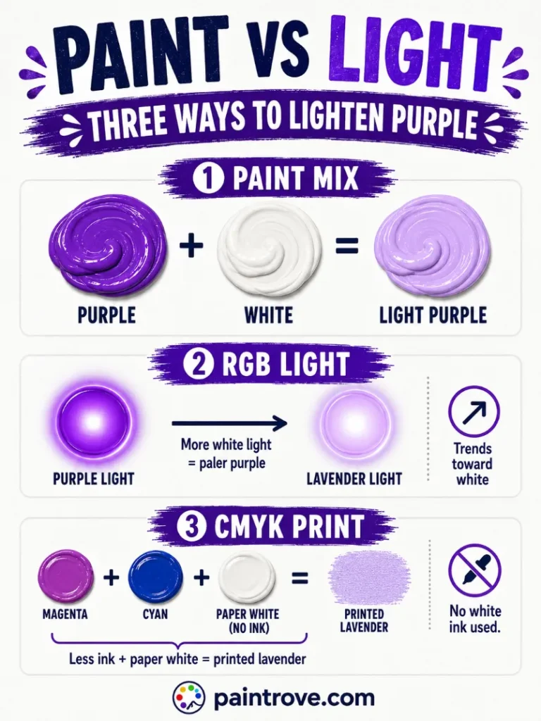
In light, using the RGB model, white is all three light primaries at full brightness. Adding white light to purple light raises every channel, producing a pale, washed-out purple that trends toward white as you add more. The result looks similar to the paint version, a pastel purple, but reached by adding light rather than reflecting more of it.
In printing, using the CMYK color model, there is no white ink in standard four-color printing. Light purples are produced by using less ink and letting the white of the paper show through, which is why pale lavenders in print depend heavily on paper quality.
| System | How light purple is made | Notes |
|---|---|---|
| RYB (paint) | Purple plus white pigment | Reliable, keeps vibrancy |
| RGB (light) | Purple plus white light | Trends toward white |
| CMYK (printing) | Less ink, paper shows through | No white ink used |
Troubleshooting Purple and White Mixes
The pastel looks chalky and lifeless. Too much white. Add a small amount of purple back, or switch to a more saturated purple pigment like dioxazine.
You wanted cool lavender and got warm lilac. Your base purple leans red. Adjust the base with a touch of blue before adding white, rather than trying to fix it afterwards.
The mix looks gray rather than purple. Your purple was probably already muted, or slightly muddy from mixing. Start from a clean, saturated purple.
It went pale too fast. Purple is strong but white is efficient. Next time start with white on the palette and add purple into it gradually.
It dried darker. Standard acrylic behavior. Mix a shade lighter than your target and it will settle where you want it.
Mixing Purple and White in Different Mediums
How you lighten purple depends heavily on what you are painting with.
Acrylics and oils use white pigment directly, and the choice of white matters. Titanium white is opaque and strong, lightening quickly and giving solid pastels. Zinc white is more transparent and gentler, ideal for subtle tints that keep more of the purple’s glow. If your lavenders keep going chalky, switching from titanium to zinc often solves it.
Watercolor works the opposite way. There is usually no white paint involved at all; you lighten by adding water and letting the paper’s white show through the transparent wash. This produces the cleanest, most luminous lavenders available in any medium, because nothing is dulling the pigment. Adding opaque white to watercolor purple makes it chalky almost instantly.
Gouache sits between the two, using white pigment but staying matte, which gives the flat, even pastels favored in illustration.
Digital work lightens by raising brightness or reducing opacity, which behaves like watercolor rather than acrylic, keeping saturation intact.
The same logic applies to lightening any color, whether that is blue and white mixed for sky blues or green and white mixed for mints, and the reverse case of muting rather than lightening is covered in blue and gray mixed.
Lavender and Lilac in Art, Fashion, and Design
Pale purples carry a gentle, slightly nostalgic quality that few other colors manage, and they are having a long moment across design.
In Art
Lavender and lilac are the colors of dusk, wisteria, and distant hills, and painters use them constantly for atmospheric effects. The Impressionists made pale violets famous by painting shadows in them rather than in gray or brown, which is why their work feels sunlit rather than flat.
In watercolor especially, a thin lavender wash is one of the most useful tools available for suggesting distance, mist, and cool light. Lavender also flatters warm colors placed next to it, which is why it appears so often in floral painting.
In Fashion
Lavender and lilac cycle back into fashion relentlessly, reading as fresh, soft, and quietly confident. Digital lavender was named a defining color of 2023, and pale purples have anchored spring collections since.
The family flatters a wide range of skin tones because it spans cool lavender through warm lilac and dusty mauve, so there is a version for almost everyone. Mauve in particular has become a reliable romantic neutral in bridal and occasion wear.
In Interiors and Branding
Lavender walls read calmer than pink and warmer than blue, which makes pastel purple a long-standing favorite for bedrooms and nurseries. Paired with sage green, warm gray, or cream, lilac feels current rather than sugary.
In branding, soft purples signal creativity with gentleness, appearing across wellness, beauty, and lifestyle identities that want to feel imaginative and calm at the same time. Purple and white used side by side, rather than mixed, reads as elegant and formal, which is why the pairing is a wedding staple.
Quick Reference: Purple + White Cheat Sheet
| Question | Answer |
|---|---|
| Purple + white in paint | Light purple, lavender or lilac |
| Blue-leaning purple + white | Lavender (hex #E6E6FA) |
| Red-leaning purple + white | Lilac (hex #C8A2C8) |
| Equal parts | Light purple (hex #B19CD9) |
| Lots of white | Palest lavender |
| Plus a touch of gray | Dusty mauve (hex #B784A7) |
| Mixing tip | Add purple into white, not the reverse |
| The risk | Chalky pastels from too much white |
| Versus black | White preserves vibrancy, black destroys it |
FAQs
What color do purple and white make when mixed?
Light purple, usually lavender or lilac. Adding white creates a tint, a lighter version of the original color. The more white you add, the paler and softer the purple becomes.
Do purple and white always make lavender?
No. Lavender is the common result from a blue-leaning purple. A red-leaning purple lightens toward lilac or mauve instead. The undertone of your starting purple decides which pastel you get, so adjust the base before adding white.
What is the difference between lavender and lilac?
Temperature. Lavender leans blue and reads cool and airy at hex #E6E6FA. Lilac leans pink and reads warmer and softer at hex #C8A2C8. Both are pale purples separated mainly by undertone.
Why does my light purple look chalky?
Too much white relative to pigment, which leaves the mix dusty and flat. Add a little of your original purple back, or use a highly saturated purple like dioxazine that holds its character when heavily lightened.
Does white ruin purple the way black does?
No, and this is the useful difference. White lightens purple while keeping much of its vibrancy, so a lightened purple still reads clearly as purple. Black tends to desaturate purple almost immediately, which is why deep purples are better built with blue or dark red.
Can you make white by mixing colors?
Not in paint. White is a base pigment and cannot be mixed from other colors, which is why you need a tube of titanium or zinc white. In light, however, combining red, green, and blue at full brightness produces white.
Purple and white make lavender, lilac, mauve, and the whole soft pastel family, and unlike black, white treats purple kindly. Start from white, add purple gradually, and match your base undertone to the pastel you actually want.
To explore further, see our full guide to what colors make purple, compare the darkening route at purple and black mixed, or step back to the color wheel.