What Color Do Pink and Purple Make When Mixed?
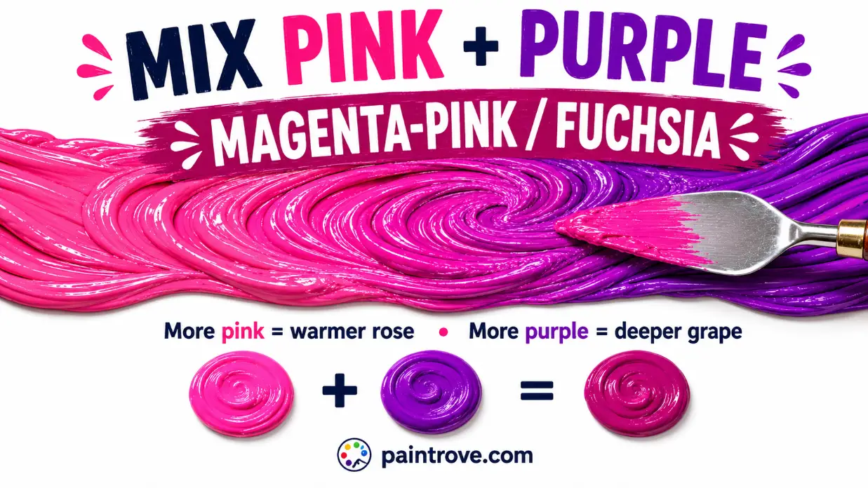
What Color Do Pink and Purple? Mix pink and purple together and you get a bright magenta-pink, often called fuchsia. It lands around hex #C71585 at its richest and hex #FF00FF at its most electric. Lean the mix toward pink and it softens into rose and mauve; lean it toward purple and it deepens into magenta and grape. Every result stays inside the warm, pink-purple family.
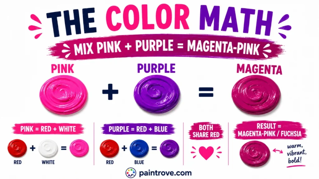
The reason is simple color math. Pink is red plus white, and purple is red plus blue. Mix them and you are combining two colors that both contain red, so red dominates and the result is a red-leaning purple: magenta. Because pink and purple are neighbors on the color wheel, this is one of the smoothest, most forgiving mixes there is, with no risk of mud.
This guide covers the color theory, the exact ratios with hex codes, which pinks and purples to use, the full shade range, and how the pairing works in art and design.
The Color Math: Why Pink and Purple Make Magenta
Start with what each parent is made of.
Pink is a tint of red: red lightened with white.
Purple is a secondary color made from red and blue, as covered in what red and blue make.
Now combine them:
Pink + Purple = (Red + White) + (Red + Blue) = Red + Red + Blue + White = a red-heavy purple, lightened
Both parents bring red to the table, so red becomes the dominant note. The single dose of blue from the purple keeps it in purple territory, but the doubled red pulls it toward the red side, landing on red-purple, which is magenta. The white from the pink lightens the whole thing, which is why pink-purple mixes read brighter and softer than a straight red-purple mix.
In short, pink and purple make the same family as red and purple mixed, just a lighter, gentler version of it. Both live in the magenta and fuchsia zone.
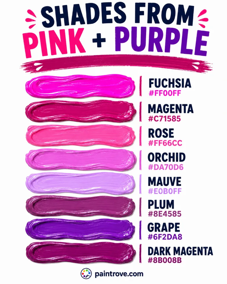
Fuchsia, Magenta, Mauve, Orchid: Which One Will You Get?
Pink and purple do not make one single color. The ratio and the shades you start with decide which member of the family you land on:
| Color | Hex code | Character | How the mix gets there |
|---|---|---|---|
| Fuchsia | Hex #FF00FF | Bright, electric pink-purple | Hot pink plus bright purple |
| Magenta | Hex #C71585 | Deep, rich red-purple | Balanced mix |
| Orchid | Hex #DA70D6 | Soft, luminous pink-purple | Equal mix plus a little white |
| Mauve | Hex #E0B0FF | Dusty, muted pastel | Pink-heavy mix plus a touch of gray |
| Rose | Hex #FF66CC | Warm, pink-leaning | Pink-heavy mix |
| Plum | Hex #8E4585 | Deep, purple-leaning | Purple-heavy mix |
| Grape | Hex #6F2DA8 | Rich dark purple | Purple-heavy mix, deeper |
| Wisteria | Hex #C9A0DC | Soft mid pink-purple | Equal mix plus generous white |
The two people confuse most:
Fuchsia vs magenta. In digital color they can share values, but in paint and design, fuchsia reads brighter and pinker while magenta reads slightly deeper and more purple. A hot-pink-heavy mix gives fuchsia; a balanced or purple-leaning mix gives magenta.
Mauve vs orchid. Both are soft pink-purples, but mauve is muted and dusty while orchid is clean and luminous. A touch of gray turns orchid into mauve.
Mixing Ratios: From Soft Rose to Deep Grape
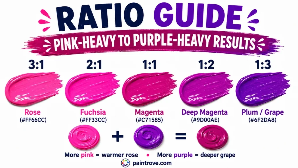
Here is the working ratio chart, with hex targets in plain text:
| Ratio (Pink : Purple) | Resulting shade | Hex code |
|---|---|---|
| 3 : 1 | Rose / warm pink-purple | Hex #FF66CC |
| 2 : 1 | Bright fuchsia | Hex #FF33CC |
| 1 : 1 | Magenta | Hex #C71585 |
| 1 : 2 | Deep magenta-purple | Hex #9D00AE |
| 1 : 3 | Plum / grape | Hex #6F2DA8 |
| 1 : 1 plus white | Orchid | Hex #DA70D6 |
| 1 : 1 plus gray | Mauve | Hex #E0B0FF |
| 1 : 1 plus a touch of black | Dark magenta | Hex #8B008B |
Practical notes:
- These colors are close together on the wheel, so the mix is forgiving, but purple is usually the stronger, darker partner. Add purple to pink in small steps.
- Judge on white paper and let it dry. Bright pink-purples shift noticeably against different backgrounds and dry slightly darker in acrylics.
- If the mix gets too dark or too purple, a little more pink brings back brightness and warmth instantly.
Which Pink and Which Purple to Use
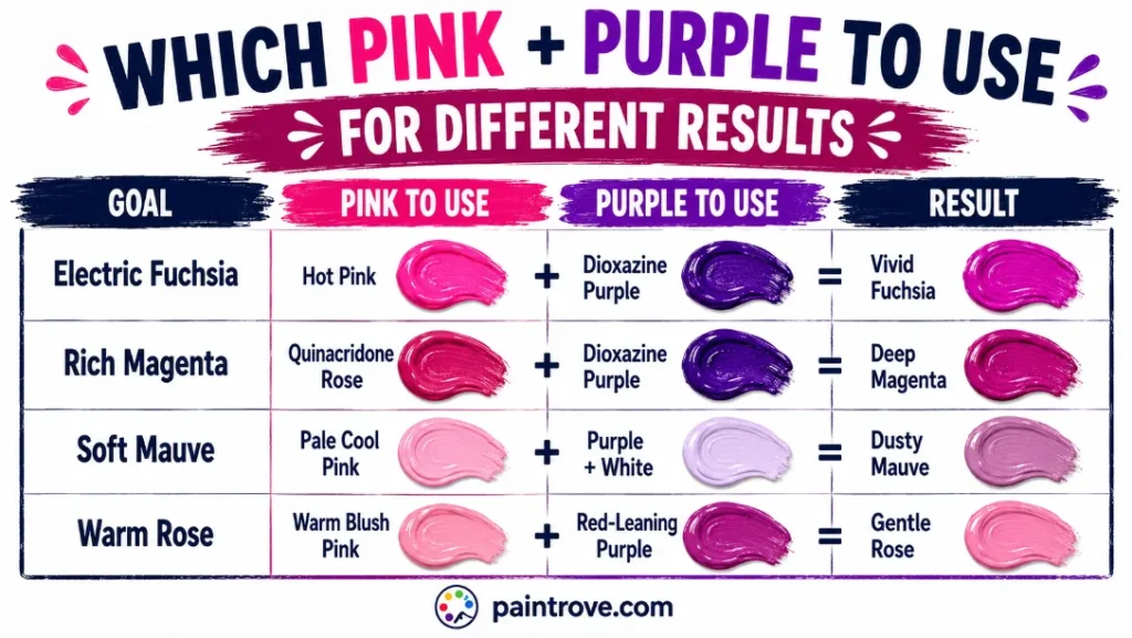
Undertones decide how clean and vivid the result stays:
| Goal | Pink to use | Purple to use | Result |
|---|---|---|---|
| Electric fuchsia | Hot pink / magenta pink | Dioxazine purple | Vivid, saturated fuchsia |
| Rich magenta | Quinacridone rose | Dioxazine purple | Deep clean magenta |
| Soft mauve | Pale cool pink | Purple lightened with white | Dusty pastel pink-purple |
| Warm rose | Warm blush pink | Red-leaning purple | Gentle warm pink-purple |
The cleanest results come from cool, magenta-based pinks paired with a clean purple like dioxazine. Both already live in the red-purple zone, so they merge seamlessly and stay bright. Warm, salmon-leaning pinks carry yellow, which is purple’s complement, so they slightly mute the mix toward dusty mauve. Sometimes dusty is exactly what you want; when it is not, choose the coolest pink available.
Every Shade You Can Make from Pink and Purple
Between ratio, pigment choice, and additions of white, gray, or black, pink and purple cover a wide band of warm purples and pinks. The reference table:
| Shade | Hex code | How to mix it |
|---|---|---|
| Fuchsia | Hex #FF00FF | Hot pink plus bright purple |
| Magenta | Hex #C71585 | Equal balanced mix |
| Rose | Hex #FF66CC | Pink-heavy mix |
| Hot pink | Hex #FF69B4 | Very pink-heavy mix |
| Orchid | Hex #DA70D6 | Equal mix plus a little white |
| Wisteria | Hex #C9A0DC | Equal mix plus generous white |
| Mauve | Hex #E0B0FF | Equal mix plus a touch of gray |
| Dusty rose | Hex #C08081 | Pink-heavy mix plus gray |
| Plum | Hex #8E4585 | Purple-heavy mix |
| Grape | Hex #6F2DA8 | Purple-heavy mix, deep |
| Dark magenta | Hex #8B008B | Balanced mix plus a touch of black |
| Byzantium | Hex #702963 | Purple-heavy mix plus a touch of black |
| Amethyst | Hex #9966CC | Purple-heavy mix plus white |
Lighter Versions (Tints)
Add white to lift the mix into orchid, wisteria, and soft lilac-pink territory. Because pink already carries white, these tints come easily and stay clean. The related route through purple and white mixed reaches similar pale purples. For an even softer, bluer pastel, pink and blue mixed is the lavender-leaning cousin of this mix.
Darker Versions (Shades)
A touch of black deepens the mix into dark magenta, byzantium, and rich grape. Go carefully, since black overwhelms these bright colors fast and can dull their glow. A livelier route to depth is adding more purple, or a deep purple like dioxazine, which darkens while keeping the color vivid. See purple and black mixed for the technique.
Muted Versions (Tones)
Gray softens the mix into mauve and dusty rose, the vintage-styled pinks and purples beloved in weddings and interiors. A tiny touch of green or yellow, the complements of this family, mutes it even more naturally than gray, pulling it toward sophisticated antique tones.
Pink and Purple in Light and Print
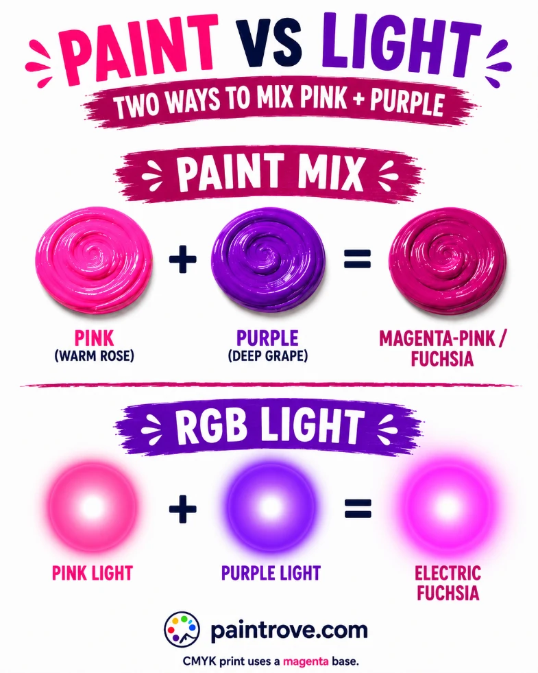
Everything above describes paint. In other color systems, the result shifts.
On screens, using the RGB model, pink and purple are both built largely from red and blue light. Combining them and pushing the values produces a bright, glowing fuchsia or magenta, more luminous than any paint can reach, since light adds rather than subtracts. This electric pink-purple is one of the signature colors of neon signage and modern digital design.
In printing, using the CMYK color model, magenta is one of the four base inks, so pink-purples are built directly from magenta, often with a touch of white space or cyan to shift them. It means this family is close to a foundation color in print rather than a complex mix.
| System | Type | Pink + Purple makes | Character |
|---|---|---|---|
| RYB (paint) | Subtractive | Magenta-pink / fuchsia | Bright but matte |
| RGB (light and screens) | Additive | Electric fuchsia | Glowing, luminous |
| CMYK (printing) | Subtractive | Magenta base | Clean, vivid |
Troubleshooting Pink and Purple Mixes
The mix looks dull or grayish. Your pink is warm. Salmon and coral pinks carry yellow, which mutes the purple. Switch to a cool, magenta-based pink.
The mix is too dark. Too much purple, which is the stronger partner. Add more pink to lift it back toward bright magenta and fuchsia.
The mix is too pale. Too much white, or a very pale pink. Add more purple, or switch to a hot pink with less white in it.
The mix looks almost identical to the purple you started with. Not enough pink, or a very dark purple dominating. Keep adding pink until the warmth and brightness show.
It dried duller than it looked. Standard acrylic behavior with bright colors. Mix a step brighter than your target.
Pink and Purple in Art, Fashion, and Design
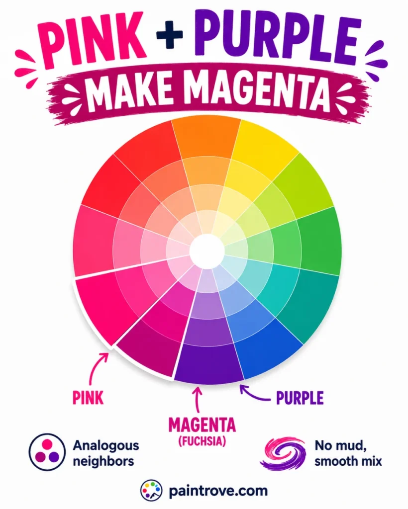
Pink and purple is one of the most naturally harmonious pairings on the wheel, both as a mix and side by side, because the two colors are so closely related.
In Art
Pink-purples are the colors of sunsets, orchids, and jewel-toned florals, and painters lean on them for exactly those subjects. Because the two colors are analogous, they blend into smooth gradients with no muddiness, which makes them ideal for the soft transitions of evening skies.
Magenta itself has an interesting status in art: it is a color with no single wavelength of light, one your brain constructs from red and blue signals, which is why it feels so vivid and almost artificial. Painters and designers use that electric quality deliberately when they want something to pop.
In Fashion
Pink and purple together read as bold, playful, and confident. The pairing anchored a lot of the maximalist and Y2K-revival looks of recent years, and fuchsia in particular is a recurring statement color on the runway, hard to ignore and impossible to call shy.
The softer members of the family, mauve and dusty rose, are quieter staples, the reliable romantic neutrals of bridal and occasion wear. Because the family spans electric fuchsia to gentle mauve, there is a pink-purple for every mood.
In Interiors and Branding
Pink and purple bring warmth and creativity to interiors, from bold fuchsia accents to soft mauve and orchid walls that feel calm and luxurious. In branding, this family signals creativity, playfulness, and a modern, youthful energy, which is why it appears across beauty, tech, and lifestyle identities aimed at feeling fresh and expressive.
The pink-to-purple gradient specifically has become shorthand for creative, forward-looking brands.
Quick Reference: Pink + Purple Cheat Sheet
| Question | Answer |
|---|---|
| Pink + purple in paint | Magenta-pink / fuchsia (hex #C71585) |
| Why | Both contain red, so red dominates |
| Pink-heavy mix | Rose, hot pink |
| Purple-heavy mix | Plum, grape |
| Plus white | Orchid, wisteria |
| Plus gray | Mauve, dusty rose |
| Plus black | Dark magenta, byzantium |
| Pink + purple in light | Electric fuchsia |
| Best parents | Cool magenta pink + dioxazine purple |
| Why it goes dull | Warm pink carrying yellow |
FAQ
What color do pink and purple make when mixed?
A bright magenta-pink, often called fuchsia. Because both pink and purple contain red, the mix leans red and lands in the red-purple family, brighter and softer than a straight red-purple mix thanks to the white in the pink.
Do pink and purple make fuchsia?
Yes. A hot-pink-heavy mix with a bright purple lands on fuchsia at around hex #FF00FF. A more balanced mix gives the slightly deeper magenta at hex #C71585.
What is the difference between the pink-purple mix and the pink-blue mix?
Direction. Pink plus purple leans warm toward magenta and fuchsia, because purple adds only a little blue. Pink plus blue leans cool toward lavender and lilac, because blue pulls the mix to the cool side. Both are light purples, but on opposite sides of the family.
Why did my pink and purple mix turn out dull?
Your pink is likely warm. Coral and salmon pinks carry yellow, which is purple’s complement and mutes the mix. Use a cool, magenta-based pink for a clean, bright result.
How do you make mauve from pink and purple?
Mix pink and purple to a soft pink-purple, then add a small touch of gray to mute it into dusty mauve at around hex #E0B0FF. Starting with paler, cooler versions of both parents helps.
How do you make the mix darker?
Add more purple, ideally a deep dioxazine purple, for rich magenta and grape tones. A tiny amount of black works too but can dull the brightness, so use it sparingly.
Are pink and purple good together?
Yes, both mixed and side by side. They are analogous neighbors on the color wheel, so they harmonize naturally, which is why the pairing is so common in fashion, floral design, and branding.
Pink and purple mixed give you the bright magenta family: fuchsia, magenta, orchid, and rose, with softer mauve and deeper grape at the edges. One of the most harmonious and forgiving mixes on the wheel.
To explore further, see our guides to what colors make purple and what colors make pink, compare it with the cooler pink and blue mix, or step back to the color wheel.