What Color Do Pink and Green Make When Mixed? (Muted Brown / Gray)
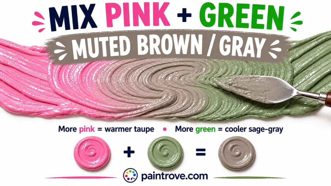
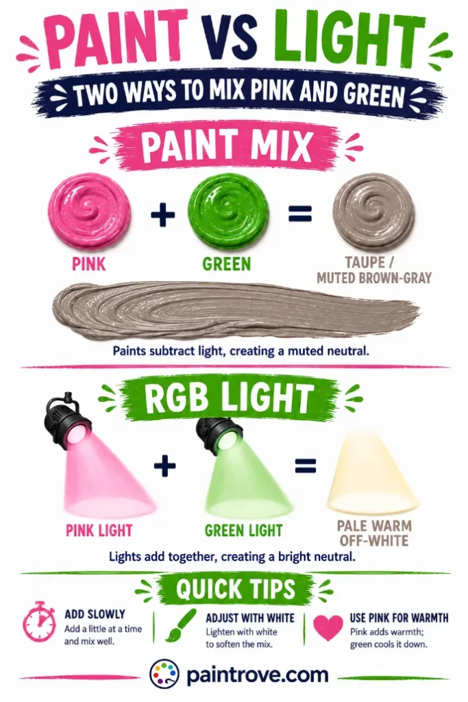
What Color Do Pink and Green Make? Mix pink and green together and you get a muted brown or soft gray. Not the bright color most people expect from two vivid parents, but a gentle neutral: something close to taupe (hex #B7A99A), dusty mauve, or a soft greige, depending on your exact shades and ratio.
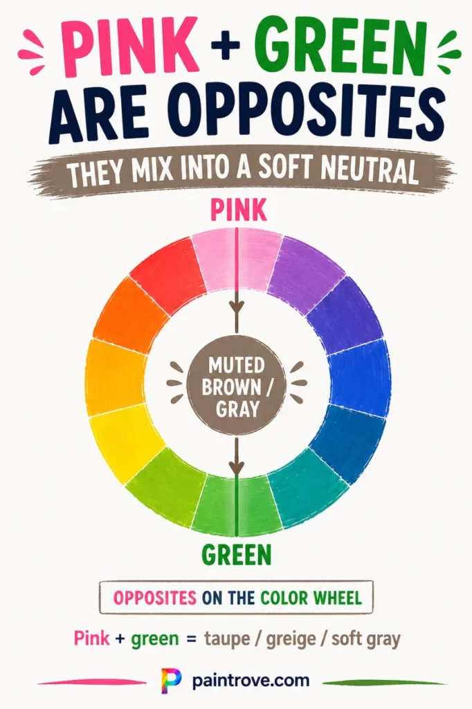
The reason is that pink and green are near-complementary colors, sitting on opposite sides of the color wheel. When complementary colors mix, they cancel each other out into neutral territory. Because pink is a lighter, softer color than the pure red that sits opposite green, the browns and grays you get are lighter and gentler than a straight red-green mix would produce.
This guide explains exactly why it happens, the ratios and hex codes for every neutral you can pull from this mix, how to steer it warmer or cooler, and why pink and green look so good together even though they mix into mud.
Why Pink and Green Make a Muted Neutral
The key idea: pink and green are complementary opposites, and complements neutralize each other.
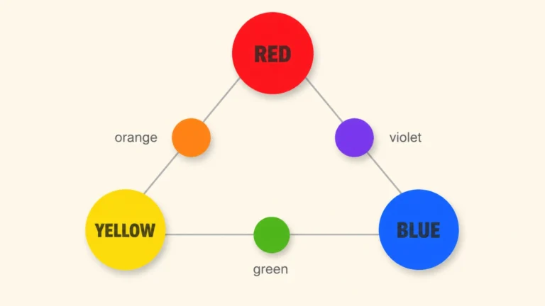
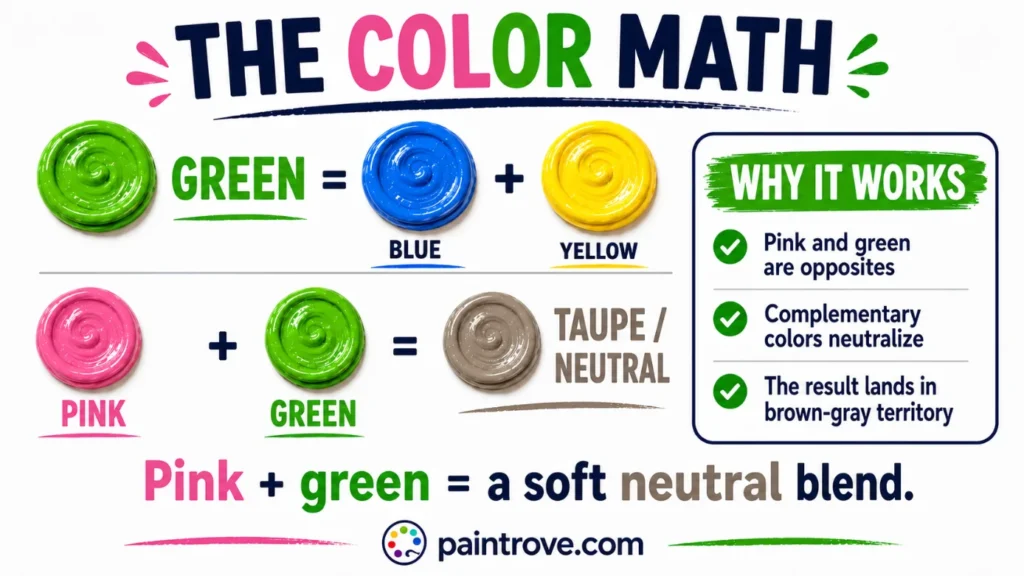
On the color wheel, green sits directly opposite red. Pink is not its own hue but a tint of red, red lightened with white. So pink inherits red’s position on the wheel and lands roughly opposite green too. When you mix any pair of complementary colors, each cancels the other’s intensity, and the mix collapses toward brown, gray, or a muddy neutral.
There is a second way to see the same thing. Green is made of blue and yellow, as covered in what colors make green. Pink is red plus white. Stack them together and you have all three primaries in the pot at once:
Pink + Green = (Red + White) + (Blue + Yellow) = Red + Yellow + Blue + White = muted brown, lightened
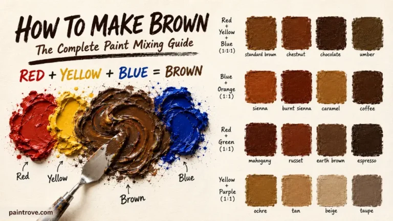
Mixing all three primaries always makes brown, which is the whole basis of how to make brown. Adding white, the white hiding inside the pink, lightens that brown toward taupe and gray. That is why pink and green land where they do: it is a brown recipe with the brightness turned down and the lightness turned up.
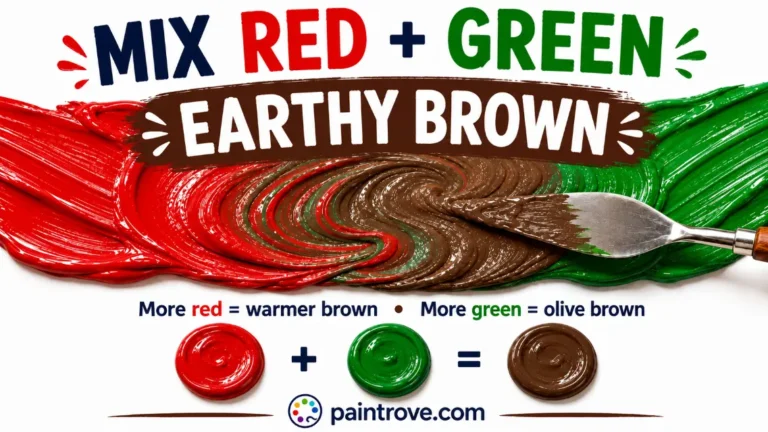
This mix is essentially a softer cousin of red and green mixed, which produces a fuller, darker brown because it uses pure red instead of white-diluted pink.
Taupe, Greige, Mauve, Sage: The Neutrals You Can Get
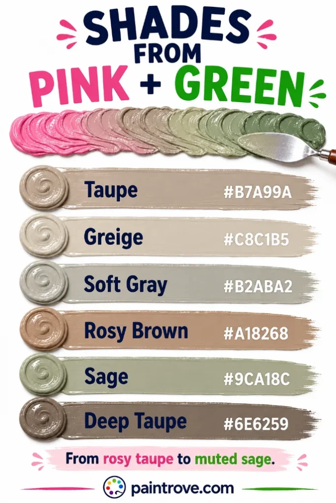
Pink and green do not make one color. They make a family of soft neutrals, and the exact result depends on which side wins and how dark your parents are:
| Result | Hex code | When you get it |
|---|---|---|
| Taupe | Hex #B7A99A | Balanced mix of mid pink and mid green |
| Greige | Hex #C8C1B5 | Light pink plus light green |
| Soft gray | Hex #B2ABA2 | Cool pink plus cool green, near-equal |
| Warm brown | Hex #A18268 | Pink-heavy mix, warm shades |
| Dusty mauve | Hex #9E8291 | Pink-heavy mix leaning cool |
| Sage / muted green | Hex #9CА18C | Green-heavy mix |
| Khaki brown | Hex #A69A73 | Green-heavy mix with a warm yellow-green |
| Deep taupe | Hex #6E6259 | Darker pink plus darker green |
The takeaway most guides miss: the winner decides the family. Slightly more pink and you drift into rosy browns and mauves. Slightly more green and you drift into sage and khaki. Only a near-perfect balance gives you true neutral gray, which is why hitting an exact gray from this mix is genuinely hard.
Mixing Ratios and Hex Codes
Here is the working chart, with hex targets written in plain text:
| Ratio (Pink : Green) | Resulting shade | Hex code |
|---|---|---|
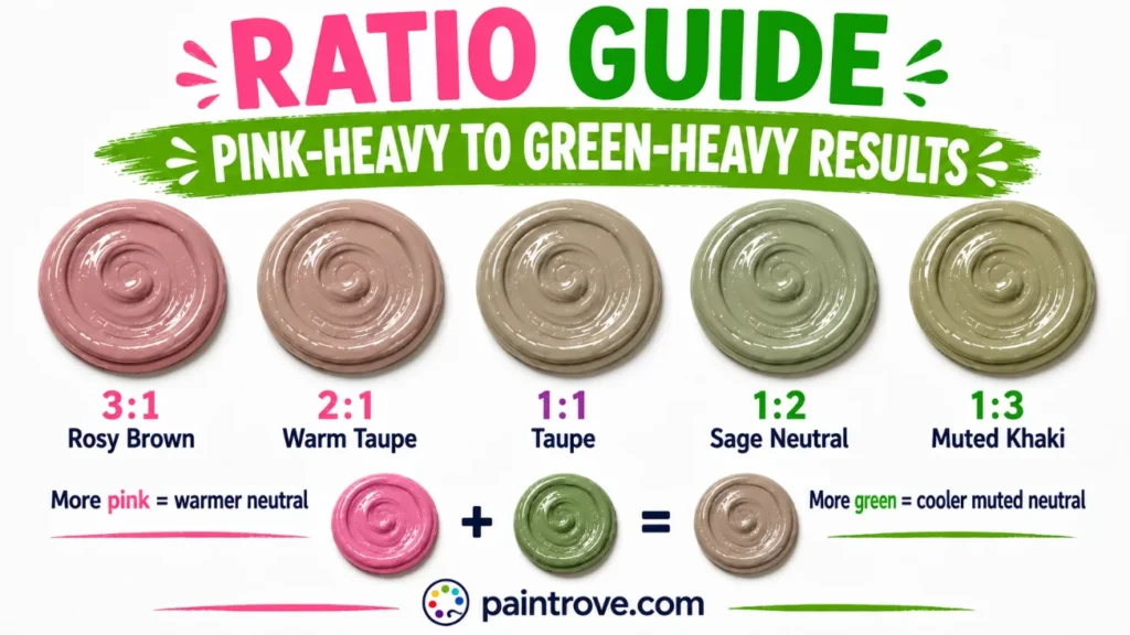
| 1 : 1 (mid tones) | Taupe | Hex #B7A99A |
| 2 : 1 | Rosy brown | Hex #A18268 |
| 3 : 1 | Dusty mauve-brown | Hex #9E8291 |
| 1 : 2 | Sage-leaning neutral | Hex #9CA18C |
| 1 : 3 | Muted khaki green | Hex #A69A73 |
| 1 : 1 (light tints) | Greige | Hex #C8C1B5 |
| 1 : 1 plus white | Pale mushroom gray | Hex #D3CCC0 |
| 1 : 1 plus a touch of black | Deep taupe | Hex #6E6259 |
Practical notes:
- Mix in tiny steps. Because you are hunting a balance point, a little too much of either color swings the whole result. Add the second color a touch at a time.
- Judge on white paper and let it dry. These subtle neutrals shift noticeably as they dry, usually a little cooler and grayer.
- If you overshoot into flat gray and want life back, nudge with a whisper of the warmer parent (pink) rather than starting over.
Which Pink and Which Green to Use
Undertones decide whether you get a clean neutral or a dead, dull mud:
| Goal | Pink to use | Green to use | Result |
|---|---|---|---|
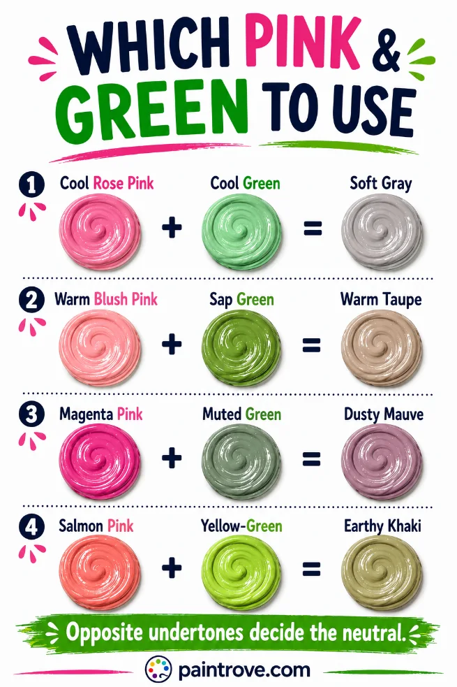
| Soft warm taupe | Warm blush pink | Sap green | Gentle, warm neutral |
| Cool gray | Cool rose pink | Cool phthalo-based green | Clean soft gray |
| Rosy mauve | Magenta-based pink | Muted green | Dusty pink-brown |
| Earthy khaki | Salmon-leaning pink | Yellow-green | Warm muted khaki |
The principle: the more truly opposite your two colors are on the wheel, the cleaner the neutral. A cool rose pink paired with a cool green cancels almost perfectly into gray. A warm pink paired with a warm green leaves extra yellow and red in the mix, which reads as warmer brown. Neither is wrong; it just depends on the neutral you want.
Adjusting Your Pink-Green Neutral
Warmer. Add a touch more pink, or a whisper of yellow, to push the neutral toward rosy brown and warm taupe. These are the flattering, cozy neutrals used in interiors.
Cooler. Add a touch more green, or the smallest amount of blue, to pull toward greige and soft gray. The related route through green and gray mixed shows how easily greens slide to neutral.
Lighter. Add white for greige, mushroom, and pale mauve-grays. Because the mix already carries white from the pink, it lightens smoothly.
Darker. Add a small amount of black for deep taupe and mushroom-brown, but go gently; black kills these subtle neutrals fast. A better deepening route is a touch more of both parents at full strength.
Toward true brown. If you actually wanted a rich brown rather than a soft neutral, swap the pink for red. That fuller mix lives at red and green mixed, and the whole brown system is mapped in how to make brown.
Pink and Green in Light: A Completely Different Answer
Everything above describes paint, where mixing subtracts light and complements cancel into mud. In light, the logic flips.
Screens use the RGB model, where colors add together and brighten instead of canceling. Green is a primary color in light, and pink is essentially white light with red boosted. Combine pink light and green light and, rather than a muddy neutral, you get a pale, warm off-white or a soft yellowish tone, because the red, green, and a little blue all stack toward white. This is why the same two colors that make mud in a paint tray can glow side by side on a screen.
| System | Type | Pink + Green makes | Character |
|---|---|---|---|
| RYB (paint) | Subtractive | Muted brown or gray | Neutral, desaturated |
| RGB (light and screens) | Additive | Pale warm off-white | Light, luminous |
| CMYK (printing) | Subtractive | Muddy neutral | Similar to paint |
It is one of the clearest demonstrations of why the mixing system matters as much as the colors themselves.
Troubleshooting Pink and Green Mixes
The mix is a dead, lifeless gray. You hit a near-perfect complementary cancel, which technically worked but looks flat. Add a small amount of one parent back to give the neutral a direction and some life.
The mix is muddy and murky, not softly neutral. Too many competing undertones, often from a warm pink fighting a cool green or vice versa. Simplify: pick a pink and green that sit more truly opposite each other.
The mix looks green, not neutral. Green is winning, and green pigments are usually stronger than pink. Add more pink, more than feels intuitive.
The mix looks pink, not neutral. Rare, but it means the green is too weak or too diluted. Add green in small steps until the pink’s intensity drops.
You wanted a bright color. Pink and green cannot make one. They are opposites, and opposites mute. For brightness, mix analogous neighbors instead, like yellow and green for chartreuse.
Mixing Pink and Green in Different Mediums
The neutral result holds across mediums, but the ease of hitting it varies. In acrylics and oils, you mix physically on the palette and can nudge the balance point precisely, which matters a lot when a hair too much green swings the whole result. Oils give you the longest working time to fine-tune a taupe. In watercolor, let a pink wash and a green wash meet on wet paper; the neutral forms softly in the overlap, which is a favorite trick for natural shadow washes.
With colored pencils, layer light pink over light green in gentle strokes rather than pressing hard, building the neutral gradually. And in digital work, remember the mix behaves oppositely: blending pink and green pixels lightens toward off-white rather than darkening toward brown, so to get a paint-style taupe on screen you pick the neutral directly rather than blending the two.
Pink and Green in Art, Fashion, and Design
Here is the paradox at the heart of this pairing: pink and green mix into quiet mud, but placed side by side they are one of the most celebrated color combinations in design. Both facts come from the same complementary relationship.
In Art
Painters treasure pink-green neutrals precisely because they are not bright. Muted, complementary-mixed grays and browns are the secret to natural-looking shadows, weathered surfaces, and convincing skin tones, which is why many artists build their neutrals from complements rather than reaching for tube gray.
A shadow mixed from pink and green sits harmoniously in a painting because it literally contains the colors around it. This is complementary muting, one of the most important techniques in representational painting, and it is why a skilled painter rarely uses black for shadows.
In Fashion
Unmixed, pink and green together is a fashion icon. The combination anchored preppy American style for decades and has cycled back repeatedly as a fresh, confident pairing, from watermelon tones to the “blush and sage” wedding palettes of recent years.
The reason it works is exactly the reason it mixes to mud: as complements, each makes the other look more vivid by contrast. Their muted mixed offspring, taupe and mauve, are quieter fashion staples in their own right, the reliable neutrals of tailoring and knitwear.
In Interiors and Branding
Sage green and blush pink is one of the most popular interior palettes of the era, calm and current at once. And the neutrals born from mixing them, greige, mushroom, and taupe, are the default backdrop colors of modern interiors, precisely because they are soft, warm, and go with everything.
In branding, this complementary pair signals freshness, balance, and natural wellness, which is why it appears across beauty, floral, and lifestyle identities.
Quick Reference: Pink + Green Cheat Sheet
| Question | Answer |
|---|---|
| Pink + green in paint | Muted brown or soft gray |
| Why | They are complementary colors that cancel out |
| Balanced mid tones | Taupe (hex #B7A99A) |
| Light tints | Greige (hex #C8C1B5) |
| More pink | Rosy brown, mauve |
| More green | Sage, khaki |
| Plus white | Mushroom gray |
| Plus black | Deep taupe |
| Pink + green in light | Pale warm off-white |
| For a real brown instead | Use red and green |
FAQs
What color do pink and green make when mixed?
A muted, desaturated neutral, usually a soft brown, taupe, or gray. Pink and green are complementary colors, so mixing them cancels their intensity and produces a gentle neutral rather than a bright new hue.
Why do pink and green make brown?
Because together they contain all three primary colors. Green is blue plus yellow, and pink is red plus white, so the mix holds red, yellow, and blue at once, which always makes brown. The white in the pink lightens that brown toward taupe and gray.
Do pink and green make gray?
They can, when the two are near- perfect complements at similar values. A cool rose pink mixed with a cool green in equal parts cancels almost completely into a soft gray. Any imbalance tips it toward brown, mauve, or sage instead.
How do you make taupe with pink and green?
Mix a mid-tone warm pink with a mid-tone green in roughly equal parts. The result lands near taupe at hex #B7A99A. Add white to lighten it toward greige, or a touch of black for deep taupe.
Why do pink and green look good together but mix badly?
Same reason for both: they are complementary opposites. Side by side, complements intensify each other, which looks striking. Mixed, they cancel each other, which looks muddy. The relationship that creates the contrast also creates the mud.
What can I do if my pink and green mix looks dull?
Give it a direction. A dead complementary gray comes alive with a small addition of one parent, usually pink for warmth. You can also lift it with white toward a soft greige, which reads intentional rather than muddy.
Do pink and green ever make purple or blue?
Occasionally, with specific pigments. A magenta-based pink mixed with a phthalo-based green can lean toward a deep blue-gray, because both carry cool bias. But as a rule, standard pink and green make neutral brown or gray, not purple or blue.
Pink and green mixed give you the soft neutral family: taupe, greige, mauve, and sage, a brown recipe with the volume turned down. Not the bright result people expect, but some of the most useful colors an artist or designer can own.
To go further, see how to make brown for the full neutral system, what colors make pink and what colors make green for the parent colors, or the color wheel for the theory behind why complements behave this way.