What Color Do Red and Green Make When Mixed? (Brown)
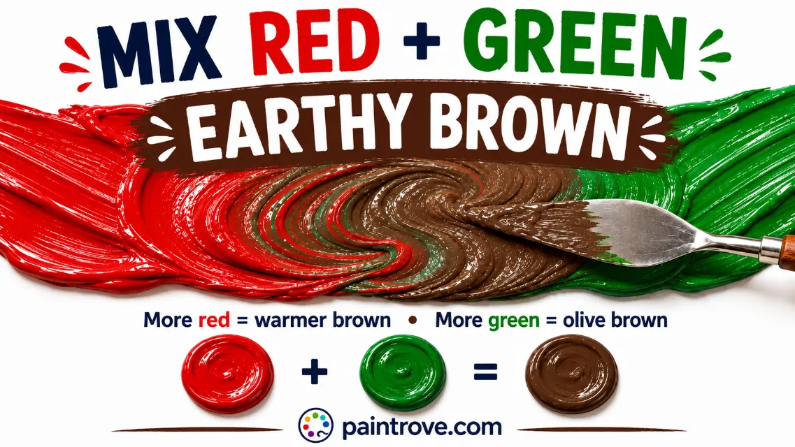
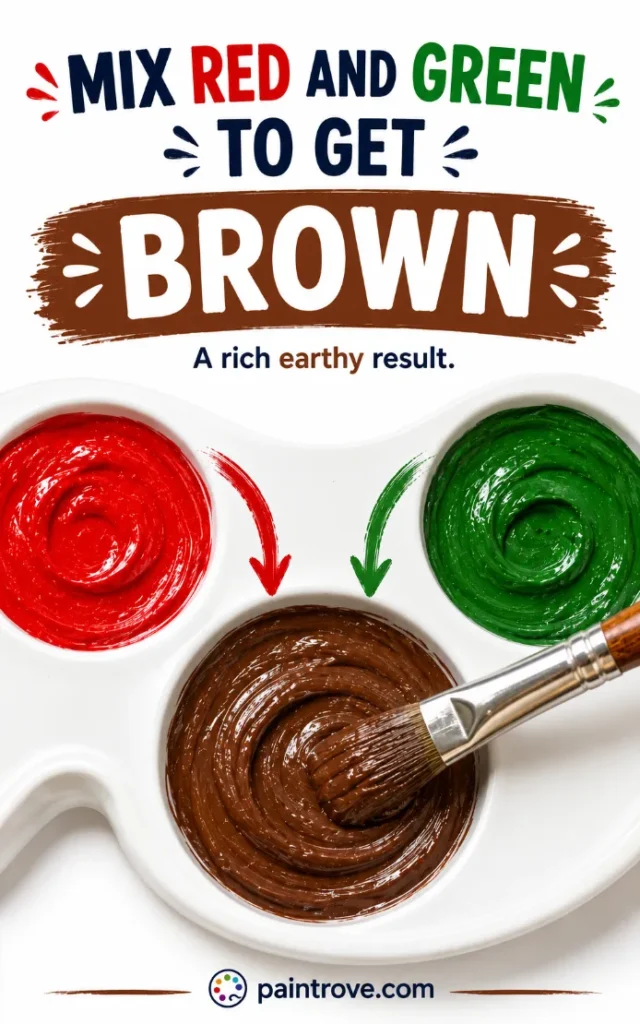
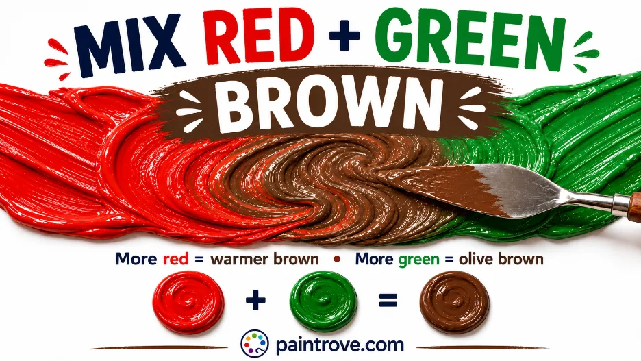
What Color Do Red and Green Make? Mix red and green together and you get brown. A balanced mix gives a standard earthy brown at hex #8B4513, while leaning the mix toward red gives warm chestnut and burgundy-brown tones, and leaning toward green gives olive and khaki. Push either side far enough with dark pigments and the mix can approach near-black.
The answer changes completely in light, though. Mix red and green as light rather than paint and you get yellow at hex #FFFF00, a bright, sunny color nothing like brown. Same two colors, two color systems, two entirely different results.
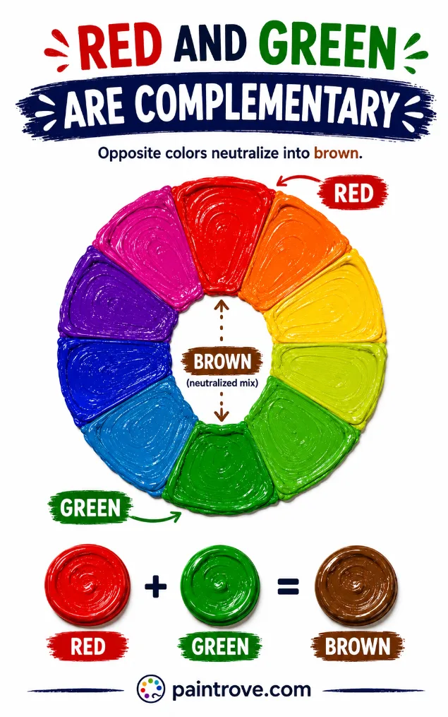
Red and green are complementary colors, sitting directly opposite each other on the color wheel, which is the key to understanding everything that happens when you mix them.
This guide covers the exact ratios with hex codes, how your pigments’ undertones steer the brown, the full range of shades from khaki to chocolate, why the mix sometimes goes gray instead, and how to control the result rather than hoping for the best.
Why Red and Green Make Brown
On the color wheel, red sits directly opposite green. Colors in that relationship are called complementary colors, and mixing any complementary pair neutralizes both, collapsing them toward brown or gray.
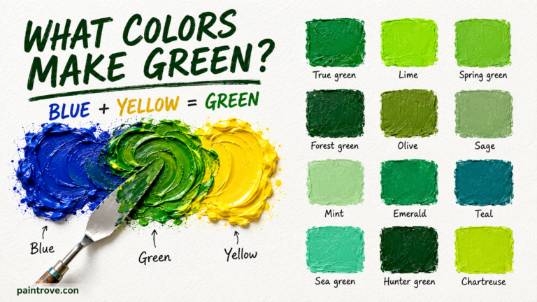
There is a simpler way to see why. Green is a secondary color made from blue and yellow, as covered in what blue and yellow make. So when you mix red into green, you are really combining all three primary colors at once:
Red + Green = Red + (Blue + Yellow) = Red + Yellow + Blue = Brown
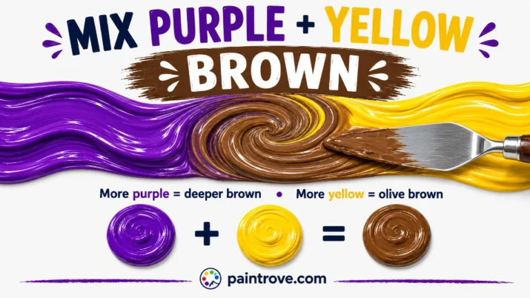
Mixing all three primaries always produces brown. That is the foundation of every brown recipe, as explained in our complete guide to how to make brown. Red and green is simply the fastest two-tube route there, which is why it is one of the most useful mixes an artist can know.
It also explains a useful fact: brown is not really its own hue. Brown is a dark, desaturated orange, which is why the warm side of this mix produces the richest browns.
Red and Green Mixing Ratios and Hex Codes
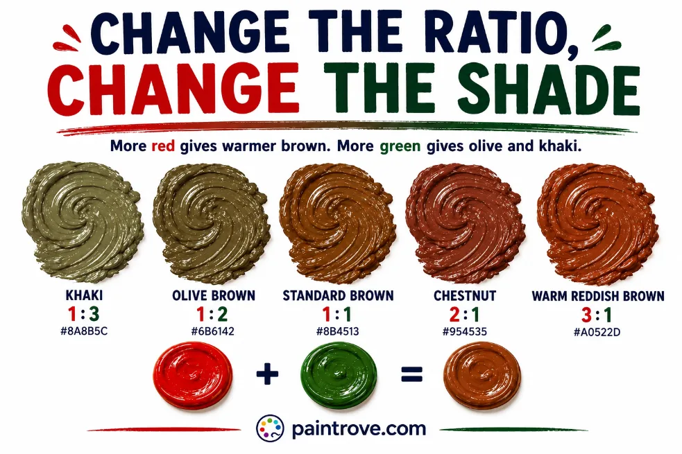
The ratio decides whether your brown leans warm or cool. Here is the working chart with hex targets in plain text:
| Ratio (Red : Green) | Resulting shade | Hex code |
|---|---|---|
| 3 : 1 | Warm reddish brown | Hex #A0522D |
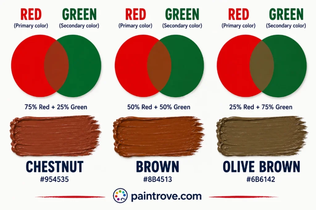
| 2 : 1 | Chestnut brown | Hex #954535 |
| 1 : 1 | Standard brown | Hex #8B4513 |
| 1 : 2 | Olive brown | Hex #6B6142 |
| 1 : 3 | Khaki / muted green-brown | Hex #8A8B5C |
| 1 : 1 plus white | Tan | Hex #D2B48C |
| 1 : 1 plus black | Dark chocolate brown | Hex #3C2414 |
| 1 : 1 with dark pigments | Near-black brown | Hex #2A1A12 |
Practical notes:
- Add the darker color into the lighter one. Greens are usually stronger than reds, so start with red and add green gradually.
- Mix thoroughly before judging. A half-mixed complementary pair looks streaky and much darker than the finished blend.
- Test on white paper and let it dry. Browns are difficult to judge in a pile, and acrylics dry darker.
- Mix more than you need. Matching a specific brown exactly on a second attempt is genuinely hard.
How Undertones Change Your Brown
This is where control comes from, and it is what separates a deliberate brown from an accidental one. The bias of your red and green decides the character of the result:
| Red used | Green used | Resulting brown |
|---|---|---|
| Warm red (cadmium red) | Warm green (sap green) | Rich warm brown, chestnut |
| Warm red (cadmium red) | Cool green (phthalo green) | Balanced neutral brown |
| Cool red (alizarin crimson) | Warm green (sap green) | Slightly cool, muted brown |
| Cool red (alizarin crimson) | Cool green (phthalo green) | Cool, gray-leaning brown |
| Red with orange lean | Yellow-leaning green | Light hazelnut, almost orange-brown |
| Red with blue lean | Blue-leaning green | Purple-leaning cool brown |
The rule is straightforward: warmth in either parent warms the brown. A red carrying orange and a green carrying yellow will give you a light, golden hazelnut brown. A red carrying blue and a green carrying blue will give you a cool, almost purplish brown. If your browns keep coming out lifeless, look at what your pigments are leaning toward before blaming the ratio.
Every Shade You Can Make from Red and Green
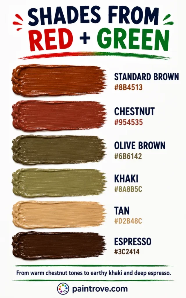
Between ratio, pigment choice, and additions of white or black, red and green cover the entire brown family. The reference table:
| Shade | Hex code | How to mix it |
|---|---|---|
| Standard brown | Hex #8B4513 | Equal parts red and green |
| Chestnut | Hex #954535 | Red-heavy mix |
| Mahogany | Hex #C04000 | Red-heavy mix, warm pigments |
| Burgundy-brown | Hex #6B2737 | Red-heavy mix with a cool red |
| Sienna | Hex #A0522D | Red-heavy mix, orange-leaning red |
| Chocolate | Hex #7B3F00 | Balanced mix plus a touch of black |
| Coffee | Hex #6F4E37 | Balanced mix, slightly dark |
| Olive brown | Hex #6B6142 | Green-heavy mix |
| Khaki | Hex #8A8B5C | Green-heavy mix, yellow-leaning green |
| Hazelnut | Hex #B5844F | Warm mix plus a little white |
| Tan | Hex #D2B48C | Balanced mix plus white |
| Taupe | Hex #483C32 | Balanced mix plus gray |
| Espresso | Hex #3C2414 | Balanced mix plus black |
| Warm gray-brown | Hex #7C6E64 | Near-perfect complementary balance |
Lighter Browns (Tints)
Add white to move the mix into tan, hazelnut, and beige territory, the light neutrals used for skin tones, sand, and weathered wood. If a lightened brown looks chalky or gray, restore warmth with a touch of red or yellow. The full route is covered in brown and white mixed, and skin-tone specific recipes appear in how to make nude color.
Darker Browns (Shades)
A touch of black deepens the mix into chocolate and espresso. Go gently, since black flattens brown quickly. A livelier route is to simply use more of both parents at full strength, or deepen with a dark blue, which keeps the brown rich rather than dead.
Adjusting an Existing Brown
Once you have a brown, you can steer it anywhere. Adding yellow gives mustard and golden tan, as covered in brown and yellow mixed. Adding red pushes toward mahogany and maroon, covered in red and brown mixed. Adding blue cools it toward a muted navy-brown, covered in brown and blue mixed.
Red and Green in Light: The Yellow Surprise
Everything above describes paint. Mix red and green as light and the answer flips completely: you get yellow.
Screens use the RGB model, where red, green, and blue are the primary colors of light and mixing works by addition. Overlap a red beam and a green beam and both sets of wavelengths reach your eye at once, which your visual system interprets as yellow at hex #FFFF00. Nothing is being absorbed, so nothing darkens.
This is not a quirk of screens; it is how human vision works. Your eye has three types of cone cells, and stimulating the red-sensitive and green-sensitive cones together produces the same signal as genuine yellow light would. Your brain cannot tell the difference.
| System | Type | Red + Green makes | Hex code |
|---|---|---|---|
| RYB (paint) | Subtractive | Brown | Hex #8B4513 |
| RGB (light and screens) | Additive | Yellow | Hex #FFFF00 |
| CMYK (printing) | Subtractive | Brown or muddy neutral | Varies |
Printing, covered in our guide to the CMYK color model, behaves like paint since it is also subtractive, producing browns from combined inks.
Troubleshooting Red and Green Mixes
The mix came out gray, not brown. You hit a near-perfect complementary cancel, or your pigments both lean cool. Brown needs the warm side to win. Add red, or a touch of yellow or orange, to bring warmth back.
The mix looks dark and muddy with no character. Too many competing pigments, or the mix is simply too dark. Add a little white to reveal the underlying hue, then adjust.
The brown is too green. Green usually dominates. Add more red than feels reasonable; it takes a surprising amount to balance a strong phthalo or sap green.
The brown looks purple. Both your red and your green lean blue. Switch to a warmer red like cadmium, or a yellow-leaning green.
It is almost black. Two dark, saturated pigments in equal amounts absorb nearly all light. Use lighter versions of both, or add white to bring it back into brown range.
It dried duller. Standard acrylic behavior. Mix a step warmer and lighter than your target.
Red and Green in Art, Fashion, and Design
Here is the paradox of this pair: red and green mix into humble brown, but placed side by side they create one of the strongest contrasts the human eye can perceive. Both facts come from the same complementary relationship.
In Art
Painters rely on the red-green mix constantly, because most of the natural world is built from browns: soil, bark, hair, skin, wood, shadow. Mixing brown from red and green rather than squeezing it from a tube gives far more control over temperature and depth.
The same relationship also underpins complementary muting, one of the most important techniques in representational painting: a touch of green calms an overly bright red, and a touch of red calms an overly bright green. It is how experienced painters make colors sit together naturally instead of shouting.
Used unmixed, the pair is deliberately jarring. The creator of the horror character Freddy Krueger reportedly chose a red and green sweater precisely because the combination is unsettling to look at, a vivid demonstration of how much visual tension complementary colors generate.
In Fashion
Red and green together carry an unavoidable Christmas association, which designers either lean into or carefully sidestep by shifting the shades. Deep burgundy with forest green reads rich and seasonal rather than festive-kitsch, and both have become staples of autumn and winter tailoring.
The browns born from mixing them, chestnut, chocolate, and khaki, are among the most enduring colors in fashion, from military-inspired khaki to the quiet-luxury chocolate tones of recent seasons.
In Interiors and Branding
Red-green mixed browns are the backbone of interiors: wood tones, leather, and warm neutrals that make a space feel grounded. Used unmixed, the pair appears in heritage and tartan-influenced design where high contrast is the point.
In branding, brown signals craft, nature, and reliability, which is why it dominates coffee, chocolate, and outdoor identities.
Quick Reference: Red + Green Cheat Sheet
| Question | Answer |
|---|---|
| Red + green in paint | Brown (hex #8B4513) |
| Red + green in light | Yellow (hex #FFFF00) |
| Why brown | They are complements; together they contain all three primaries |
| More red | Chestnut, mahogany, burgundy-brown |
| More green | Olive, khaki |
| Warm pigments both sides | Rich golden brown |
| Cool pigments both sides | Gray-leaning brown |
| Plus white | Tan, hazelnut |
| Plus black | Chocolate, espresso |
| Fix a gray mix | Add red, orange, or yellow for warmth |
FAQs
What color do red and green make when mixed?
Brown. Red and green are complementary colors, and because green contains blue and yellow, mixing them combines all three primaries, which always produces brown. The exact shade depends on the ratio and the undertones of your pigments.
Do red and green make yellow?
In light, yes. Red and green light combine additively to make yellow at hex #FFFF00, which is how screens produce yellow. In paint, red and green make brown, because pigments subtract light rather than adding it.
Why did my red and green mix turn gray instead of brown?
Your pigments cancelled each other too evenly, or both lean cool. Brown needs warmth to dominate. Add red, orange, or a touch of yellow and the gray will shift back toward brown.
How do you make dark brown from red and green?
Use deeper versions of both, such as alizarin crimson with sap green, or add a small amount of black to a balanced mix. Adding a dark blue instead of black keeps the brown richer.
How do you make light brown from red and green?
Mix your brown, then add white gradually for tan and hazelnut tones. If the lightened brown turns chalky, warm it back up with a touch of red or yellow.
Do red and green make black?
Not quite, though they can come close. Two very dark, saturated versions of red and green mixed in equal parts absorb almost all light and can look nearly black, but the result is technically a very dark brown.
Are red and green a good color combination?
Side by side, they create the strongest complementary contrast available, which is striking but intense, and heavily associated with Christmas. Shifting the shades to burgundy and forest green keeps the contrast while losing the seasonal reference. Mixed, they produce the browns that underpin most natural color schemes.
Red and green make brown in paint and yellow in light, and the brown you get is entirely controllable once you understand pigment undertones. Warm both sides for golden browns, cool both sides for gray-leaning ones, and adjust from there.
For the full neutral system, see our guide to how to make brown, explore the parent color at what colors make green, or step back to the color wheel.