What Color Do Blue and Orange Make When Mixed? (Brown)
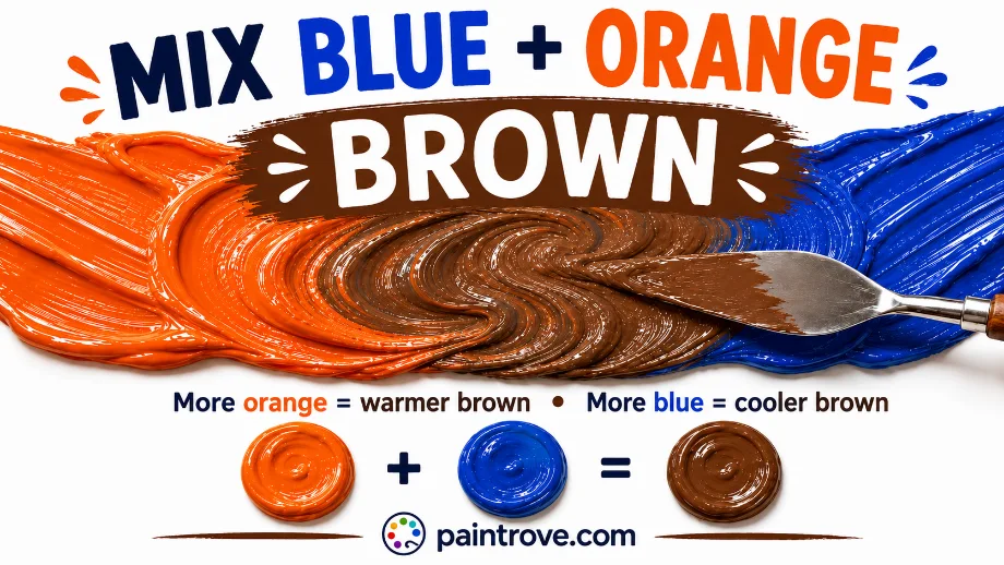
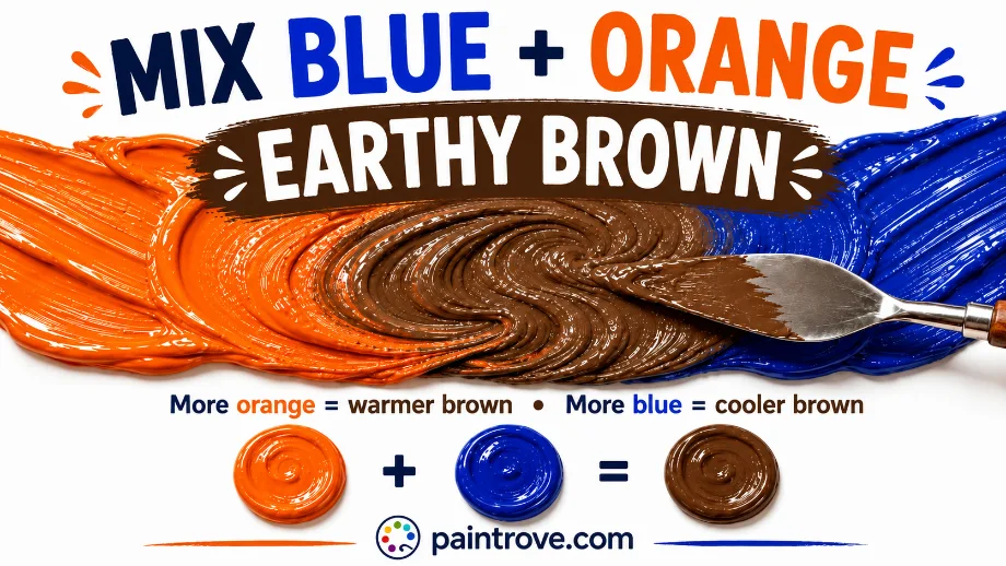
What Color Do Blue and Orange Make? Mix blue and orange together and you get brown. A balanced mix gives a rich, slightly cool brown at hex #6F4E37, leaning the mix toward orange gives warm reddish browns and burnt sienna, and leaning toward blue gives deep, cool, almost navy-brown tones. Equal parts of two strong pigments can even approach near-black.
In light, the answer is completely different. Blue and orange light combine to make white, or a pale neutral, because they are complementary colors and together they cover the full spectrum. Same two colors, two systems, two opposite results.
Blue and orange are one of the three classic complementary pairs on the color wheel, which is why this mix behaves the way it does. This guide covers the exact pigment recipes professionals use, the ratios with hex codes, how to steer the brown warm, cool, or neutral, why the mix is one of the most useful browns in painting, and how it flips to white in light.
Why Blue and Orange Make Brown
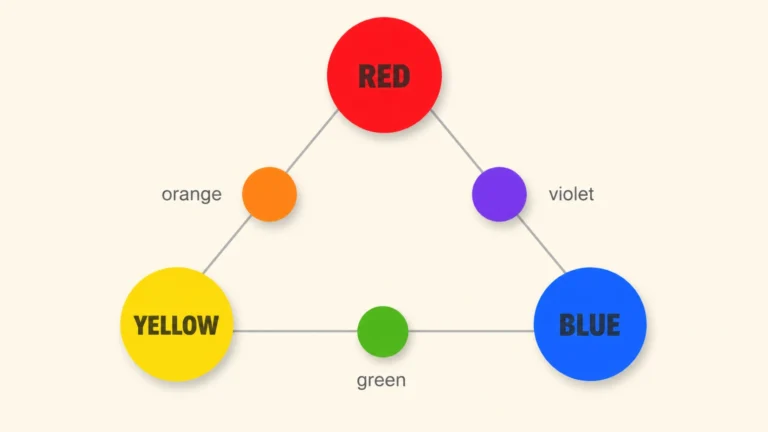
On the color wheel, blue sits directly opposite orange. That relationship makes them complementary colors, and mixing any complementary pair neutralizes both into brown or gray.
The clearest way to understand it: orange is a secondary color made from red and yellow, as covered in what colors make orange. So mixing blue into orange is really combining all three primary colors at once:
Blue + Orange = Blue + (Red + Yellow) = Red + Yellow + Blue = Brown
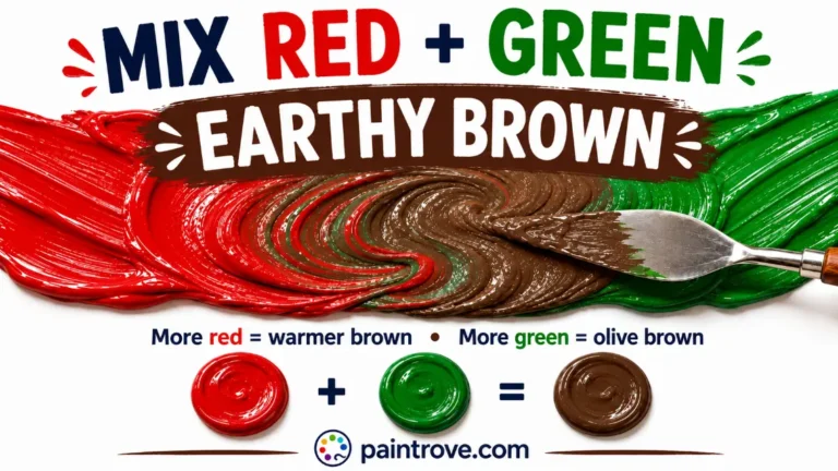
All three primaries together always make brown, which is the basis of every brown recipe in our full guide to how to make brown. Blue and orange is one of the two most popular two-color routes to brown, alongside red and green mixed, and many painters prefer it because it offers exceptional control over temperature.
Because brown is fundamentally a dark, desaturated orange, this mix has a natural advantage: you are starting with orange and simply knocking it down with blue, which is a very intuitive way to build browns.

The Pigment Recipes Professionals Use
This mix rewards specific pigment choices more than almost any other, because the exact blue and orange decide the entire character of the brown. Here are the pairings artists rely on:
| Blue + Orange | Result | Hex code |
|---|---|---|
| Ultramarine + Cadmium orange | Deep, glowing reddish-brown | Hex #7B3F2B |
| Cerulean + Naples orange | Cool, soft, grayed neutral brown | Hex #8C7A66 |
| Phthalo blue + Vermilion orange | Dark, navy-leaning brown | Hex #4A3B32 |
| Ultramarine + Burnt orange | Rich chocolate brown | Hex #5C4033 |
| Cobalt blue + Cadmium orange | Balanced mid brown | Hex #6F4E37 |
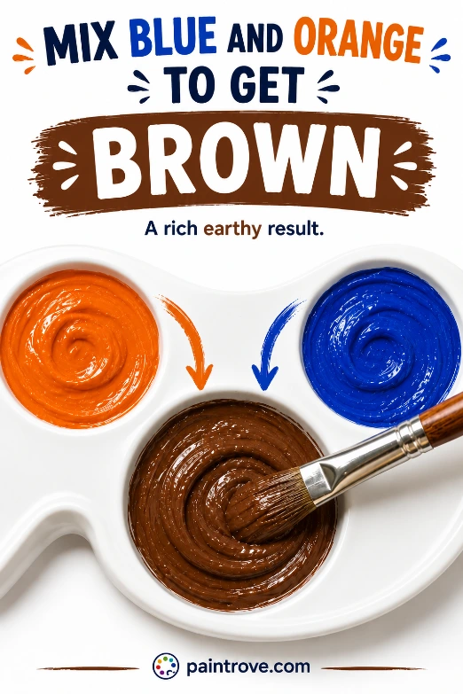
The classic combination is ultramarine blue with cadmium orange. Ultramarine is a warm, red-leaning blue, so paired with a warm orange it produces a brown full of warmth and life, ideal for skin tones, bricks, foliage, and natural shadows. Swap in a cool cerulean and a muted Naples orange and you get a soft, grayed brown perfect for fog, wood grain, and quiet interiors. Phthalo blue, being cool and extremely strong, pulls toward dark navy-browns and needs to be used sparingly.
Blue and Orange Mixing Ratios and Hex Codes
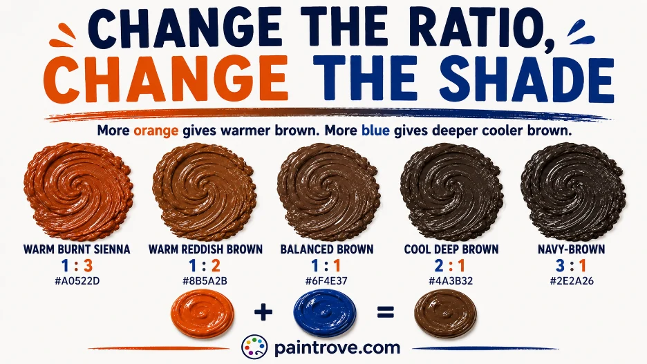
The ratio decides warm versus cool and light versus dark. Here is the working chart with hex targets in plain text:
| Ratio (Blue : Orange) | Resulting shade | Hex code |
|---|---|---|
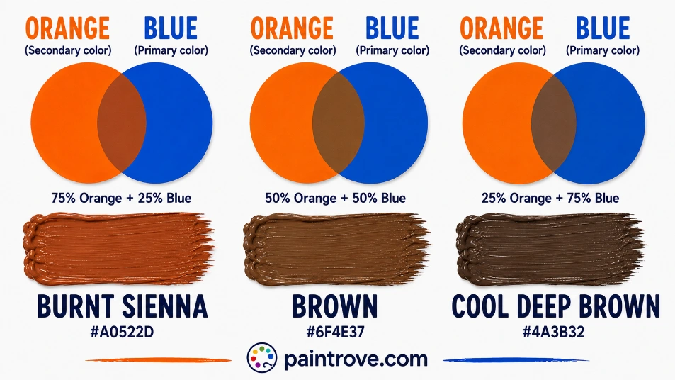
| 1 : 3 | Warm burnt sienna | Hex #A0522D |
| 1 : 2 | Warm reddish brown | Hex #8B5A2B |
| 1 : 1 | Balanced brown | Hex #6F4E37 |
| 2 : 1 | Cool deep brown | Hex #4A3B32 |
| 3 : 1 | Navy-brown, near-black | Hex #2E2A26 |
| 1 : 1 plus white | Taupe | Hex #B0A08F |
| 1 : 2 plus white | Tan | Hex #D2B48C |
| 1 : 1 with muted pigments | Cool gray-brown | Hex #7C7266 |
Practical notes:
- Start with orange and add blue in small amounts. Blue is powerful and quickly overwhelms orange, taking the mix darker and cooler than intended.
- Mix thoroughly. A half-mixed complementary pair looks streaky and darker than the finished blend.
- Test on white paper and let it dry, since browns are hard to judge in a pile and acrylics dry darker.
- Because a tiny amount of blue transforms the mix, add it gradually. It is much easier to deepen than to lighten.
Every Shade You Can Make from Blue and Orange
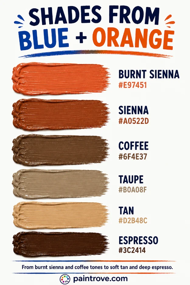
Between pigment choice, ratio, and additions of white or black, blue and orange cover the full brown family. The reference table:
| Shade | Hex code | How to mix it |
|---|---|---|
| Burnt sienna | Hex #E97451 | Orange-heavy mix, small blue |
| Sienna | Hex #A0522D | Orange-heavy warm mix |
| Standard brown | Hex #8B4513 | Balanced mix leaning orange |
| Coffee | Hex #6F4E37 | Balanced mix |
| Chocolate | Hex #5C4033 | Balanced mix, slightly dark |
| Chestnut | Hex #954535 | Warm orange-heavy mix |
| Umber | Hex #635147 | Blue-heavy mix |
| Taupe | Hex #B0A08F | Balanced mix plus white |
| Tan | Hex #D2B48C | Orange-heavy mix plus white |
| Beige | Hex #F5F5DC | Orange-heavy mix plus generous white |
| Navy-brown | Hex #3B3A36 | Blue-heavy mix |
| Espresso | Hex #3C2414 | Balanced mix plus black |
| Cool gray-brown | Hex #7C7266 | Muted pigments, near-equal |
Lighter Browns (Tints)
Add white to move the mix into taupe, tan, and beige, the light neutrals used for sand, skin, and weathered surfaces. If a lightened brown looks chalky or gray, warm it with a touch of orange. The full route is in brown and white mixed, with skin-tone recipes in how to make nude color, and a warm sandy version in how to make sand color.
Darker Browns (Shades)
A touch of black gives chocolate and espresso, but adding more blue is the better route here, since blue deepens the brown while keeping it rich rather than flat. This is one of the advantages of the blue-orange mix: your darkener is already in the recipe.
Adjusting an Existing Brown
Steer a finished brown by adding yellow for mustard tones, covered in brown and yellow mixed, or more orange for warmer, redder browns. Pushing further into reddish territory takes you toward the russet of orange and purple mixed and the mahogany of red and brown mixed.
Blue and Orange in Light: The White Surprise
Everything above describes paint. Mix blue and orange as light and you get white, or a pale neutral, not brown.
Screens use the RGB model, where colors add together and combining all wavelengths produces white. Orange light contains red and green wavelengths, and blue light adds the blue, so blue plus orange light covers red, green, and blue, the three light primaries, which combine into white. Complementary colors in light always add up to white, which is actually the definition of complementary in the additive system.
| System | Type | Blue + Orange makes | Result |
|---|---|---|---|
| RYB (paint) | Subtractive | Brown | Hex #6F4E37 |
| RGB (light and screens) | Additive | White or pale neutral | Hex #FFFFFF |
| CMYK (printing) | Subtractive | Brown | Varies |
Printing, covered in our guide to the CMYK color model, behaves like paint since it is subtractive, producing browns from the combined inks.
Troubleshooting Blue and Orange Mixes
The mix came out gray, not brown. Your pigments cancelled too evenly, or both lean toward neutral. Brown needs orange to lead. Add more orange to bring warmth back.
The mix went almost black. Equal parts of two strong, saturated pigments absorb nearly all light. Use less blue, or lighter versions of both colors, and add white to recover a usable brown.
The brown is too cool or dull. Too much blue, or a cool blue like phthalo dominating. Rebuild with a warm ultramarine and add it more sparingly.
The brown lacks richness. Muted or student-grade pigments gray out mixes. Artist-grade ultramarine and cadmium orange produce noticeably livelier browns.
It dried duller. Standard acrylic behavior. Mix a step warmer and lighter than the target.
Mixing Blue and Orange in Different Mediums
The brown you get shifts with your medium, so it is worth knowing how each behaves.
Acrylics mix cleanly on the palette and are forgiving, but they dry noticeably darker, so a brown that looks like coffee wet can dry closer to chocolate. Mix a shade lighter and warmer than your target.
Oils give the most control thanks to their long working time, letting you balance the blue and orange precisely and judge the temperature before it sets. Many classical earth-tone palettes are built on exactly this mix.
Watercolor produces the most luminous browns, because you can let blue and orange meet on wet paper and granulate. Ultramarine and burnt orange are both granulating pigments, which gives watercolor browns a beautiful textured quality impossible in other media. Overmixing on the palette, though, quickly turns a watercolor blue-orange brown lifeless, so many artists layer them instead.
Gouache and digital both behave predictably: gouache stays matte and even, while digital blending lets you fine-tune the exact ratio and undo mistakes, which makes hitting a precise brown far easier than with wet paint.
Whichever medium you use, the same principle holds as in red and green mixed: control the temperature through your pigment bias and the ratio, not by hoping the tubes cooperate.
Blue and Orange in Art, Fashion, and Design
Blue and orange is one of the most powerful complementary pairs, and like all complements it lives a double life: muddy when mixed, electric when placed side by side.
In Art
The blue-orange mix is a studio workhorse. Because it lets a painter dial a brown warm or cool simply by adjusting the blue, it is the preferred way many artists mix natural shadows, earth, and skin tones.
The same complementary relationship powers a core painting technique: a touch of blue neutralizes an over-bright orange, and a touch of orange warms an over-cool blue, letting an artist knock any color back toward believable without reaching for gray. Used unmixed, blue and orange create the vivid contrast the Impressionists loved for capturing sunlight against shadow, warm light against cool shade.
In Fashion
Blue and orange side by side reads as bold, energetic, and modern, which is why it dominates sports team branding and action-movie posters, where the warm-cool clash grabs attention instantly. In clothing, the pairing is a confident statement, softened when the shades shift toward navy and terracotta for a more wearable version. The browns the mix produces, from burnt sienna to chocolate, are wardrobe staples in their own right.
In Interiors and Branding
Interior designers use blue and orange as a balanced complementary scheme, cool walls with warm terracotta accents, or navy paired with copper and rust. The mixed browns, meanwhile, are the grounding neutrals of almost any room. In branding, the blue-orange contrast signals energy and trust at once, the reason it appears across tech, travel, and sports identities that want to feel both dynamic and dependable.
Quick Reference: Blue + Orange Cheat Sheet
| Question | Answer |
|---|---|
| Blue + orange in paint | Brown (hex #6F4E37) |
| Blue + orange in light | White or pale neutral |
| Why brown | They are complements; together they contain all three primaries |
| Classic recipe | Ultramarine + cadmium orange for warm brown |
| More orange | Burnt sienna, warm brown |
| More blue | Cool deep brown, navy-brown |
| Plus white | Taupe, tan, beige |
| Plus black or more blue | Chocolate, espresso |
| Fix a gray mix | Add orange for warmth |
FAQs
What color do blue and orange make when mixed?
Brown. Blue and orange are complementary colors, and because orange contains red and yellow, mixing it with blue combines all three primaries, which always produces brown. The exact shade depends on the pigments and ratio.
Do blue and orange make white?
In light, yes. Blue and orange light are complementary and together cover the full spectrum, adding up to white on a screen. In paint, they make brown, because pigments subtract light rather than adding it.
What blue and orange make the best brown?
Ultramarine blue with cadmium orange is the classic pairing, producing a warm, glowing reddish-brown ideal for skin tones and natural shadows. For a cooler, grayer brown, use cerulean blue with a muted Naples orange.
Why did my blue and orange mix turn gray?
The two colors neutralized each other too evenly. Brown needs orange to dominate. Add more orange, and the gray will warm into brown.
How do you make dark brown from blue and orange?
Add more blue, which deepens the brown while keeping it rich, or add a small amount of black. Because blue is already in the recipe, using more of it is the cleaner route to a deep, living brown.
Do blue and orange make black?
Not quite, but they can get close. Equal parts of two dark, saturated pigments absorb almost all light and can look nearly black, though the result is technically a very dark brown.
Are blue and orange a good color combination?
Side by side, they form one of the strongest and most popular complementary contrasts, which is why they dominate sports branding and film posters. Mixed, they produce versatile browns. Both uses come from the same complementary relationship.
Blue and orange make brown in paint and white in light, and the brown is one of the most controllable on the palette. Start with orange, add blue to taste, and choose your pigments to set the temperature.
For the full neutral system, see our guide to how to make brown, explore the parent color at what colors make orange, or step back to the color wheel.