What Color Do Red and Orange Make When Mixed? (Vermilion / Red-Orange)
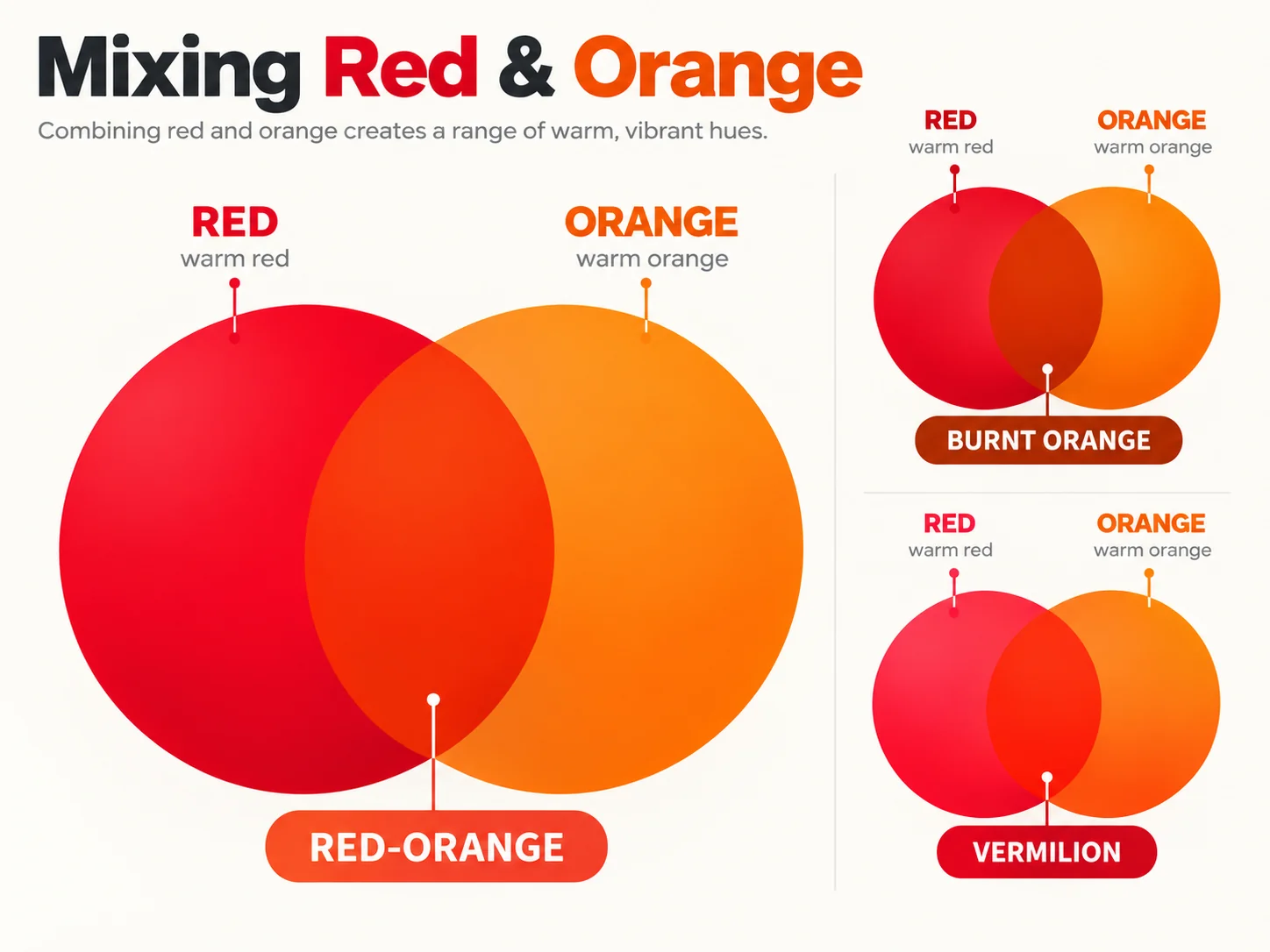
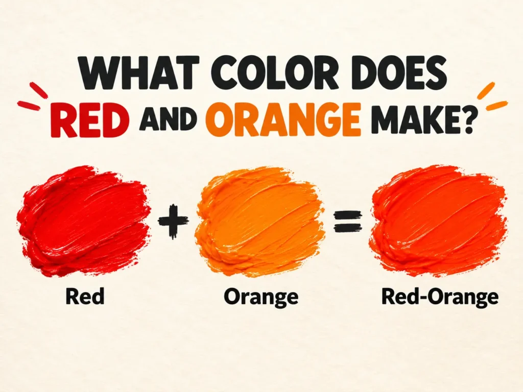
What Color Do Red and Orange Make? Red and orange make red-orange, the fiery hue commonly known as vermilion. It sits at roughly Hex #E34234, one step around the wheel from pure red toward orange.
Because orange already contains red, this mix does not create a genuinely new color so much as shift orange deeper and hotter. An equal mix gives true vermilion. More red pushes toward scarlet. More orange pushes toward tangerine. Nothing here will turn muddy, because red and orange sit beside each other on the wheel and have nothing to cancel out.
The order of the names makes no difference. Orange and red make the same vermilion as red and orange, and only the ratio changes what you end up with.
What color does red and orange make?
Red-orange, also called vermilion. It is a tertiary color, produced by mixing a primary with the secondary next to it.
Red is a primary color. Orange is a secondary color, built from red and yellow. Combine a primary with its neighbouring secondary and you get a tertiary sitting between the two, which is why red and orange make something that reads unmistakably as both at once. The six tertiaries on the traditional wheel are red-orange, yellow-orange, yellow-green, blue-green, blue-purple and red-purple.
Understanding that orange is itself two-thirds red explains why this mix behaves the way it does. You are not introducing a new pigment family, you are increasing the proportion of red already present. The result stays saturated but moves quickly, which is why small adjustments matter more here than in most mixes. The guide to what colors make orange covers the red and yellow foundation this sits on top of.
Why red and orange make a clean color instead of mud
Red and orange are analogous colors, meaning neighbours on the color wheel. Analogous mixes stay bright.
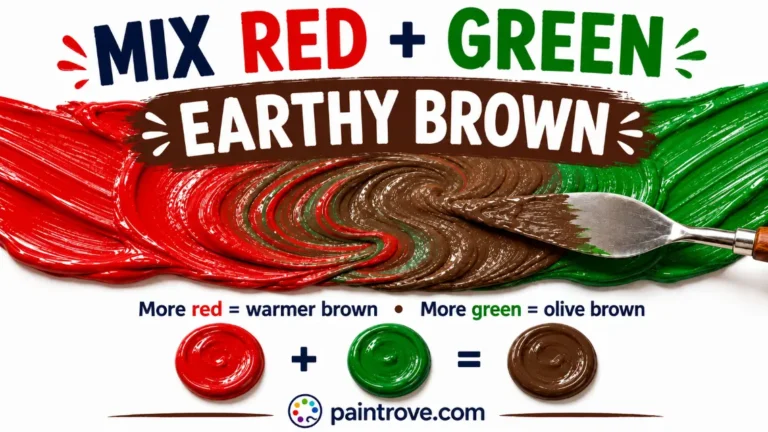
When two colors sit opposite each other, each cancels part of the other and the mixture loses saturation, sliding toward brown or grey. That is what happens with red and green, and the underlying mechanism is explained in the guide to complementary colors.
There is no such conflict here. Put red and orange together and neither one has anything to cancel in the other. Neither red nor orange contains any blue to neutralize the other, so red and orange mixed together produce a color that holds its intensity at every ratio, and red and orange mixed in any proportion stays clean. This makes it one of the most reliable mixes on the palette, and a good one for beginners who have struggled with muddy purples or greens.
The trade-off is subtlety. Because the two colors are so close, the visible range you can travel is narrow. You are working between red and orange, not creating something outside that band.
Red and orange mixing ratios
Every ratio below is a starting point rather than a formula. Pigment strength differs by brand and medium, so add gradually and test before committing.
| Approximate ratio (red : orange) | Result | Roughly matches |
|---|---|---|
| 1 : 5 | Orange with a warm flush | Tangerine, Hex #F28500 |
| 1 : 3 | Deep orange leaning red | Cadmium orange, Hex #E6812F |
| 1 : 2 | Rich orange-red | Orange-red, Hex #FF4500 |
| 1 : 1 | True vermilion | Vermilion, Hex #E34234 |
| 2 : 1 | Red-dominant, still visibly warm | Flame, Hex #E25822 |
| 4 : 1 | Red with an orange cast | Scarlet, Hex #FF2400 |
| 8 : 1 | Barely warmed red | Close to pure red |
The practical rule here is the reverse of most mixes: add red into orange, in very small amounts. Red pigments carry high tinting strength, and since orange is already part red, even a brushtip shifts the balance noticeably. Working the other way means using a great deal of orange to move a red base, and wasting paint doing it.
Red plus orange in equal parts is what most people picture when they imagine this mix. Anything past two parts red reads simply as red to most eyes.
Red-orange, orange-red, vermilion and scarlet compared
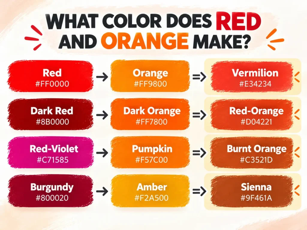
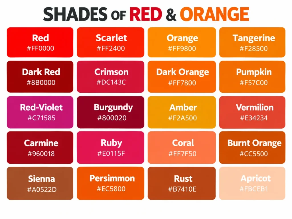
The red orange color family covers a narrow band, and the names within it get used interchangeably even though they are not quite the same. Here is roughly where each sits between red and orange.
| Name | Approximate hex | RGB | Character |
|---|---|---|---|
| Scarlet | #FF2400 | 255, 36, 0 | A quarter of the way from red to orange |
| Vermilion | #E34234 | 227, 66, 52 | The classic red-orange midpoint, slightly muted |
| Orange-red | #FF4500 | 255, 69, 0 | The web-standard name, bright and pure |
| Red-orange | #FF5349 | 255, 83, 73 | Softer, pinker, the crayon-box version |
| Flame | #E25822 | 226, 88, 34 | Deeper and more orange-leaning |
| Cinnabar | #E34234 | 227, 66, 52 | Same value as vermilion, named for the mineral |
| Coral | #FF7F50 | 255, 127, 80 | Red-orange lightened toward pink |
| Tomato | #FF6347 | 255, 99, 71 | Soft, slightly muted orange-red |
Two points worth knowing. Orange Red is the formal web color name at Hex #FF4500, which is why the orange red color appears in CSS and design tools while vermilion does not. Written without the hyphen, Orange Red is what you will find in most digital color pickers. And vermilion and cinnabar are the same hue under two names, since the pigment was originally made by grinding cinnabar, a mercury sulfide mineral. The Royal Society of Chemistry traces the name back through Old French to the Latin for a small worm, a reference to the insect-derived red dye kermes rather than to the mineral itself.
How to mix vermilion without an orange tube
You do not need premixed orange. Since orange is red plus yellow, you can build red-orange from two primaries and get cleaner control doing it.
- Start with a warm red such as Cadmium Red Light, Pyrrole Red or Scarlet Lake. A cool red like Alizarin Crimson carries blue bias and will dull the result.
- Add a warm yellow such as Cadmium Yellow Medium in small touches.
- Stop early. The mix needs far less yellow than orange does, roughly one part yellow to four or five parts red as a starting point.
- Adjust with a touch more red if it drifts too far toward orange.
Mix red and orange from primaries this way and you usually beat mixing red into a commercial orange, because many orange paints are pigment blends carrying undertones you cannot see until they are in the mixture.
Single-pigment shortcuts also exist. Pyrrole Orange (PO73) and Cadmium Red Light both sit close to the red-orange band straight from the tube, and Pyrrole Scarlet lands almost exactly on the target with no mixing at all.
Adjusting the mix once you have it
| Want | Add | Result |
|---|---|---|
| Lighter, softer | Titanium white | Coral to salmon, near Hex #FF7F50 |
| Deeper, richer | More red, then a touch of burnt umber | Brick, rust, oxblood |
| Muted or antique | A trace of blue or green | Terracotta, weathered brick |
| Darker without dulling | Burnt umber or a deep violet | Mahogany, dark russet |
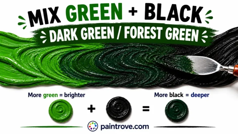
Avoid black. Most blacks read green or blue and will pull red-orange toward a dirty brown rather than deepening it cleanly. The orange and black mixture shows what that actually produces, and why an earth pigment is nearly always the better choice.
If you push the mix further toward brown deliberately, you are heading into the territory covered by red and brown mixed, which lands on maroon and mahogany rather than vermilion.
Why your red and orange mix looks flat
It just looks red. The commonest outcome, because red dominates. Add orange in quantity rather than small touches to pull it back.
It just looks orange. Not enough red. Add it at brushtip scale; a little travels a long way.
The color is dull or brownish. Your red is cool. Alizarin Crimson, Quinacridone Magenta and Permanent Rose all lean purple and carry blue bias, which quietly neutralizes the warmth. Switch to a warm red. A dirty brush holding traces of blue or green does the same thing.
It went chalky when lightened. White reduces saturation as well as value, so a heavily tinted mix loses its fire and reads as dusty pink. Rebuild from a stronger base and add white sparingly, or lighten with more orange instead.
It dried different from the wet mix. Expected. Acrylic dries darker, watercolor dries lighter. Cadmium and pyrrole reds are also strongly opaque, so a thin layer reads very differently from a thick one.
Red and orange in RGB, hex and CMYK
Digital color arrives at red-orange by a different route than paint, and the two should not be confused.
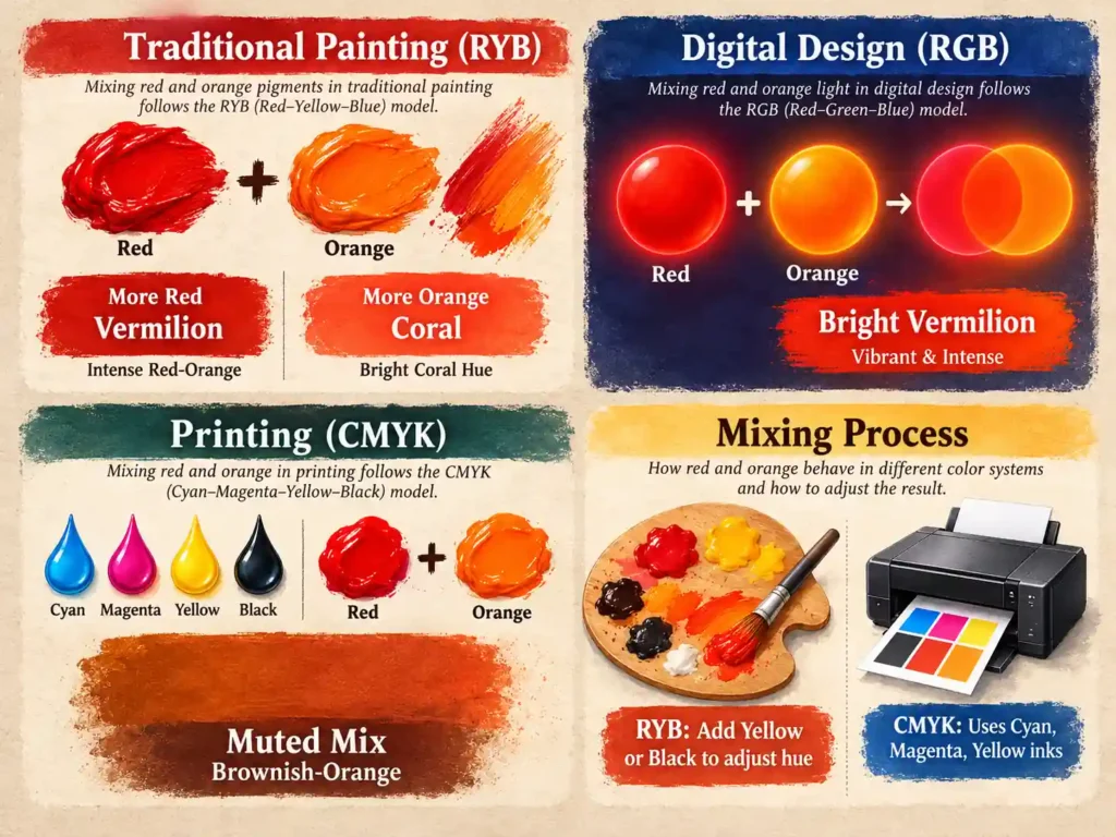
- Paint (subtractive RYB). Red and orange make vermilion by combining pigments that each absorb part of the spectrum.
- Screens (additive RGB). Orange-red is 255, 69, 0. Full red light, a small amount of green light, no blue. There is no orange channel; orange itself is just red light with more green added.
- Print (CMYK). Vermilion comes from magenta and yellow ink, roughly 0, 71, 77, 11.
That RGB breakdown explains the relationship neatly. Orange is 255, 165, 0. Drop the green value and you move toward red. Orange-red at 255, 69, 0 is simply orange with most of the green removed, which is the digital equivalent of adding red pigment to orange paint.
A monitor can display saturated red-oranges that no pigment physically reaches, so treat any hex code as a target rather than a value your paint will land on.
Using red-orange in art, decor and design
In painting, red-orange is one of the oldest working colors in the trade and still does specific jobs no other hue does. It is the color of flame, embers, autumn maple, terracotta roof tile and the warm edge of a sunset. Because it is opaque and dense in most formulations, it covers well and holds its intensity in thin applications. Placed beside a cool blue or teal it appears to glow, which is the standard trick for making a small area of a painting read as the light source.
In interiors, red-orange is used almost entirely as an accent. At full saturation it dominates a room, so most schemes reach for the muted versions instead: terracotta, brick, rust and clay all sit in this family with the chroma pulled back. It pairs naturally with deep teal, navy, cream and warm wood. Paired with pure red it tends to look accidental rather than deliberate, since the two are too close to read as a decision.
In design and branding, orange-red signals urgency and appetite simultaneously. It is common in food, sport and entertainment branding for exactly that reason, and it is the standard choice for calls to action where plain red would feel like a warning. Softer coral and tomato versions read as friendly rather than urgent, which is why they show up in lifestyle and wellness branding where full vermilion would feel aggressive.
FAQs
What color do red and orange make when mixed?
Red-orange, commonly called vermilion, at roughly Hex #E34234. It is a tertiary color sitting between red and orange on the wheel. Equal parts gives true vermilion, more red moves it toward scarlet, and more orange moves it toward tangerine. The mix stays bright at every ratio.
What do red and orange make together?
A red-orange called vermilion, near Hex #E34234. Because orange is already part red, the mix deepens and heats the orange rather than producing a genuinely new hue. Equal parts is the standard starting point, and the result stays saturated at any ratio.
What color does orange and red make?
The same as red and orange: vermilion. Mixing order does not change the hue, only your control over it. Starting with orange and adding red in small touches gives the finer control, since red has stronger tinting power and orange already contains red.
Is red-orange the same as vermilion?
Effectively yes. Red-orange is the color-theory name for the tertiary between red and orange, while vermilion is the historical pigment name for the same region. Vermilion is often slightly less saturated than the pure tertiary, because the original pigment was a mineral rather than an ideal hue.
What is the difference between orange-red and red-orange?
In practice very little, though the hex values differ. Orange-red is a formal web color at Hex #FF4500 and reads brighter and purer. Red-orange as used in crayon and paint ranges sits near Hex #FF5349 and reads slightly softer and pinker. Both describe the same band between the two parent colors.
What is the best ratio of red to orange?
Equal parts gives true vermilion. One part red to two parts orange gives a brighter orange-red, and two parts red to one part orange gives a red-dominant flame tone. Add red into orange rather than the reverse, since red shifts the mixture very quickly.
Can red and orange make brown?
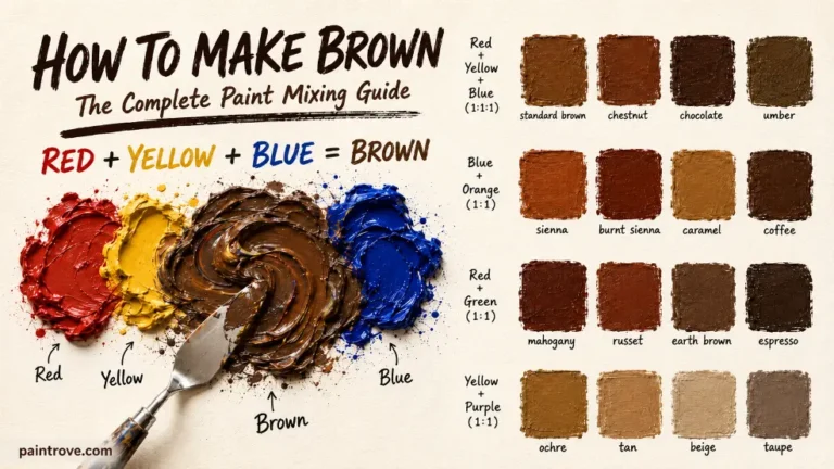
Not on their own. Brown requires a third element, usually blue or green, to neutralize the mixture. Red and orange are analogous with no opposing content, so they stay clean. Adding a touch of blue or burnt umber will move it toward brick and eventually brown.
What does red and orange make in light rather than paint?
On a screen, orange-red is 255, 69, 0 in RGB, built from red light with a small amount of green and no blue. Red and orange do not exist as separate channels in additive color, so the digital route to the same hue works nothing like mixing pigment.
How do you make red-orange lighter without losing intensity?
Add more orange rather than white. Orange raises the value while keeping the warmth, so the result stays fiery. White lightens but also mutes, turning the mix into coral and then into a dusty pink. Use white only when a soft, opaque coral is the actual goal.
What colors go with red-orange?
Teal and deep blue give the strongest contrast, since blue-green sits opposite it on the wheel. Cream, warm grey, terracotta and olive create a softer, more grounded scheme. Charcoal and navy make it read as a rich accent. Pairing it with pure red tends to flatten both, since they are too close to separate visually.
Red and orange at a glance
| If you want | Do this |
|---|---|
| True vermilion | Equal parts red and orange |
| Brighter orange-red | Two parts orange to one part red |
| Scarlet or flame | Two to four parts red to one part orange |
| Lighter without dulling | Add orange, not white |
| Coral or salmon | Add white to the vermilion base |
| Muted brick or terracotta | A trace of blue or burnt umber |
| Vermilion without orange paint | Warm red plus a small touch of warm yellow |
The short answer to what color does red and orange make is vermilion, and the mix is forgiving because the two are neighbours on the wheel with nothing to cancel out. Three things are worth remembering: add red into orange rather than the reverse, use a warm red if you want the result to stay fiery, and reach for an earth pigment rather than black when you need to deepen it.