What Colors Make Orange? How to Make Orange + RGB Codes
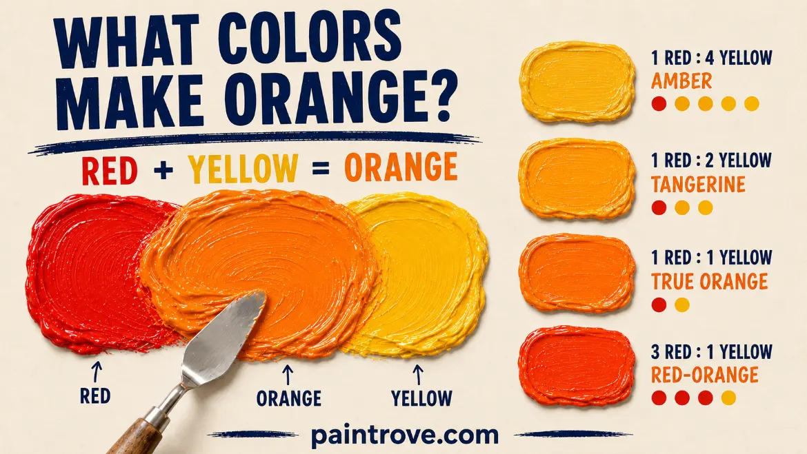
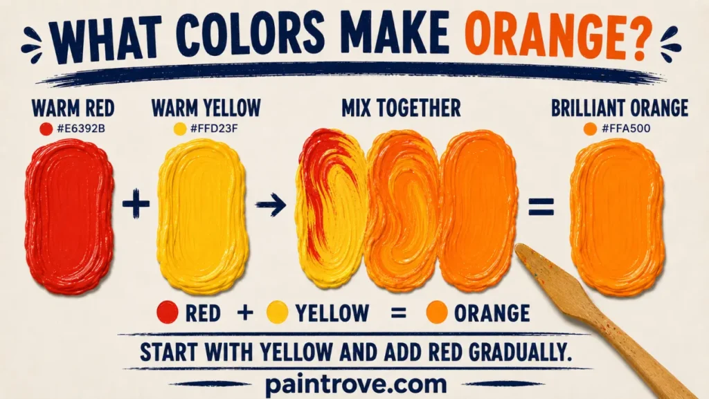
What Colors Make Orange? Red and yellow make orange. In paint, ink, dye and food coloring, those two are all you need. A roughly equal mix of a warm red and a warm yellow gives a true, balanced orange close to Hex #FFA500. Push the ratio toward red and you get a hotter red-orange or vermilion. Push it toward yellow and you get amber, marigold or golden orange.
The catch is that “red” and “yellow” cover a huge range of tubes and bottles, and the specific ones you pick change the result more than the ratio does. Some pairs give a glowing, high-chroma orange. Others give something closer to rust or dull brick.
This guide covers what colors make orange in every situation: the ratios, the paint pairings that actually work, how to mix burnt orange, peach, coral and every other named shade, the digital codes, and how to fix an orange that has gone muddy.
What two colors make orange?
Red and yellow. Orange is a secondary color, which means it is created by combining two primaries rather than existing as one itself.
In the traditional red-yellow-blue model used for paint mixing, the three primaries are red, yellow and blue, and mixing any two of them produces a secondary. Red plus yellow gives orange, blue plus yellow gives green, and red plus blue gives purple. If you want the wider picture of how those relationships sit together, the complete guide to secondary colors walks through all three and how they behave in mixtures.
On a standard artist’s color wheel, orange sits directly between red and yellow. That position is not decorative. It tells you two useful things straight away:
- The closer your starting red and yellow already lean toward orange, the brighter your mix will be.
- The color sitting opposite orange on the wheel is blue, which makes blue the tool for dulling, darkening or neutralizing an orange you have mixed.
How to make orange, step by step
If you are working out how to make orange color for a specific project, the process takes about a minute once you know the order of operations. The same six steps apply to acrylic, oil, watercolor, gouache, ink and food coloring.
- Choose a warm red and a warm yellow. Cadmium Red Light and Cadmium Yellow Medium are the reliable default pair. Avoid Alizarin Crimson and Lemon Yellow for a bright result.
- Put out the yellow first. Squeeze out more yellow than you think you need and keep the red separate on the palette.
- Add red into the yellow in small amounts. Red has far stronger tinting power, so introduce it a touch at a time rather than combining equal piles.
- Mix fully before judging. Streaky paint reads darker and duller than it will once blended.
- Test a swatch and let it dry. Acrylic dries darker, watercolor dries lighter. Judging a wet mix is the most common reason a color misses.
- Adjust. More yellow for amber, more red for vermilion, white for peach, a trace of blue for burnt orange.
How much red and how much yellow?
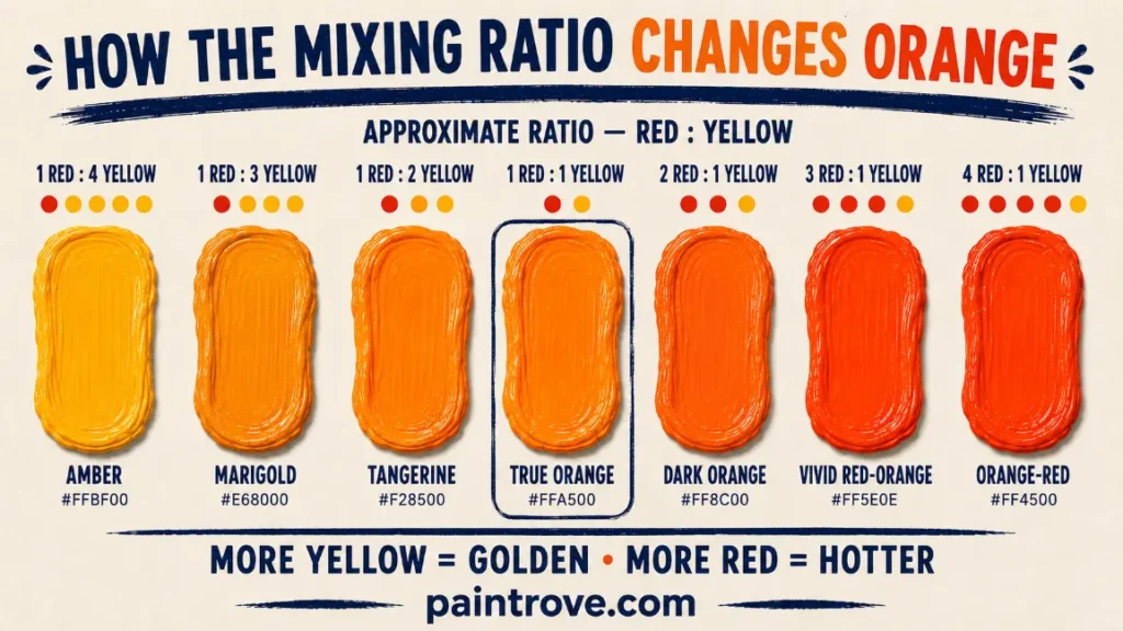
Ratio controls hue, not brightness. Every mix below assumes a warm red and a warm yellow, and every one is a starting point rather than a formula. Pigments differ in strength, so add the red gradually and test as you go.
| Approximate ratio (red : yellow) | Resulting orange | Roughly matches |
|---|---|---|
| 1 : 4 | Golden yellow-orange, barely orange | Amber, Hex #FFBF00 |
| 1 : 3 | Warm marigold, still yellow-dominant | Fulvous, Hex #E68000 |
| 1 : 2 | Bright classic orange | Tangerine, Hex #F28500 |
| 1 : 1 | Balanced true orange | Orange, Hex #FFA500 |
| 2 : 1 | Deeper, hotter orange | Dark orange, Hex #FF8C00 |
| 3 : 1 | Red-orange | Vivid orange, Hex #FF5E0E |
| 4 : 1 | Strongly red-leaning orange | Orange-red, Hex #FF4500 |
| 6 : 1 | Almost red with a warm cast | Vermilion, Hex #D74826 |
One practical point that saves a lot of paint: start with the yellow and add red into it, not the other way around. Red pigments generally have far more tinting strength than yellows, so a small amount of red shifts a pile of yellow quickly, while adding yellow to red takes a surprising quantity before anything visible happens.
The red-and-yellow pairing is the single most searched mixing question in color, and it holds true across acrylic, oil, watercolor, gouache, ink, dye and food coloring, because all of those work by subtraction.
A pigment appears the color it does because it absorbs the other wavelengths and reflects the rest, so when two pigments are combined only the wavelengths both of them reflect survive. The University of Wisconsin–Madison Ingersoll Physics Museum has a clear demonstration of how that subtraction works.
Why the reds and yellows you choose matter more than the ratio
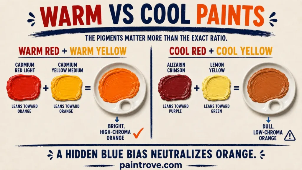
Almost nobody owns a perfectly neutral red or a perfectly neutral yellow. Every tube leans slightly toward one of its neighbours on the color wheel, and that lean is called color bias or temperature.
- A warm red leans toward orange. Cadmium Red Light, Pyrrole Red and Scarlet are warm.
- A cool red leans toward purple, which means it carries a hint of blue. Alizarin Crimson, Quinacridone Magenta and Permanent Rose are cool.
- A warm yellow leans toward orange. Cadmium Yellow Medium, Indian Yellow and Hansa Yellow Deep are warm.
- A cool yellow leans toward green, which also means a hint of blue. Lemon Yellow, Cadmium Lemon and Hansa Yellow Light are cool.
Mix a warm red with a warm yellow and nothing is fighting the orange, so you get high chroma. Mix a cool red with a cool yellow and you have quietly introduced blue into the mixture from both directions. Blue is orange’s complement, so it cancels the orange and you end up with something dull, brownish or greyed. That single fact explains most disappointing orange mixes.
Paint pairings and what they actually produce
| Red + yellow | Result | Best used for |
|---|---|---|
| Cadmium Red Light + Cadmium Yellow Medium | Dense, opaque, brilliant orange | Sunsets, poppies, strong flat color |
| Pyrrole Red + Hansa Yellow Deep | Very high chroma, modern, semi-transparent | Glowing highlights, bright florals |
| Cadmium Red Light + Cadmium Lemon | Bright but slightly cooler orange | Citrus fruit, cooler light |
| Naphthol Red + Azo Yellow Medium | Good bright orange at student-range prices | General practice mixing |
| Quinacridone Rose + Cadmium Yellow | Softer, peachier, slightly greyed orange | Skin tones, subtle glazes |
| Alizarin Crimson + Lemon Yellow | Dull, brownish, low-chroma orange | Shadow oranges, aged surfaces |
| Yellow Ochre + Cadmium Red Light | Earthy, muted orange | Terracotta, rust, autumn foliage |
You can also skip the mix entirely. Single-pigment oranges exist and generally produce cleaner, more intense results than anything you can mix, because a mixture always loses a little saturation. Cadmium Orange is PO20, made by modifying cadmium yellow with cadmium selenide, and it is dense and opaque. Pyrrole Orange (PO73) is higher in chroma and less opaque.
Perinone Orange (PO43) and the benzimidazolone oranges such as PO62 sit between them. Jackson’s Art guide to orange pigments is a reliable reference if you want to check what is actually in a tube, and it is worth doing, because many paints labelled “Cadmium Orange Hue” are premixed blends rather than a true orange pigment.
How to mix specific shades of orange
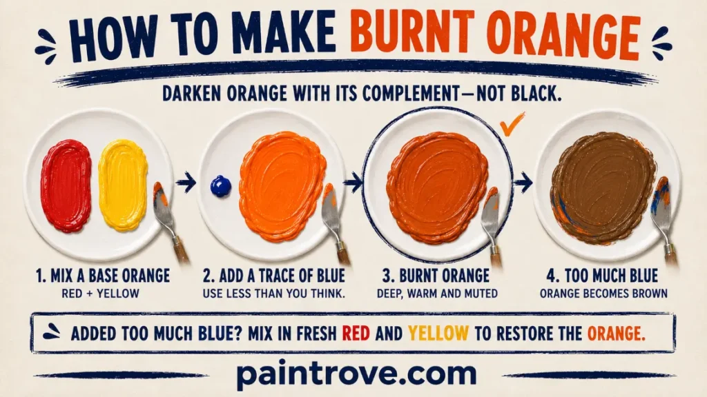
Once you have a base orange, four adjustments cover almost every named shade: add white to lighten, add a touch of blue to mute and darken, add more red or yellow to shift the hue, and add an earth pigment to warm and dull it.
Burnt orange
Mix a standard orange first, then add a very small amount of blue. Ultramarine works well. Blue is orange’s complement, so it darkens the mix without the flatness that black brings. Use less than you think you need, because blue has high tinting strength and one extra brushload takes you straight past burnt orange into brown. A good stopping point sits near Hex #CC5500. If it does go too far, adding red and yellow back in will pull it toward orange again.
Peach and apricot
Start with a generous amount of titanium white and fold your orange into the white a little at a time. Building on a white base keeps the result opaque and creamy rather than thin. A yellow-leaning orange gives apricot, around Hex #FBCEB1. A slightly redder orange gives peach, around Hex #FFE5B4. If the tint looks chalky, a whisper more of the original orange restores warmth.
Coral
Coral is a pink-orange, so it needs red doing more work than yellow. Mix orange with a heavier red content, then lighten with white and add a touch of a cool red such as Quinacridone Rose to push it pink. The target sits near Hex #FF7F50. Adding the pink before the white gives better control than trying to tint a pale mixture.
Dark orange without going flat
Black is the obvious choice and usually the wrong one. Many blacks carry a green or blue base, which neutralizes orange and leaves it looking dirty. A better route is a deep blue, a violet, or a dark earth such as burnt umber. Each darkens the value while keeping some warmth. If you do want to see exactly what black does to an orange mixture, the breakdown of what orange and black make when mixed covers the full range from deep burnt orange down to near-brown.
Terracotta and rust
These are muted, earthy oranges rather than bright ones. Yellow Ochre with a warm red gives a soft terracotta near Hex #E2725B. Adding a little burnt umber or a trace of blue deepens it toward rust, near Hex #B7410E. Small amounts of white will move the mix toward the pale, chalky terracotta used in interiors.
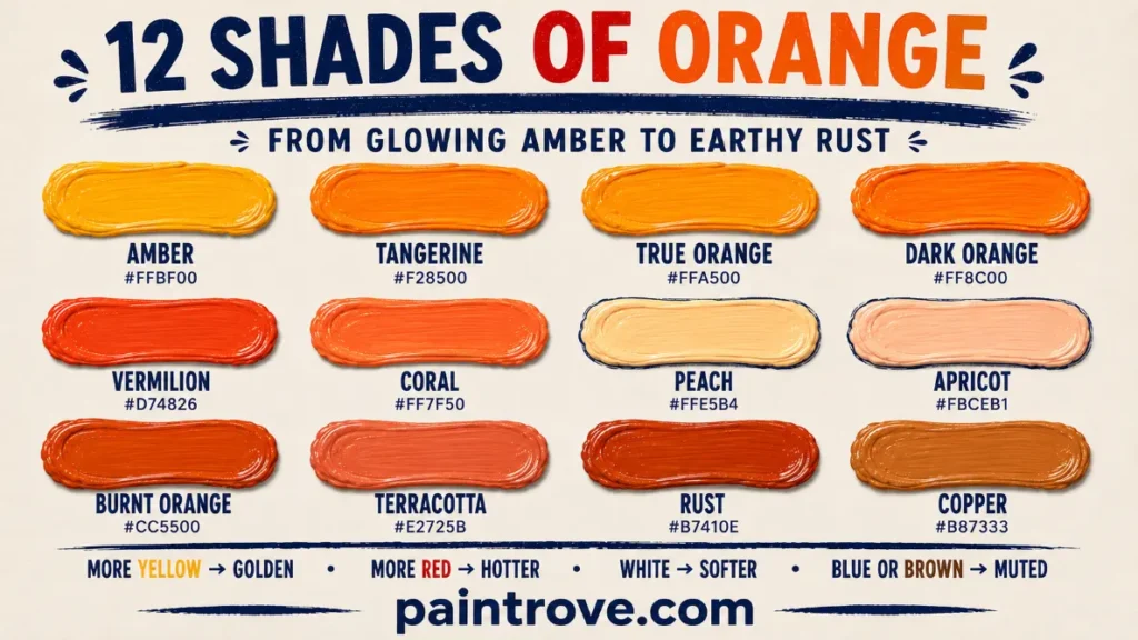
Quick shade reference
| Shade | Approximate hex | How to mix from a base orange |
|---|---|---|
| Amber | #FFBF00 | Add more yellow |
| Tangerine | #F28500 | Slightly more yellow than red |
| Orange | #FFA500 | Roughly equal red and yellow |
| Dark orange | #FF8C00 | Add red, then a trace of violet |
| Vermilion | #D74826 | Heavy red, light yellow |
| Coral | #FF7F50 | Add white plus a cool pink-red |
| Peach | #FFE5B4 | Add plenty of white |
| Apricot | #FBCEB1 | Yellow-leaning orange plus white |
| Burnt orange | #CC5500 | Add a trace of blue |
| Terracotta | #E2725B | Yellow ochre plus warm red |
| Rust | #B7410E | Burnt orange plus burnt umber |
| Copper | #B87333 | Orange plus ochre and a little brown |
Why does my orange look brown?
Because blue got in somewhere. Red, yellow and blue together always move toward brown or grey, and blue rarely arrives on purpose. The usual sources are:
- A cool red or cool yellow. Alizarin Crimson leans purple and Lemon Yellow leans green, and both carry blue bias. Together they can produce something closer to weak coffee than orange.
- A dirty brush or dirty water. Leftover blue or green pigment from a previous mix is enough to knock the chroma down noticeably.
- Too much black. Blacks with a blue or green undertone dull orange fast.
- Overmixing on a busy palette. Pulling paint through an area that already has other colors in it drags them into the mix.
The fix is usually not to add more color but to start again with a warm red and a warm yellow on a clean part of the palette. If the muddy mixture is close to something useful, you can lean into it instead: that reaction is exactly the mechanism behind most mixed browns, and the full guide to mixing brown explains how to steer it deliberately rather than accidentally.
Deliberately muting orange is a legitimate technique, not a mistake. Adding a controlled amount of its complement is how painters knock back a color that is too loud without dulling the whole painting. The mechanics of that relationship are covered in the guide to complementary colors and how they cancel each other, and the specific outcome of pushing it further is documented in what blue and orange make when mixed.
Can you make orange without red?
Not from scratch in paint, no. Orange requires a red component by definition, and no combination of yellow, blue, black and white will produce it.
There are three things people usually mean when they ask, though:
- Using magenta instead of red. Magenta plus yellow gives orange, and with a heavy yellow bias it gives a good one. This is how printing works, where magenta and yellow are the relevant primaries rather than red and yellow. The orange will lean slightly cooler and pinker than one mixed from a warm red.
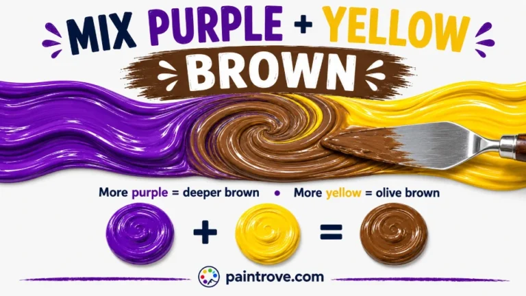
- Using an earth pigment. Yellow Ochre, Raw Sienna and Burnt Sienna are naturally orange-leaning without any mixing. Burnt Sienna in particular, around Hex #E97451, functions as a ready-made muted orange.
- The red-plus-green claim. Several sites suggest mixing red and green to get yellow, then adding red to reach orange. This does not work with paint. Red and green are complements, and combining them in pigment gives a brown or grey, as shown in the breakdown of what red and green make when mixed. The idea comes from additive light mixing, where red light plus green light genuinely does produce yellow. It is a real principle applied to the wrong medium.
Orange RGB values and color codes
What colors make orange on a screen is a completely different question. Screens use additive RGB, where color is built from red, green and blue light rather than pigment, so there is no yellow channel involved at all.
The RGB value for orange is 255, 165, 0, which is Hex #FFA500. That is full red light, a moderate amount of green light, and no blue at all. Lowering the green value pushes the color toward red-orange. Raising it pushes toward yellow. Adding any blue immediately desaturates it toward grey or brown, which is the digital equivalent of the muddy paint problem.
The orange RGB and hex codes below cover the shades most often needed for design and web work.
| Orange shade | Hex | RGB |
|---|---|---|
| Orange (web standard) | #FFA500 | 255, 165, 0 |
| Dark orange | #FF8C00 | 255, 140, 0 |
| Orange red | #FF4500 | 255, 69, 0 |
| Tangerine | #F28500 | 242, 133, 0 |
| Amber | #FFBF00 | 255, 191, 0 |
| Vermilion | #D74826 | 215, 72, 38 |
| Tomato | #FF6347 | 255, 99, 71 |
| Coral | #FF7F50 | 255, 127, 80 |
| Peach | #FFE5B4 | 255, 229, 180 |
| Apricot | #FBCEB1 | 251, 206, 177 |
| Terracotta | #E2725B | 226, 114, 91 |
| Burnt orange | #CC5500 | 204, 85, 0 |
| Rust | #B7410E | 183, 65, 14 |
Three routes to orange, three different sets of ingredients:
- Paint and pigment (subtractive RYB). Red plus yellow makes orange. Adding more colors moves the mixture toward dark and neutral.
- Screens and light (additive RGB). Full red light plus mid green light, no blue. Adding all three at full strength gives white, not black.
- Printing (CMYK). Yellow ink overlaid with magenta, typically around 0, 45, 100, 0 for a standard orange.
The visible wavelengths we perceive as orange fall roughly between 585 and 620 nanometers, sitting between red and yellow in the spectrum exactly as it sits between them on the wheel.
This distinction matters when you are matching paint to something you saw on screen. A monitor can display saturated oranges that no pigment can physically reach, so a hex or RGB code should be treated as a target to aim at rather than a value your paint will land on. The same gap applies across all mixed colors, which is why how the primaries behave in each system is worth understanding before attempting an exact match.
Mixing orange in other mediums
Acrylic dries slightly darker than it appears wet, so mix your orange a shade lighter than the target and let a test patch dry before committing.
Watercolor dries lighter, the opposite problem, so mix stronger than looks right. Layering a transparent yellow wash and glazing red over it once dry often gives a more luminous orange than mixing the two in the well.
Oil stays workable longest and gives the most control over subtle shifts. Cadmium Orange in oil is dense enough that a little goes a long way.
Food coloring and icing follow the same rule of red into yellow. Start with yellow, add red drop by drop, and mix thoroughly before judging, because gel colors deepen noticeably as they sit. For frosting, mix a little darker than your target and let it rest for around half an hour.
Wall paint should always be tested on the wall itself. Orange is one of the most light-sensitive colors in interiors and reads dramatically warmer under incandescent light than under north-facing daylight.
Using orange in art, interiors and design
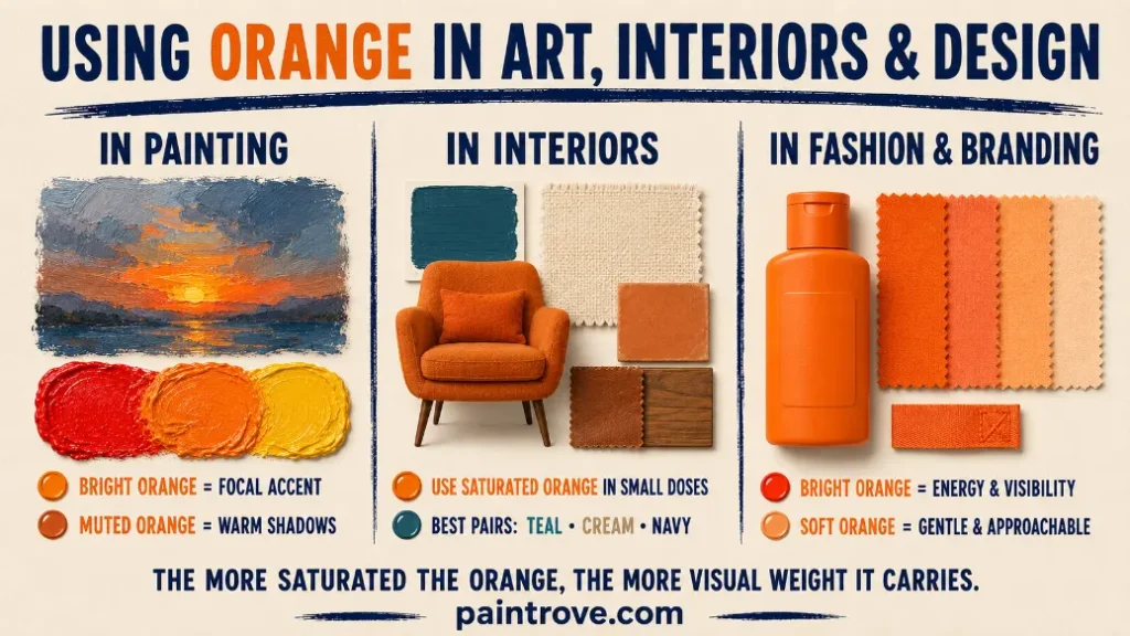
Knowing how to mix orange is only half the job. Knowing how much of it to use is the other half, because orange has more visual weight than almost any other hue and behaves very differently depending on how saturated it is.
In painting, orange is most often used as an accent rather than a field. Because blue sits opposite it on the wheel, a small area of bright orange surrounded by cool blues or greys will read as intensely luminous, which is why sunsets, firelight and lit skin tones are usually built from a muted orange base with only a few strokes of pure high-chroma orange at the brightest points.
The Impressionists took this further by placing dabs of pure red and pure yellow next to each other and letting the eye combine them at viewing distance, which produces a livelier orange than mixing the two on the palette. Muted oranges do the heavy lifting in most paintings: terracotta, raw sienna and burnt sienna carry warmth through shadow areas without shouting.
In interiors, saturated orange works better in small doses than on four walls. Burnt orange, terracotta and rust are the versions that read as warm and grounded rather than loud, which is why they dominate autumn-toned rooms. The classic pairing is orange with teal or turquoise, a complementary relationship softened by moving both colors away from full saturation.
Cream, warm white, oatmeal and mid-grey let an orange accent stay dominant without competing, while navy and charcoal deepen the contrast. Natural materials help too, since leather, terracotta tile, clay and unfinished wood are all naturally in the orange family.
In fashion and branding, orange signals energy, warmth, appetite and visibility. It is used heavily in food and drink packaging because warm hues stimulate appetite, and in safety equipment because high-visibility orange stands out against most natural backgrounds. Softer versions behave completely differently: coral, peach and apricot read as gentle and approachable, which is why they show up in cosmetics, spring collections and lifestyle brands where bright orange would feel aggressive.
FAQs
What two colors make orange?
Red and yellow. Orange is a secondary color, produced by mixing two primaries. Roughly equal parts of a warm red and a warm yellow give a balanced orange near Hex #FFA500. Increasing the red produces red-orange and vermilion, while increasing the yellow produces amber and golden orange.
What is the best ratio of red to yellow for orange?
Equal parts is the standard starting point for a true orange. A 1:2 ratio of red to yellow gives a brighter, more tangerine result, and a 2:1 ratio gives a deeper, hotter orange. Always add red into yellow in small amounts, since red pigments have much stronger tinting power and will overwhelm the mix quickly.
How do you make burnt orange?
Mix a standard orange from red and yellow, then add a tiny amount of blue. Ultramarine works well. Blue is the complement of orange, so it darkens and mutes the mix without the deadness black produces. Add it in very small amounts, because too much turns burnt orange into brown.
Why does my orange turn brown?
Blue has entered the mixture. This usually comes from using a cool red such as Alizarin Crimson or a cool yellow such as Lemon Yellow, both of which carry a blue bias, or from a dirty brush. Red, yellow and blue together always neutralize toward brown. Switching to a warm red and warm yellow fixes it.
How do you make orange lighter?
Add titanium white gradually, working white into the orange rather than the reverse. White lightens the value but also reduces saturation, so heavily tinted oranges look softer and chalkier. Adding more yellow instead lightens the mix while keeping the intensity, which usually looks more natural for highlights.
How do you darken orange without making it dull?
Use a deep blue, a violet, or burnt umber rather than black. Many black paints have a blue or green undertone that neutralizes orange and leaves it looking dirty. Small additions of the darker color deepen the value while keeping warmth in the mixture.
Is orange a primary or secondary color?
Orange is a secondary color in the red-yellow-blue model used for paint mixing, because it is made by combining two primaries. It is not primary in any standard model. In printing it is produced from magenta and yellow ink, and on screens it comes from red and green light.
Can you mix orange without red?
Not in the strict sense, since orange needs a red component. Magenta plus yellow will produce an orange, which is how printing achieves it. Earth pigments like Burnt Sienna and Yellow Ochre are also naturally orange-leaning and need no mixing. Red plus green does not make orange in paint, only in light.
What colors go with orange?
Blue is orange’s direct complement and creates the strongest contrast. Analogous pairings with red, yellow and warm browns give a softer, more harmonious effect. Teal, navy and slate are popular with burnt orange in interiors, while cream and warm grey let brighter oranges stay dominant without competing.
What is the RGB code for orange?
Orange is 255, 165, 0 in RGB, which corresponds to Hex #FFA500. Dark orange is 255, 140, 0 and orange red is 255, 69, 0. Screens build orange from red and green light with no blue, so the digital route to orange has nothing in common with mixing red and yellow paint.
How do you make neon or fluorescent orange with paint?
You cannot mix it. Fluorescent oranges use pigments that re-emit ultraviolet light as visible light, and no combination of standard red and yellow can replicate that effect. Buying a fluorescent orange paint is the only route, and applying it over a white ground makes it read brightest.
Orange mixing at a glance
Everything on this page comes down to five decisions:
| If you want to… | Do this |
|---|---|
| Mix a basic orange | Equal parts warm red and warm yellow |
| Get a brighter orange | Use warm-biased paints, or a single-pigment orange |
| Shift the hue | More red for vermilion, more yellow for amber |
| Lighten it | White for peach and coral, extra yellow for glowing highlights |
| Darken or mute it | A trace of blue, violet or burnt umber rather than black |
Red and yellow make orange in every physical medium, so the answer to what colors make orange never changes. What changes is which orange you end up with.
Three things are worth remembering beyond the ratios: start with yellow and add red into it, because red has far more tinting strength; check whether your red and yellow are warm or cool, because a hidden blue bias is what turns orange brown; and treat every hex code as a target rather than a guarantee, since pigment, brand, opacity, medium and lighting all shift the final result.
Mix small test amounts, let them dry, and adjust from there rather than committing a large batch to a color you have not seen dry.