What Does Black and White Make When Mixed? (Gray)
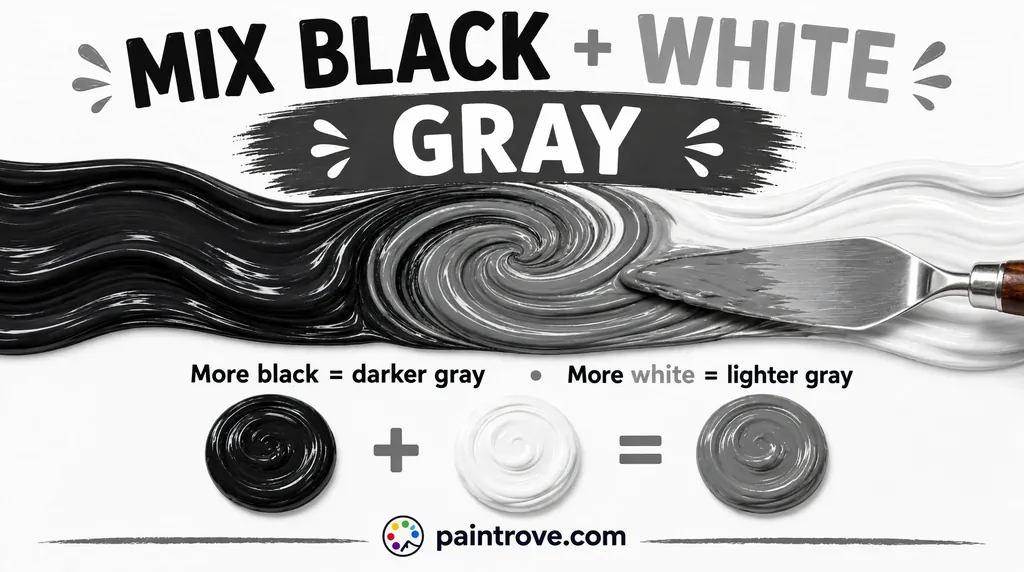
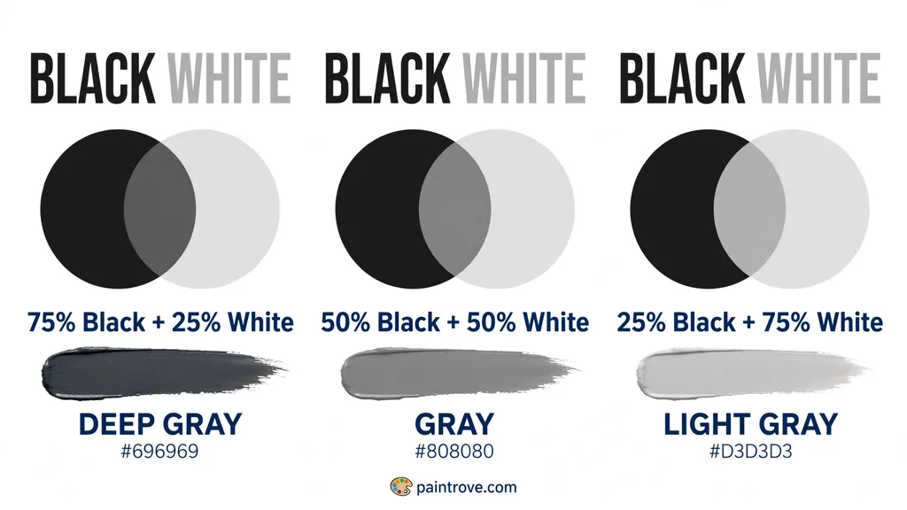
Black and white make gray. In paint, ink, dye or any other pigment, combining the two gives a neutral gray, with equal parts landing on mid-gray around Hex #808080.
The ratio decides nothing except how light or dark the result is. More white gives light gray or silver. More black gives charcoal. If you are wondering whether black and white make what color changes at some proportion, they do not: there is no hue in the mixture at all, which is what makes gray an achromatic color. It has lightness and nothing else.
The answer to what color does black and white make therefore stays the same across every medium and every ratio. One thing worth knowing before you start: black is vastly stronger than white, so a tiny amount of black shifts a large pool of white. Always add black into white rather than white into black.
What color does black and white make?
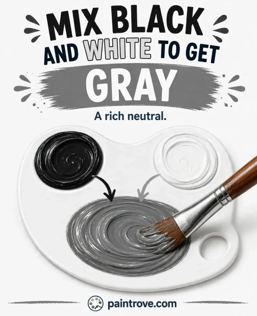
Gray, in every physical medium. Paint, ink, dye, clay and food coloring all behave the same way, so black and white makes what color you expect no matter what you are mixing.
The mechanism is simple. White reflects nearly all visible light. Black absorbs nearly all of it. Mixed together, the pigment particles sit side by side and the surface reflects a reduced, even amount of light across the whole spectrum. Nothing is reflected more than anything else, so no hue appears. You get a flat middle value.
So what does black and white make beyond gray? Nothing. There is no ratio, brand or technique that produces a hue from two colorless ingredients. If your mixture is showing a tint of blue, brown or green, that tint is coming from an undertone in one of the two paints, not from the mixing itself.
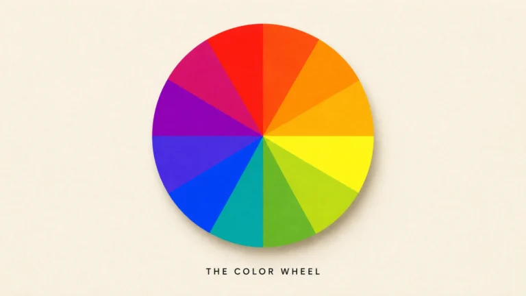
Gray is one of the three neutrals, alongside black and white, and none of them appear on the color wheel because the wheel organises hues. For the full picture of how gray is made by other routes, including the chromatic grays painters generally prefer, the guide to what colors make gray covers every method.
What does black and white make at each ratio?
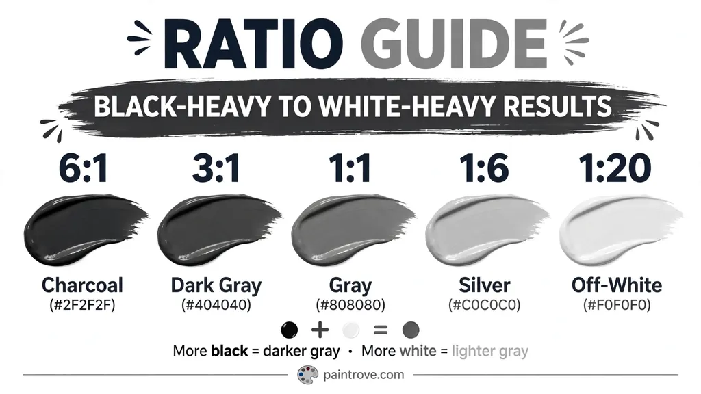
Every ratio below is an approximate starting point. Black pigments vary enormously in strength, so add in very small amounts and test as you go.
| Approximate ratio (black : white) | Result | Roughly matches |
|---|---|---|
| 1 : 20 | Barely tinted off-white | Near Hex #F0F0F0 |
| 1 : 10 | Pale gray | Light gray, Hex #D3D3D3 |
| 1 : 6 | Soft gray | Silver, Hex #C0C0C0 |
| 1 : 3 | Mid-light gray | Hex #BFBFBF |
| 1 : 1 | True mid gray | Gray, Hex #808080 |
| 2 : 1 | Deep gray | Dim gray, Hex #696969 |
| 3 : 1 | Dark gray | Hex #404040 |
| 6 : 1 | Near-black | Charcoal, Hex #2F2F2F |
Black and white makes what color sits at that point on the value scale and nothing more, so the only decision is where on the scale you want to land.
The ratios look uneven because they are. A 1:1 mix of black and white paint does not give you a true middle gray in practice. Black has far more tinting strength, so an honest equal-parts mix usually comes out considerably darker than Hex #808080. The table above describes target values rather than literal spoonfuls, which is why testing matters more here than in almost any other mix.
Practical method:
- Put out a generous pool of titanium white.
- Pick up the smallest amount of black your brush or knife will carry.
- Blend it in fully before judging. Streaky gray always reads darker than it will when mixed.
- Repeat until you reach the value you want.
- Test on your actual surface and let it dry. Acrylic dries darker, watercolor dries lighter.
Going too dark is the standard mistake, and recovering means adding a great deal of white. Undershoot deliberately. The order makes no difference to what color does white and black make; it only changes how easily you can control the value.
Why your gray looks blue, brown or green
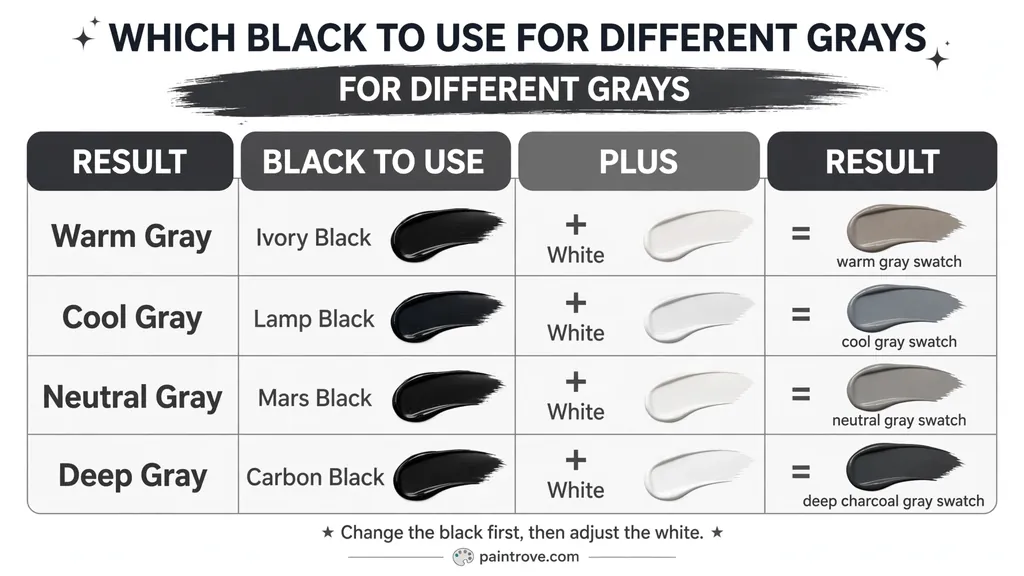
A mixture of two neutrals should be neutral. When it is not, the cause is the specific black you used, because almost no black paint is truly neutral. If you are asking what color does white and black make when the result refuses to look neutral, the answer lies entirely in the black.
| Black pigment | Undertone | Gray it produces |
|---|---|---|
| Ivory black (PBk9) | Warm, slightly brown | Often tints to a cool, slightly blue-gray |
| Lamp black (PBk6) | Cool, bluish | Distinctly cool gray |
| Mars black (PBk11) | Neutral to slightly warm | The most neutral gray, very strong |
| Carbon black (PBk7) | Cool | Crisp, slightly blue gray |
| Payne’s gray | Blue-violet | A blue-gray, not a neutral at all |
Payne’s gray catches people out regularly. It is not a black and it is not a neutral; it is a premixed blue-violet gray, usually built from ultramarine with a red or black. Mixing it with white gives a decidedly cool blue-gray, which is useful but not what most people mean by gray.
The white matters too, though less. Titanium white is opaque and powerful, giving flat, solid grays. Zinc white is translucent and weaker, giving softer grays that let whatever is underneath show through slightly.
If your gray is coming out warm or brownish, your black likely has a brown base or something else has contaminated the mix. Check your brush and water.
Why mixed black-and-white gray looks flat
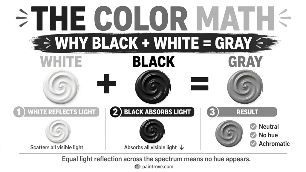
What color does black and white make is one question; whether that gray is worth using is another. This is the practical criticism painters make of black-plus-white gray, and it is worth understanding before committing it to anything large.
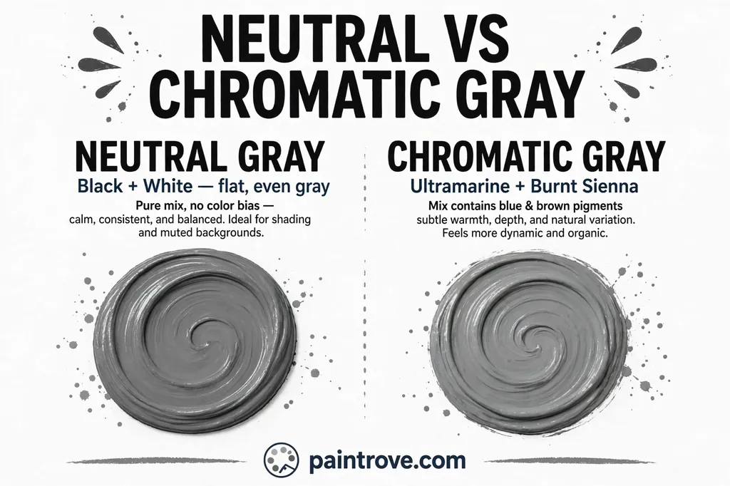
A gray made from black and white has no hue content at all. It sits dead center with nothing pulling it warm or cool. Next to saturated colors it reads as lifeless and slightly dirty, because it has no relationship to anything else on the canvas.
The alternative is a chromatic gray, mixed from two complementary colors that cancel each other out. Ultramarine blue with burnt sienna is the classic pairing. The result still reads as gray, but it retains a faint hue bias that you can steer warm or cool, and it sits far more comfortably alongside other colors. Painters almost always reach for this instead.
Where black and white gray genuinely works:
- Value studies, where hue would be a distraction
- Underpainting and grisaille, built deliberately in neutral tones
- Design and digital work, where a true neutral is often exactly what is needed
- Mixing tones, when you want to reduce another color’s saturation without shifting its hue
The last of those is worth remembering. Adding gray to a color produces a tone, as distinct from a tint (color plus white) or a shade (color plus black). A tone keeps the hue and lowers the intensity.
What does black and white make in light and on screens?
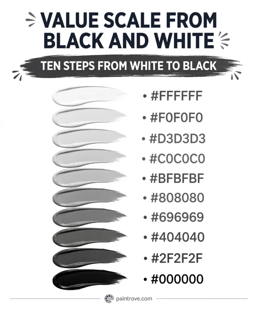
Here the answer changes completely, and most guides get it wrong.
Black and white light do not make gray. They make white.
Light is additive, which means it adds up rather than absorbing. Black is not a color of light at all; it is the absence of light. A black spotlight does not exist. Ask what does white and black make in light, and the honest answer is that you have simply shone white light, so the result is white at Hex #FFFFFF.
Gray on a screen is not a mixture of anything. It is white at reduced brightness, produced by setting the red, green and blue channels to equal values below maximum:
| Gray | Hex | RGB |
|---|---|---|
| White | #FFFFFF | 255, 255, 255 |
| Light gray | #D3D3D3 | 211, 211, 211 |
| Silver | #C0C0C0 | 192, 192, 192 |
| Gray | #808080 | 128, 128, 128 |
| Dim gray | #696969 | 105, 105, 105 |
| Dark gray | #404040 | 64, 64, 64 |
| Black | #000000 | 0, 0, 0 |
Whenever the three channels are equal, the result is achromatic. That is the digital definition of gray, and it is why Hex #808080 is the exact midpoint and the default gray keyword in CSS.
In printing, gray is produced differently again: a percentage screen of black ink, so a 50 percent screen reads as mid gray. Rich blacks and grays in CMYK often add small amounts of the color inks to deepen the result.
The difference between these systems is the difference between additive and subtractive mixing, which the University of Wisconsin–Madison Ingersoll Physics Museum demonstrates clearly.
Adjusting the gray once you have it
| Want | Add | Result |
|---|---|---|
| Lighter | White, gradually | Silver, pale gray |
| Darker | Black, in minute amounts | Charcoal |
| Warmer | A touch of yellow ochre or burnt sienna | Greige, warm gray |
| Cooler | A touch of ultramarine | Slate, blue-gray |
| Greener | A trace of yellow ochre plus black | Davy’s gray, olive-gray |
| Softer and less clinical | Rebuild it from complements instead | Chromatic gray |
Warm and cool grays are worth knowing because they behave very differently in use. A warm gray sits comfortably with wood, cream and skin tones. A cool gray sits with white, steel and blue. A true neutral gray sits with neither particularly well, which is why interior palettes almost never use one.
The same tinting logic applies to every color, not just neutrals. Adding white to a hue produces a tint, which is why green and white make a pastel green and purple and white make lavender. Adding black produces a shade, which is why green and black make dark forest green. Black and white mixed with each other is the one case where neither a tint nor a shade of any hue results, because there is no hue to begin with.
Mixing gray in other mediums
Acrylic dries noticeably darker, so mix one step lighter than your target and confirm with a dried swatch.
Watercolor dries lighter, and most watercolorists never use white at all. Gray comes from diluting a black with water and letting the paper provide the lightness.
Oil gives the most control, since the long working time lets you adjust a value gradually.
Food coloring and icing reach gray through black gel, added in very small amounts to white frosting. Gel blacks are extremely strong and deepen as they rest, so mix lighter than your target and let it stand for about half an hour before judging.
Wall paint should always be tested on the wall. Gray is the most light-sensitive color in interiors by a wide margin, and a gray that reads neutral in the store can read blue, green or purple at home depending on the light and the surrounding surfaces.
Frequently asked questions
What does black and white make when mixed?
Gray. In paint, ink, dye and every other pigment-based medium, the two combine into a neutral achromatic gray. Equal parts gives a mid gray near Hex #808080, more white gives light gray or silver, and more black gives charcoal. No hue appears at any proportion.
What color does black and white make in paint?
A neutral gray, with the exact value set by the ratio. Because black pigments are far stronger than white, start from a pool of white and introduce black in tiny amounts. A brushtip of black will visibly shift a large quantity of white, and overshooting is the usual mistake.
Black and white makes what color at equal parts?
In theory a mid gray near Hex #808080. In practice a literal equal-parts mix comes out noticeably darker, because black has much higher tinting strength than white. To land on a true middle gray you will need considerably less black than white, so treat 1:1 as a target value rather than a measurement.
Black and white make what color in every ratio?
Gray, always. Only the lightness changes across the range, running from near-white through silver and mid gray down to charcoal. There is no proportion at which a hue appears, because neither ingredient contains one.
What color does white and black make?
The same as black and white: gray. Mixing order does not change the result, only your control over it. Adding black into white is far easier to manage, since black’s greater tinting strength means a very small amount does the work.
What does white and black make in light?
White. Light is additive, and black is the absence of light rather than a color of light, so it contributes nothing at all. Gray on a screen is not a mixture; it is white at reduced brightness, produced by setting red, green and blue to equal values below maximum.
Why does my black and white mix look blue?
Your black has a cool undertone. Lamp black and carbon black both lean bluish, and ivory black frequently tints toward a cool gray as well. Mars black is the most neutral option. Payne’s gray is not a black at all and will always give a blue-gray.
What is the ratio of black to white for gray?
Start with white and add black in very small amounts. For a light gray near Hex #D3D3D3, expect roughly one part black to ten parts white as a starting point. For charcoal, build up gradually rather than starting dark, since recovering from too much black takes a great deal of white.
Is gray a color?
Gray is an achromatic color, meaning it has lightness but no hue. In everyday use it is called a color; in color theory it is grouped with black and white as a neutral rather than placed on the color wheel, because the wheel organises hues and gray has none.
Why do painters avoid black and white gray?
Because it has no hue content, so it reads flat and slightly dead beside saturated colors. Most painters mix chromatic grays from complementary pairs such as ultramarine and burnt sienna instead, which stay neutral while keeping a faint warm or cool bias that sits better in a painting.
How do you make gray without black paint?
Mix two complementary colors until they neutralize, then add white to reach the value you want. Ultramarine with burnt sienna is the standard pairing, though red with green or yellow with purple also work. The result is a chromatic gray, which looks livelier than a black-and-white mix.
How do you make a warm or cool gray?
Add a small amount of yellow ochre or burnt sienna for a warm gray, or ultramarine for a cool one. Keep the addition tiny; the aim is a bias rather than a visible hue. Warm grays pair with wood and cream, cool grays with white and steel.
Black and white at a glance
| If you want | Do this |
|---|---|
| Any gray | Start with white, add black in tiny amounts |
| Light gray or silver | A great deal of white, a trace of black |
| Mid gray near #808080 | Less black than you expect, tested as you go |
| Charcoal | Build up black gradually rather than starting dark |
| A gray that is not flat | Mix complements instead of black and white |
| A warm or cool gray | Add a trace of ochre or ultramarine |
| Gray on a screen | Equal red, green and blue values below 255 |
Black and white makes what color the value scale allows and nothing more: gray, from near-white to charcoal. However the question is phrased, black and white make what color has no hue in it, because neither ingredient carries one. Three things are worth remembering: add black into white rather than the reverse, check what your black actually is before blaming the mix for a color cast, and use a chromatic gray instead when the flatness of a true neutral is working against you.