What Color Do Pink and Blue Make When Mixed?
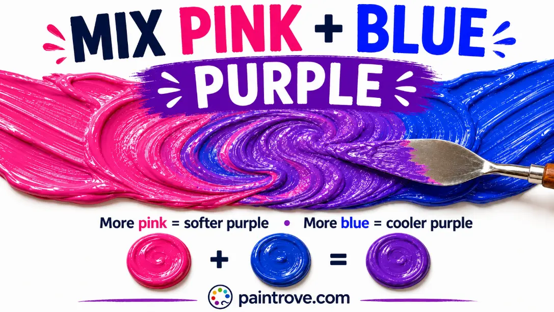
What Color Do Pink and Blue Make? Mix pink and blue together and you get light purple. Depending on the exact pink, the exact blue, and the ratio, that light purple shows up as lavender (hex #E6E6FA), lilac (hex #C8A2C8), or periwinkle (hex #CCCCFF). Every result lands somewhere in the soft, pastel corner of the purple family.
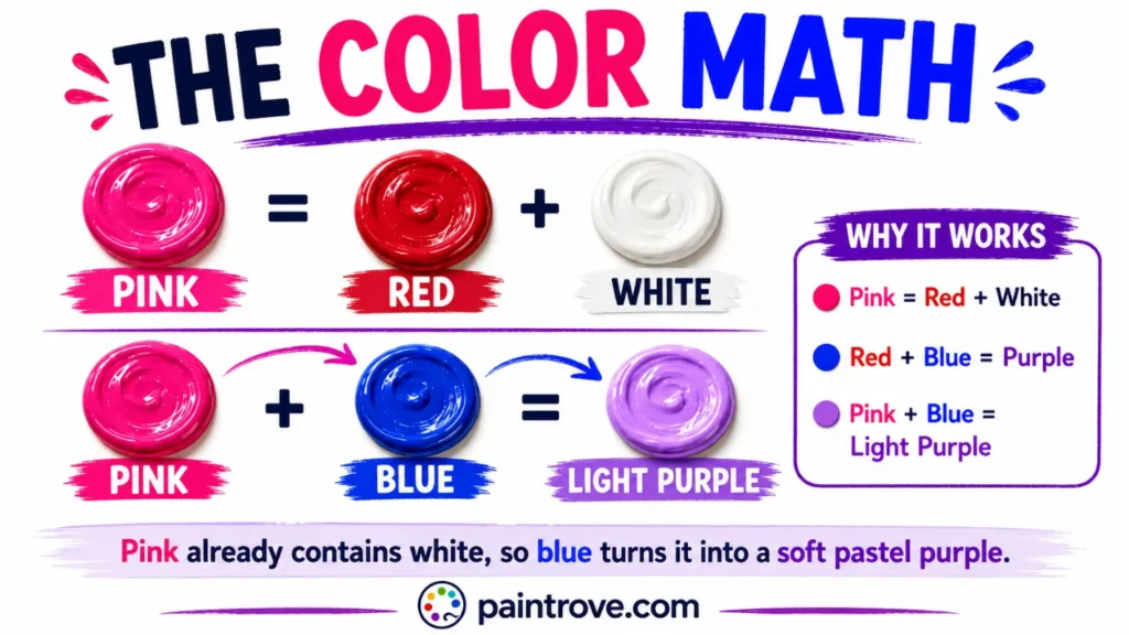
The reason is simple color math. Pink is just red lightened with white. So when you mix pink with blue, you are really mixing red plus blue plus white, and since red and blue make purple, the white lightens that purple into pastel territory. Pink and blue mixed is essentially the shortcut recipe for lavender.
This guide covers the full picture: why the math works, the exact ratios and hex codes for every pastel purple shade, which pinks and blues to choose, what happens in light instead of paint, and how designers use this famously loved pairing.
The Color Math: Why Pink and Blue Make Light Purple
Start with what each parent actually is.
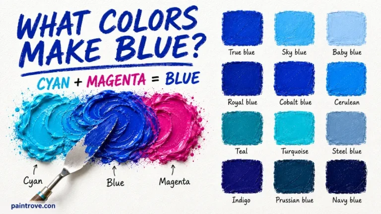
Blue is a primary color, one of the three foundation colors of the color wheel that cannot be mixed from anything else.
Pink is not a primary, a secondary, or even really its own hue. Pink is a tint of red: red paint lightened with white, as covered in our guide to what colors make pink. The specific recipe, red plus white, has its own page too: what red and white make.
Now stack the equations:
- Red + Blue = Purple (the classic secondary mix, explained in what red and blue make)
- Red + White = Pink
- Therefore: Pink + Blue = (Red + White) + Blue = Purple + White = Light Purple
The white that was hiding inside the pink comes along for the ride and lightens the purple automatically. That is the entire trick, and it is why pink and blue can never make a deep, saturated purple. The white is baked in from the start. If you want royal purple or violet, you need pure red and blue; if you want lavender in one step, pink and blue is the fastest road there.
Lavender, Lilac, Periwinkle, Mauve: Which One Will You Get?
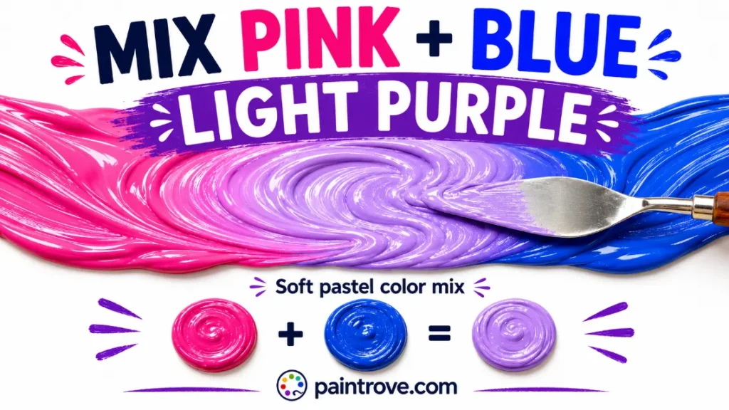
All the results of pink and blue mixed live in the pastel purple family, but they are not identical. The ratio and the undertones decide which name your mix earns:
| Color | Hex code | Character | How the mix gets there |
|---|---|---|---|
| Light purple | Hex #B19CD9 | The balanced default | Equal pink and blue |
| Lavender | Hex #E6E6FA | Very pale, cool, airy | Equal mix, generous white content |
| Lilac | Hex #C8A2C8 | Pinker, warmer pastel | Pink-heavy mix |
| Periwinkle | Hex #CCCCFF | Blue-leaning pastel | Blue-heavy mix |
| Mauve | Hex #E0B0FF | Dusty, slightly muted | Equal mix plus a touch of gray |
| Orchid | Hex #DA70D6 | Brighter, pink-forward | Hot pink plus a little blue |
| Thistle | Hex #D8BFD8 | Soft grayish pastel | Pale pink plus pale blue |
| Wisteria | Hex #C9A0DC | Mid pastel purple | Slightly pink-heavy mix |
The two names people confuse most:
Lavender vs lilac. Both are named after flowers, and both are pale purples, but lavender leans blue and cool while lilac leans pink and warm. If your mix feels slightly chilly, it is lavender. If it feels sweet, it is lilac.
Periwinkle barely counts as purple at all. It sits on the border between purple and blue, and a blue-heavy pink-blue mix lands on it naturally.
Mixing Ratios: From Cool Pink to Periwinkle
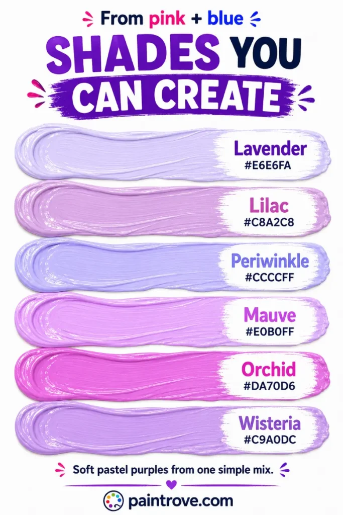
Here is the working ratio chart, with hex targets in plain text:
| Ratio (Pink : Blue) | Resulting shade | Hex code |
|---|---|---|
| 3 : 1 | Cool pink with a purple cast | Hex #E8A0D8 |
| 2 : 1 | Lilac | Hex #C8A2C8 |
| 1 : 1 | Light purple | Hex #B19CD9 |
| 1 : 2 | Periwinkle-leaning purple | Hex #9683EC |
| 1 : 3 | Periwinkle | Hex #CCCCFF territory |
| 1 : 1 plus extra white | Lavender | Hex #E6E6FA |
| 1 : 1 plus a touch of gray | Mauve | Hex #E0B0FF |
| 1 : 1 plus a touch of black | Dusty grape | Hex #6F5A7E |
Practical notes:
- Blue is far stronger than pink. Add blue to pink in small steps, not the other way around, or the mix will race past lavender into blue-purple before you can stop it.
- Judge the color against white paper. Pastels shift dramatically depending on the background behind them.
- If the mix feels too intense, more white pulls it toward lavender. If it feels chalky, a touch more pink restores life.
Which Pink and Which Blue to Use
Undertones decide whether your pastel purple comes out clean or dusty:
| Goal | Pink to use | Blue to use | Result |
|---|---|---|---|
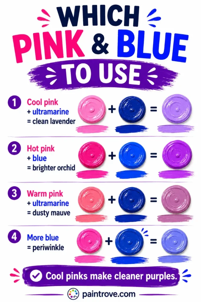
| Clean lavender | Cool pink (rose, from magenta) | Ultramarine or cerulean | Fresh, clear pastel purple |
| Bright orchid | Hot pink / magenta pink | Ultramarine | Vivid pinkish purple |
| Soft periwinkle | Pale cool pink | Cerulean plus white | Airy blue-purple |
| Dusty mauve | Warm salmon-leaning pink | Ultramarine | Muted, grayed pastel |
The logic follows the same bias rules as every purple mix. Cool pinks descend from magenta and carry a hint of blue, so they merge into purple cleanly. Warm pinks, salmon and coral types, descend from orange-leaning reds and carry a trace of yellow. Yellow is purple’s complement, so a warm pink mutes the mix into dusty mauve. Sometimes dusty is the goal; when it is not, choose the coolest pink on the shelf.
On the blue side, ultramarine’s violet lean makes it the natural partner for purples of every kind, while a green-leaning blue like phthalo can drag the mix toward a grayish tone.
Adjusting Your Pastel Purple
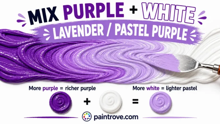
Lighter. More white takes any pink-blue mix toward lavender and eventually the faintest lilac-white. Because the mix already contains white, it lightens gracefully without chalking as fast as a pure purple would. The same principle powers purple and white mixed, which reaches identical territory from the opposite direction: full purple lightened after the fact.
Darker. A touch of black turns pastel purple into dusty grape and heather tones. Go extremely gently, since black overwhelms pastels almost instantly, as shown in our guide to purple and black mixed. A safer route to depth: add a little more blue, which deepens the mix while keeping it alive, sliding it toward the blue-violet territory of blue and purple mixed.
Brighter and pinker. More pink, or a switch to hot pink, pushes toward orchid and fuchsia-adjacent shades, the zone covered in pink and purple mixed.
More muted. A whisper of gray creates mauve, thistle, and the dusty heathers beloved by knitwear designers everywhere.
Pink and Blue in Light: A Different Answer
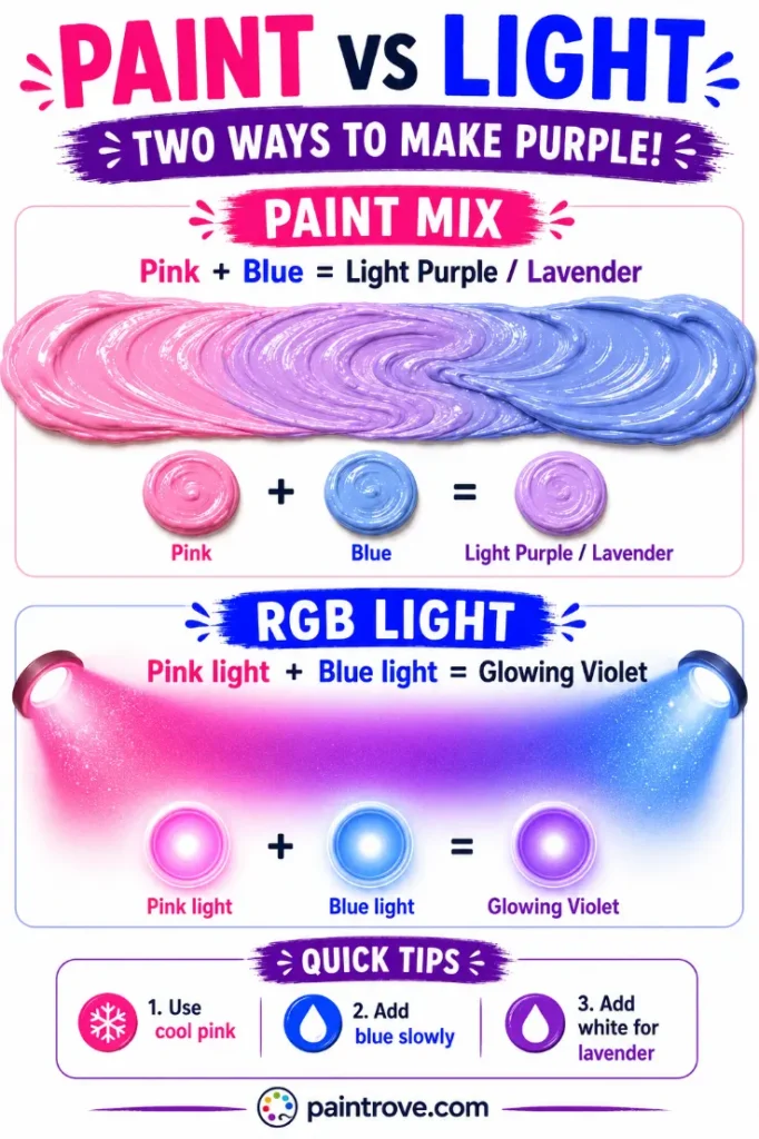
Everything above describes paint and pigment. Mix pink and blue as light and the outcome shifts, because screens use the RGB model, where colors add together and brighten.
Pink light is essentially white light tinted red, meaning it already contains a full spread of red, green, and blue wavelengths with red boosted. Add blue light to it and the result is a pale, glowing violet-pink, brighter than either source. On a screen, blending a standard pink (hex #FFC0CB) with a standard blue (hex #0000FF) averages out near a soft violet, around hex #8060E5, noticeably more luminous than the paint result.
| System | Type | Pink + Blue makes | Character |
|---|---|---|---|
| RYB (paint) | Subtractive | Light purple / lavender | Softer, matte pastel |
| RGB (light and screens) | Additive | Pale glowing violet | Brighter, luminous |
The pink-blue gradient itself became one of the defining looks of digital design in the 2010s, the vaporwave and synthwave palette of pink fading into blue through purple. That gradient is literally this article rendered as light: every pixel between the pink end and the blue end is a pink-blue mix.
Troubleshooting Pink and Blue Mixes
The mix looks gray or muddy. Your pink is warm. Salmon, coral, and peachy pinks carry yellow, which neutralizes purple. Switch to a cool, magenta-based pink.
The mix went straight to blue-purple and skipped lavender. Too much blue, too fast. Blue dominates pastels; rebuild starting from pink and add blue by the brush-tip.
The mix looks chalky and lifeless. Too much total white for the pigment present. Add a small amount of both parents, keeping the ratio, to restore saturation.
You wanted deep purple and got pastel. That is the ceiling of this recipe. The white inside pink caps the depth. For rich purples, mix from pure red and blue instead, or start with a purple pigment and adjust.
It dries duller than it looked. Standard pastel behavior, especially in acrylics, where colors dry slightly darker and flatter. Mix one step brighter than the target.
Mixing Pink and Blue in Different Mediums
The recipe holds across mediums, but the behavior changes.
Acrylics and oils mix physically on the palette and give you the most control. Acrylic pastels dry slightly darker and flatter than they look wet, so mix a step brighter. In oils, the slow drying time lets you adjust a lavender on the canvas itself.
Watercolor is where this mix shines most. Instead of premixing, lay down a pink wash and a blue wash and let them bleed into each other on wet paper. The lavender forms in the overlap with a softness no palette mix can match, which is exactly how painters build dawn skies.
Food coloring and icing follow the same math, but gel colors are concentrated, so one drop of blue can overpower a whole bowl of pink frosting. Add blue with a toothpick tip.
Digital tools average the two values, so pink hex #FFC0CB blended evenly with blue hex #0000FF lands near hex #8060E5. Lower the blue’s brightness first if you want a result closer to paint lavender.
Pink and Blue in Art, Fashion, and Design
Few color pairings carry as much cultural loading as pink and blue, and few mixes produce shades as consistently loved as lavender and lilac.
In Art
Pastel purples earned their fine-art credentials with the Impressionists, who scandalized critics by painting shadows in violet and lavender instead of gray and brown. Monet’s haystacks and cathedrals glow with exactly the shades a pink-blue mix produces. In watercolor, the pink-blue blend is a staple of sky work: dawn and dusk skies are, in pigment terms, washes of pink and blue allowed to meet on wet paper, mixing into lavender exactly where they touch.
In Fashion
Lavender and lilac cycle back into fashion relentlessly, reading as fresh, gentle, and slightly nostalgic. Digital lavender was named a defining color of 2023, and the pastel purple family has anchored spring collections ever since. Periwinkle, the blue-leaning cousin, had its own Pantone moment with Very Peri in 2022. The pink-plus-blue pairing worn together, unmixed, also carries its own history as the classic gender-color duo, a convention barely a century old that designers now play with and subvert deliberately.
In Interiors and Branding
Lavender walls read calmer than pink and warmer than blue, which makes pastel purple a favorite for bedrooms and nurseries. Paired with sage green or warm gray, lilac feels current rather than sugary. In branding, soft purples signal creativity with gentleness, and the pink-to-blue gradient specifically became shorthand for approachable tech, wellness apps, and anything aimed at feeling modern and friendly at the same time.
Quick Reference: Pink + Blue Cheat Sheet
| Question | Answer |
|---|---|
| Pink + blue in paint | Light purple / lavender (hex #B19CD9) |
| Why it comes out light | Pink carries white inside it |
| Pink-heavy mix | Lilac (hex #C8A2C8) |
| Blue-heavy mix | Periwinkle (hex #CCCCFF) |
| Plus extra white | Lavender (hex #E6E6FA) |
| Plus gray | Mauve (hex #E0B0FF) |
| Plus black | Dusty grape |
| Best parents | Cool magenta-based pink + ultramarine |
| Why it goes gray | Warm pink carrying yellow |
| For deep purple instead | Use pure red + blue |
FAQ
What color do pink and blue make when mixed?
Light purple. Because pink is red lightened with white, mixing it with blue produces purple that is pre-lightened, landing on lavender, lilac, or periwinkle depending on the ratio.
Do pink and blue make lavender?
Yes. A roughly equal mix of a cool pink and blue, especially with a little extra white, lands on lavender at around hex #E6E6FA. It is the most direct paint recipe for the color.
Do pink and blue make purple?
They make a light version of purple. The white content inside pink prevents the mix from ever reaching a deep, saturated purple. For rich royal purples, mix pure red with blue instead.
What do hot pink and blue make?
Orchid and vivid violet shades. Hot pink carries less white and more magenta than pastel pink, so the mix keeps more intensity, landing near hex #DA70D6 and deeper.
Why did my pink and blue make gray?
Your pink is warm. Coral, salmon, and peach pinks carry yellow, which is purple’s complement and neutralizes the mix. Use a cool, magenta-based pink for clean pastels.
Is lavender more pink or more blue?
Slightly more blue. Lavender sits on the cool side of the pastel purple family, while lilac is its warmer, pinker counterpart. A balanced pink-blue mix can be steered to either with a small addition of one parent.
What colors make periwinkle?
A blue-heavy pink and blue mix, or more precisely blue plus violet plus white. Periwinkle sits on the border of blue and purple, so any pastel purple mix pushed toward blue arrives there.
Pink and blue mixed give you the pastel purple family in a single step: lavender, lilac, periwinkle, and mauve, with the white already built in. It is the gentlest mix on the color wheel, and one of the most useful.
For the deeper end of this family, see our full guide to what colors make purple, or explore the parent recipes at what colors make pink and what colors make blue.