What Color Do Orange and Green Make When Mixed? (Olive Brown)
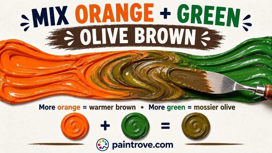
What Color Do Orange and Green Make? Mix orange and green together and you get a light olive brown. A balanced mix lands around hex #8B8B29, a warm, yellowish brown with olive character. Leaning the mix toward orange gives a warmer, redder brown, while leaning toward green gives a cooler, mossier olive. Because both colors are built partly from yellow, this brown comes out lighter and more golden than most other brown mixes.
That yellow connection is the whole story here, and it is what makes orange and green different from the other brown recipes. Unlike the sharp complementary clash of blue and orange or red and green, orange and green are near neighbors that share a parent color, so their mix is a gentler, warmer, more olive-leaning brown rather than a deep neutral. T
his guide covers exactly why, the ratios and hex codes for every shade, which pigments to use, and how to steer the result from bright golden brown to muted moss.
Why Orange and Green Make Olive Brown
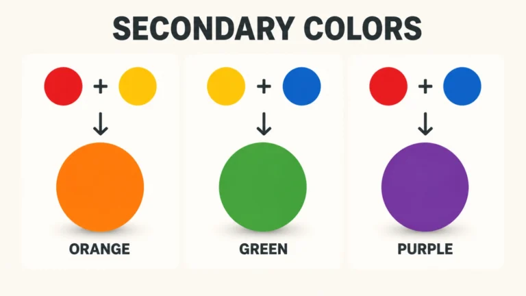
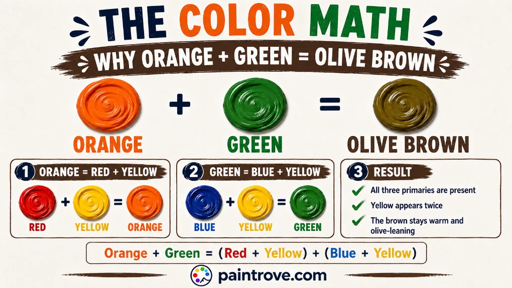
Both orange and green are secondary colors, and here is the key: they share a common parent.
- Orange is made from red and yellow, as covered in what colors make orange.
- Green is made from blue and yellow, as covered in what colors make green.
Mix them and you combine all three primaries, which always makes brown, the basis of how to make brown:
Orange + Green = (Red + Yellow) + (Blue + Yellow) = Red + Yellow + Yellow + Blue
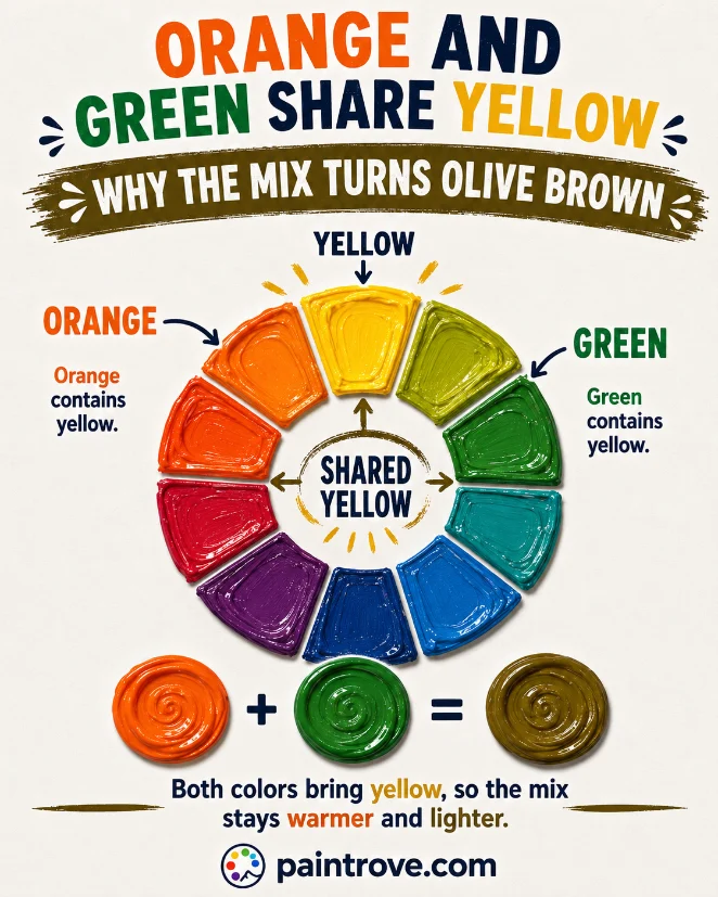
Notice the double dose of yellow. Both parents bring yellow to the mix, so yellow ends up dominant. That extra yellow is exactly why orange and green do not make a dark, neutral brown but a lighter, warmer, olive-toned one. Olive itself is really a dark, muted yellow, so this mix lands naturally in olive territory.
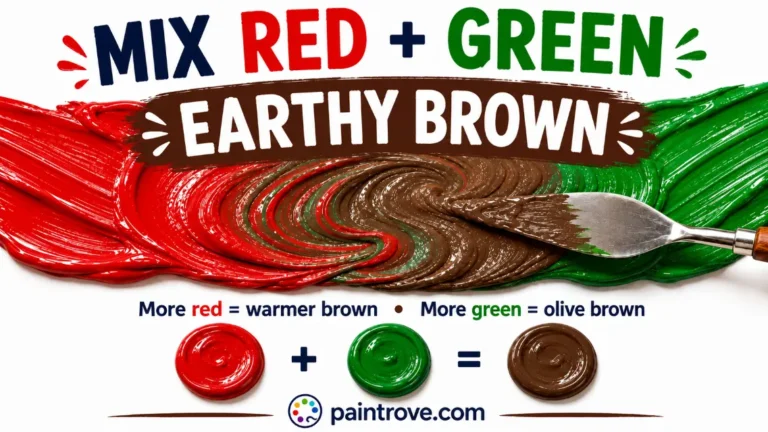
It also explains why the mix stays fairly bright compared to complementary browns. Orange and green sit only two steps apart on the color wheel, not opposite each other, so they neutralize each other less completely. The result keeps more life and color than a true complementary mix like blue and orange or red and green, both of which produce deeper, more neutral browns.
Orange and Green Mixing Ratios and Hex Codes
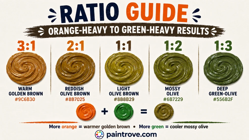
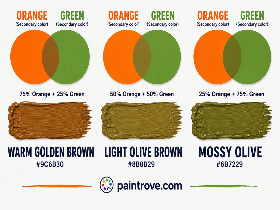
The ratio decides how warm or how mossy your olive brown turns out. Here is the working chart with hex targets in plain text:
| Ratio (Orange : Green) | Resulting shade | Hex code |
|---|---|---|
| 3 : 1 | Warm golden brown | Hex #9C6B30 |
| 2 : 1 | Reddish olive brown | Hex #8B7025 |
| 1 : 1 | Light olive brown | Hex #8B8B29 |
| 1 : 2 | Mossy olive | Hex #6B7229 |
| 1 : 3 | Deep green-olive | Hex #556B2F |
| 1 : 1 plus white | Soft sage-beige | Hex #B5B08A |
| 1 : 1 plus black | Dark olive drab | Hex #4A4A1E |
| 2 : 1 with muted pigments | Grayed khaki | Hex #8A8560 |
Practical notes:
- Start with orange and add green gradually. Green pigments are often stronger, so a little green shifts the mix quickly toward olive.
- Mix thoroughly before judging. A half-mixed blend looks streaky and darker than the finished color.
- Test on white paper and let it dry. Olive browns are hard to read in a pile, and acrylics dry slightly darker.
How Pigment Choice Changes the Result
The shades of orange and green you start with steer the character of the olive brown:
| Orange used | Green used | Resulting brown |
|---|---|---|
| Cadmium orange (warm) | Sap green (warm) | Bright, rich warm brown |
| Cadmium orange | Phthalo green (cool) | Balanced golden olive |
| Burnt orange | Sap green | Deep earthy olive brown |
| Naples orange (muted) | Muted green | Soft grayed khaki |
| Yellow-orange | Yellow-green | Very light, golden olive |
The pattern: two bright, warm pigments give a lively, rich brown, while two muted or cool pigments give a soft, grayed khaki. If you want a golden olive that still has life, reach for cadmium orange with a clean green. If you want a quiet, earthy khaki, start with muted versions of both. As homemade and studio guides both note, the difference between a bright brown and a dull gray from this mix comes down almost entirely to whether your starting colors are bright or muted.
Every Shade You Can Make from Orange and Green
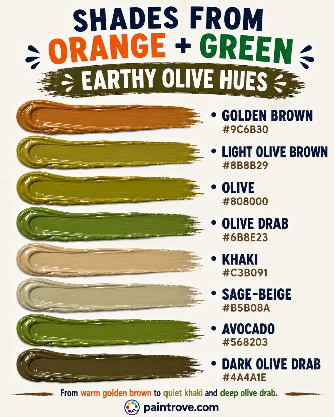
Between ratio, pigment choice, and additions of white or black, orange and green cover a warm, earthy band of the brown family. The reference table:
| Shade | Hex code | How to mix it |
|---|---|---|
| Light olive brown | Hex #8B8B29 | Equal parts orange and green |
| Golden brown | Hex #9C6B30 | Orange-heavy mix |
| Ochre-brown | Hex #A67B32 | Orange-heavy, yellow-leaning |
| Olive | Hex #808000 | Balanced mix, yellow-dominant |
| Olive drab | Hex #6B8E23 | Green-heavy mix |
| Dark olive drab | Hex #4A4A1E | Green-heavy mix plus black |
| Moss green | Hex #8A9A5B | Green-heavy mix plus a little gray |
| Khaki | Hex #C3B091 | Balanced mix plus white |
| Sage-beige | Hex #B5B08A | Balanced mix plus generous white |
| Avocado | Hex #568203 | Green-heavy mix, small orange |
| Fawn | Hex #C9A66B | Orange-heavy mix plus white |
| Drab brown | Hex #7C6E3A | Muted pigments, balanced |
Lighter Versions (Tints)
Add white to move the mix into sage-beige, khaki, and fawn, the soft earthy neutrals of natural interiors and utility fashion. Because the mix is already warm and yellow-rich, these tints stay soft and inviting rather than chalky. The full lightening route is covered in brown and white mixed, and the green-white side in green and white mixed.
Darker Versions (Shades)
A touch of black deepens the mix into dark olive drab and military greens. Because olive already contains that darkened-yellow quality, black works better here than on brighter colors, though it still flattens if overused. A livelier route is to add more green plus a whisper of red, its complement, for a natural deep olive.
Adjusting the Mix
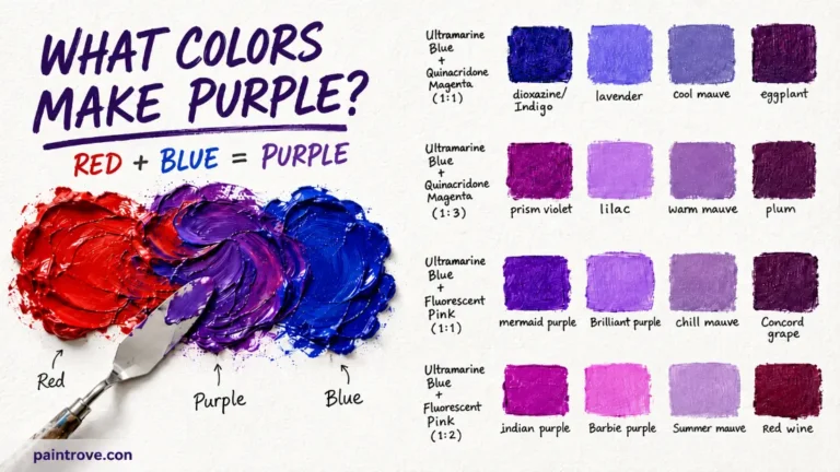
Push toward orange for the golden and ochre browns near brown and yellow mixed. Push toward green for the mossy tones near green and gray mixed. Add purple, and you move toward the murkier browns of green and purple mixed and orange and purple mixed.
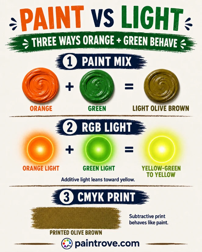
Orange and Green in Light
Everything above describes paint. In light, using the RGB model, the answer changes and becomes genuinely interesting.
In the additive system, yellow light is made from red and green, and orange is essentially red with some green. Green is a primary of light. So adding green light to orange light increases the green until red and green are roughly balanced again, and balanced red and green light make yellow. Orange and green light lean back toward yellow, not brown.
| System | Type | Orange + Green makes | Result |
|---|---|---|---|
| RYB (paint) | Subtractive | Light olive brown | Hex #8B8B29 |
| RGB (light and screens) | Additive | Yellow-green to yellow | Bright, warm |
| CMYK (printing) | Subtractive | Olive brown | Varies |
Printing, covered in our guide to the CMYK color model, behaves like paint since it is subtractive, producing olive browns from combined inks.
Troubleshooting Orange and Green Mixes
The mix came out gray, not olive brown. Your pigments were muted or cool, so they neutralized more than expected. Add a warmer orange or a brighter green to bring the golden olive back.
The mix is too green. Green usually dominates. Add more orange than feels necessary to reach a true olive brown.
The mix is dull and lifeless. Muted or student-grade pigments gray out. Use bright cadmium orange and a clean green for a lively result.
The olive looks too yellow. Expected, given the double yellow, but you can cool it with a touch more green or a whisper of blue.
It dried duller. Standard acrylic behavior. Mix a step brighter and lighter than your target.
Mixing Orange and Green in Different Mediums
The olive brown holds across mediums, but each behaves a little differently.
Acrylics mix cleanly and are forgiving, though they dry darker, so an olive that looks golden wet can dry closer to drab. Mix a shade lighter and warmer than your target.
Oils give the most control, and their slow drying lets you fine-tune the balance between the warm orange and the cooler green until the olive sits exactly where you want it. Classical earth-tone palettes lean heavily on mixes like this.
Watercolor produces the most luminous olives, letting orange and green meet on wet paper. Because the mix is yellow-rich, watercolor olives glow in a way that suits sunlit foliage, though overmixing on the palette turns them flat, so many painters layer the two as glazes instead.
Gouache and digital both stay predictable: gouache gives flat, even olive tones ideal for illustration, while digital blending lets you dial the exact orange-to-green ratio and undo any overshoot, making a precise khaki or olive far easier to hit than with wet paint.
Whichever medium you use, the guiding principle is the same as in red and green mixed: steer the warmth through pigment choice and ratio rather than hoping the tubes behave.
Olive and Earthy Browns in Art, Fashion, and Design
The olive browns from orange and green are among the most useful earth tones in any palette, quiet, natural, and endlessly versatile.
In Art
Olive and earthy browns are essential for landscape and nature painting: dried grass, autumn foliage, camouflage of the natural world, the muted greens of distant hills. Because the mix leans warm and yellow, it captures sunlit vegetation far better than a tube green, which often looks artificial. Painters also use these muted olive tones to calm and ground a composition, letting brighter colors sing against them. Mixing them from orange and green rather than reaching for a tube gives precise control over exactly how warm or cool the olive sits.
In Fashion
Olive and khaki are among fashion’s most enduring colors, the backbone of military-inspired and utility styles that never fully leave. Olive green flatters a wide range of skin tones and pairs effortlessly with tan, cream, black, and burnt orange. The warmer golden browns from this mix, fawn and ochre, are staples of autumn wardrobes. Together, olive and its earthy relatives form the core of the quiet, natural palettes that dominate outdoor and heritage fashion.
In Interiors and Branding
Olive and sage browns bring the calm of nature indoors, working beautifully with wood, linen, and warm metals in organic interior schemes. These muted earth tones read as grounded and timeless rather than trendy. In branding, olive and earthy browns signal nature, sustainability, craft, and authenticity, which is why they appear across organic food, outdoor, and artisanal identities that want to feel natural and dependable.
Quick Reference: Orange + Green Cheat Sheet
| Question | Answer |
|---|---|
| Orange + green in paint | Light olive brown (hex #8B8B29) |
| Orange + green in light | Yellow-green to yellow |
| Why olive | Both share yellow, so yellow dominates |
| More orange | Golden brown, ochre |
| More green | Mossy olive, olive drab |
| Bright pigments | Rich, lively brown |
| Muted pigments | Soft grayed khaki |
| Plus white | Sage-beige, khaki, fawn |
| Plus black | Dark olive drab |
| Fix a gray mix | Use a warmer orange or brighter green |
FAQs
What color do orange and green make when mixed?
A light olive brown. Because both orange and green contain yellow, the mix ends up yellow-dominant, producing a warmer, lighter brown with olive character rather than a dark neutral brown.
Why is orange and green brown lighter than other browns?
Both parents share yellow, so the mix carries a double dose of it. Yellow is a light, warm color, which keeps the resulting brown lighter and more golden than complementary browns like blue and orange, where no single primary dominates.
Do orange and green make olive green?
Yes, effectively. A green-heavy mix lands on olive at around hex #808000, and a balanced mix gives a light olive brown. Olive is really a darkened, muted yellow, which is exactly what the yellow-rich orange-green mix produces.
Why did my orange and green mix turn gray?
Your pigments were muted or cool, neutralizing each other more than expected. Bright, warm pigments give a lively olive brown, while dull ones give gray. Switch to cadmium orange and a clean green.
How do you make khaki from orange and green?
Mix orange and green to a light olive brown, then add white until you reach a soft, muted khaki around hex #C3B091. Starting with slightly muted pigments helps the khaki read natural.
Are orange and green a good combination?
Side by side, they are a playful, natural pairing that reads as fresh and earthy, common in nature-themed and retro design. Mixed, they produce the versatile olive browns that underpin so many natural palettes.
Do orange and green make yellow?
In light, they lean back toward yellow, because adding green light to orange rebalances red and green, which make yellow. In paint, they make olive brown, since pigments subtract light rather than adding it.
Orange and green make a light olive brown, warmer and more golden than any complementary brown thanks to their shared yellow. Control the warmth through your pigments and ratio, and the whole earthy range from golden fawn to dark olive drab is yours.
For the full neutral system, see how to make brown, explore the parent colors at what colors make orange and what colors make green, or step back to the color wheel.