What Color Do Red and Blue Make When Mixed? (Purple)
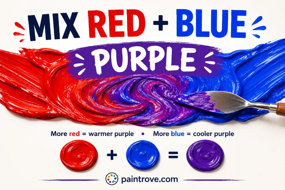
What Color Do Red and Blue Make? Mix red and blue paint, and you get purple. Equal parts of each give you a balanced, true purple with the hex code #800080. Add more red, and the mix shifts toward magenta and warm reddish purples. Add more blue, and it cools down into violet and blue-purple territory.
That is the short answer, and if you stopped reading here, you would be right most of the time. But if you have ever actually mixed red and blue paint and ended up with a dull, brownish sludge instead of the rich purple you pictured, you already know the short answer is not the whole story.
The purple you get depends on three things: which red you use, which blue you use, and whether you are mixing paint or light. This guide covers all three, with exact pigment recommendations, mixing ratios, hex codes for every major purple shade, and fixes for the most common mixing problems.
Why Red and Blue Make Purple
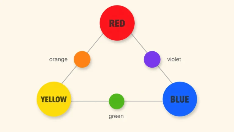
Red and blue are two of the three primary colors in the traditional RYB model, the red, yellow, and blue system painters have used for centuries. Primary colors cannot be created by mixing other colors, but combining any two of them produces a secondary color:
- Red + Blue = Purple
- Red + Yellow = Orange
- Blue + Yellow = Green
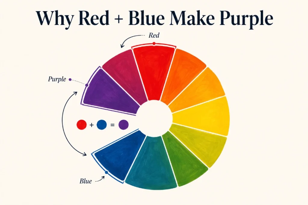
On the color wheel, purple sits directly between red and blue, which is exactly where you would expect the child of those two parents to live. It inherits qualities from both sides: the warmth and energy of red, the calm and depth of blue. That split personality is why purple can feel bold in one room and soothing in another.
If you want to understand why paint mixing follows these rules in the first place, our guide to the RYB color model explains the science behind it. And for the full picture of purple beyond just red and blue, including shades you cannot get from those two colors alone, see our complete guide on what colors make purple.
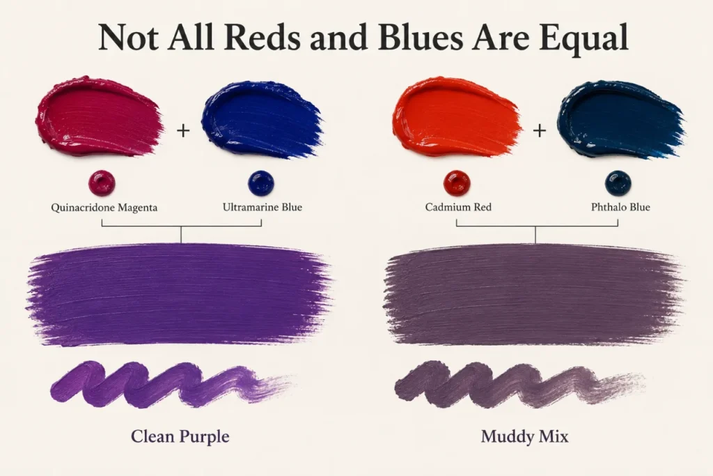
The Catch: Not All Reds and Blues Are Equal
Here is where most beginners get tripped up. You grab a tube labeled “red,” a tube labeled “blue,” mix them, and get something closer to mud than royalty. The paint did not lie to you. The labels just do not tell the whole truth.
Almost every red and blue paint on the shelf carries a color bias, meaning it leans slightly toward another color on the wheel:
- Warm reds (cadmium red, scarlet, vermilion) lean toward orange, which means they contain a touch of yellow.
- Cool reds (alizarin crimson, quinacridone magenta, permanent rose) lean toward purple, so they contain a hint of blue.
- Warm blues (ultramarine) lean toward purple and carry a trace of red.
- Cool blues (phthalo blue, cerulean) lean toward green and carry a trace of yellow.
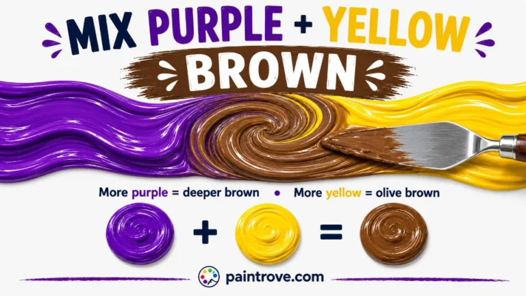
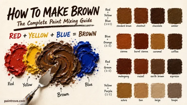
Why does this matter so much? Because yellow is the complementary color of purple. Complementary colors sit opposite each other on the wheel, and when mixed, they neutralize each other into gray or brown. So if either your red or your blue is smuggling yellow into the mix, that hidden yellow starts canceling out your purple before it even forms. In fact, mixing purple and yellow directly is one of the classic recipes for muddy brown.
This is the single most common reason a red and blue mix turns out muddy. It is not your technique. It is your tubes.
The Best Red and Blue Pigments for Clean Purple
| Goal | Red to use | Blue to use | Result |
|---|---|---|---|
| Bright, vivid purple | Quinacridone magenta | Ultramarine blue | Clean, saturated purple |
| Rich royal purple | Permanent rose | Ultramarine blue | Deep, warm-leaning purple |
| Soft lilac-leaning purple | Permanent rose | Cerulean blue | Lighter, airier purple |
| Deep moody violet | Alizarin crimson | Ultramarine blue | Dark, slightly muted violet |
| Muted plum or mauve | Cadmium red | Ultramarine blue | Earthy, dusty purple |
The golden rule: pair a purple-biased red with a purple-biased blue for the cleanest result. Quinacridone magenta plus ultramarine is the combination most professional painters reach for when they want purple that actually looks purple.
Mixing Ratios: How the Red-to-Blue Balance Changes the Shade
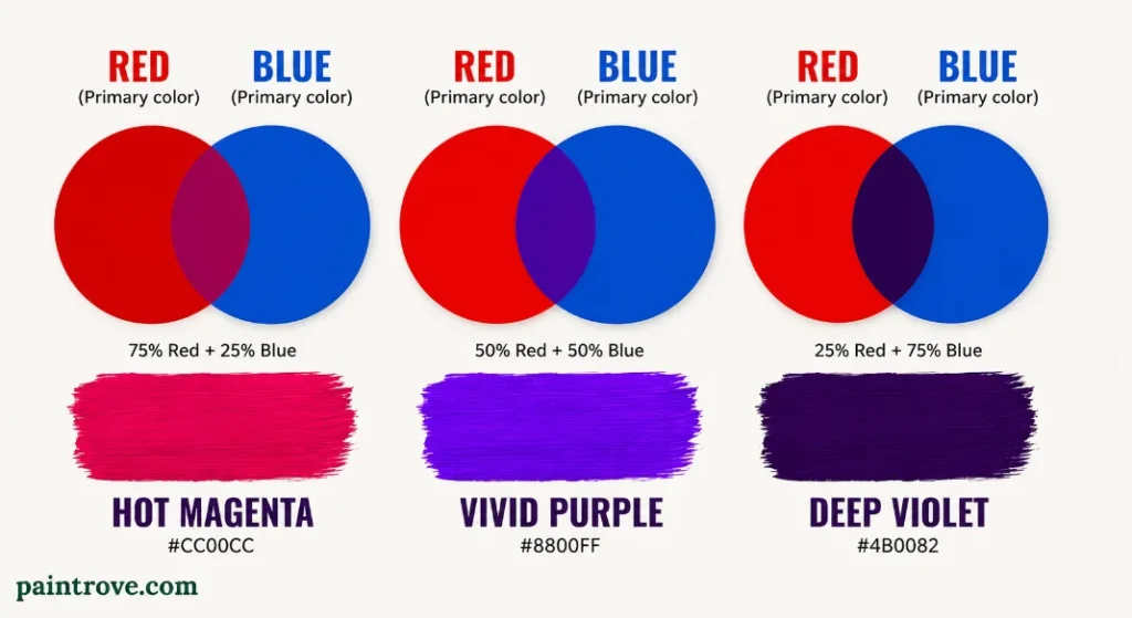
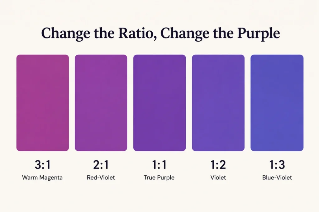
Once you have the right pigments, the ratio decides the personality of your purple. Here is what different balances produce, with hex code approximations written out so you can look up each target color:
| Ratio (Red : Blue) | Resulting shade | Hex code |
|---|---|---|
| 1 : 1 | True purple | Hex #800080 |
| 2 : 1 | Red-violet | Hex #A0308F |
| 3 : 1 | Warm magenta | Hex #C71585 |
| 1 : 2 | Violet | Hex #7F00FF |
| 1 : 3 | Blue-violet | Hex #5A4FCF |
| 1 : 1 plus a touch of white | Lavender | Hex #B57EDC |
| 1 : 1 plus a touch of black | Dark plum | Hex #4B0055 |
A few practical notes on ratios:
- Start with the lighter color first and add the darker one gradually. Blue overpowers red quickly, so add blue in small amounts.
- Mix thoroughly before judging. A half-mixed puddle always looks darker and duller than the finished blend.
- Test on scrap paper or canvas. Wet paint often dries slightly darker, especially acrylics.
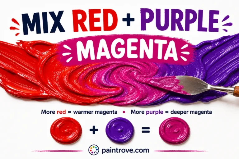
Pushing the ratio to its extremes takes you into neighboring territory. Keep adding blue past the violet stage and you are essentially exploring what blue and purple make when mixed. Keep adding red and you drift into the reds and magentas covered in our guide to red and purple mixed.
Every Purple Shade You Can Make from Red and Blue
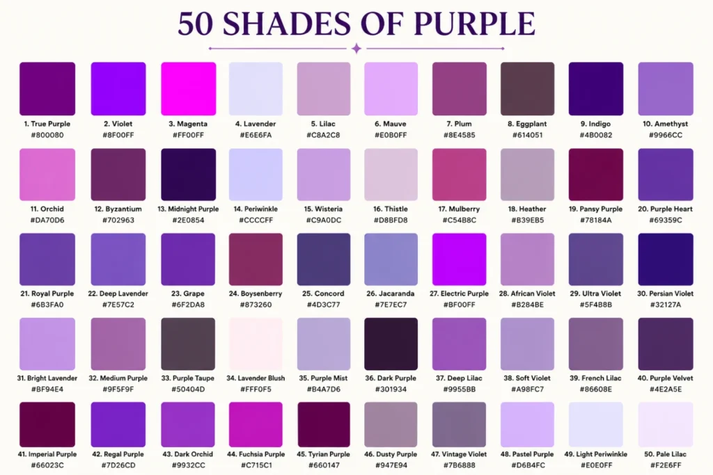
Adjusting the ratio is only the beginning. Adding white, black, or gray opens up the full purple family. Here is a reference table of popular purple shades, their hex codes written in plain text, and how to mix each one:
| Shade | Hex code | How to mix it |
|---|---|---|
| True Purple | Hex #800080 | Equal parts red and blue |
| Violet | Hex #8F00FF | More blue than red |
| Magenta | Hex #FF00FF | More red than blue |
| Lavender | Hex #E6E6FA | Equal mix plus generous white |
| Lilac | Hex #C8A2C8 | Equal mix plus white, tiny extra red |
| Mauve | Hex #E0B0FF | Equal mix plus white plus a touch of gray |
| Plum | Hex #8E4585 | Slightly red-heavy mix plus a touch of black |
| Eggplant | Hex #614051 | Red-heavy mix plus black |
| Indigo | Hex #4B0082 | Blue-heavy mix plus a touch of black |
| Amethyst | Hex #9966CC | Equal mix plus a small amount of white |
| Orchid | Hex #DA70D6 | Red-heavy mix plus white |
| Byzantium | Hex #702963 | Red-heavy mix plus a touch of black |
| Midnight Purple | Hex #2E0854 | Blue-heavy mix plus black |
| Periwinkle | Hex #CCCCFF | Blue-heavy mix plus lots of white |
Making Lighter Purples (Tints)
Add white in small increments. White lifts purple into lavender, lilac, and pastel territory without changing its underlying character much. We cover this in detail in our guide to purple and white mixed. If your lightened purple starts to look chalky, add a whisper more red or blue to bring back the saturation.
There is also a shortcut to soft purples that skips white entirely: swap the red for pink. Pink is already red plus white, so combining it with blue lands you straight in lavender territory. See what happens when pink and blue are mixed for that route.
Making Darker Purples (Shades)
Add black, but carefully. Black is the strongest pigment on your palette and can swallow a purple whole. Our full guide to purple and black mixed covers the technique, but the short version: add black in amounts smaller than you think you need, mix fully, then reassess. Many artists skip black entirely and darken purple by adding more blue, or a tiny amount of yellow for a more natural-looking shadow tone. A deep blue-heavy mix plus a trace of black gives you midnight purple, one of the richest darks you can build.
Muting Purple (Tones)
If a purple feels too loud for your painting, add a small amount of gray, or a very small touch of yellow. Both knock the intensity down. Yellow does it faster, so go slowly. You are aiming for a dusty mauve, not brown.
Red and Blue in Light: Why Screens Give You Magenta
Everything above applies to paint, pigment, ink, and dye. Anything physical. But mix red and blue as light, and the answer changes.
Screens, stage lights, and LEDs use the RGB model, which stands for red, green, and blue and works by additive mixing. Instead of pigments absorbing light, colored lights combine and become brighter:
| System | Type | Red + Blue makes | Hex code |
|---|---|---|---|
| RYB (paint) | Subtractive | Purple | Hex #800080 |
| RGB (light and screens) | Additive | Magenta | Hex #FF00FF |
| CMYK (printing) | Subtractive | Violet-purple range | Varies |
Here is why the results differ. Paint works by subtracting light: each pigment absorbs certain wavelengths and reflects the rest, so mixing pigments removes more and more light, which is why paint mixes get darker. Light works by adding: overlapping a red beam and a blue beam sends both wavelengths to your eye at once, and your brain interprets that combination as magenta, a bright, electric pink-purple.
Magenta is genuinely strange, by the way. There is no single wavelength of light that is “magenta.” It only exists because your brain invents it to bridge the gap between red and blue on the visible spectrum. Purple you can point to in a rainbow. Magenta you cannot.
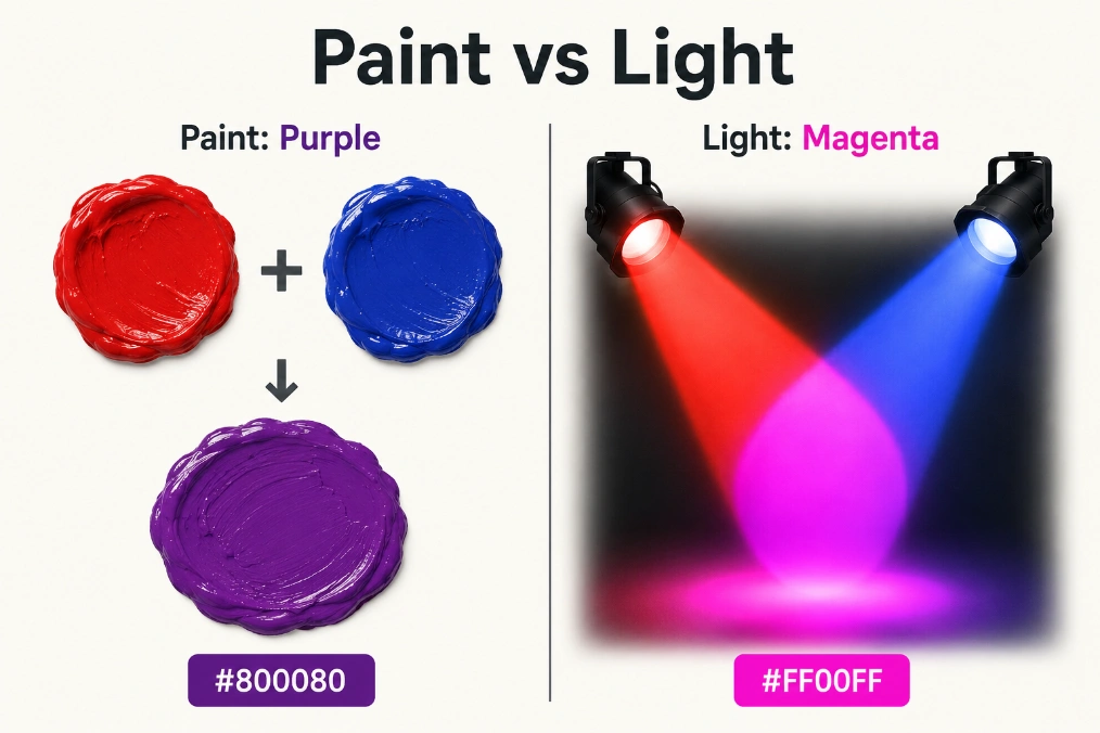
So the complete answer to “what color does red and blue make” is:
- In paint: purple.
- In light: magenta.
If you are designing on a screen and want a paint-style purple, do not just max out the red and blue channels, because that gives you magenta at hex #FF00FF. Pull both values down and let blue slightly lead. Something like RGB 128, 0, 128 lands you at true purple. Printers handle this differently again, building purples from magenta and cyan inks, which our guide to the CMYK color model explains.
Troubleshooting: Why Your Red and Blue Made Mud
If your mix came out gray, brown, or just lifeless, run through this checklist:
1. One of your paints has a yellow bias. The most likely culprit. Cadmium red and phthalo blue are the usual offenders. Swap in a cool red (quinacridone magenta, permanent rose) and a warm blue (ultramarine).
2. Your red is too dark. Alizarin crimson is a beautiful pigment, but it is deep and already blue-leaning. Paired with ultramarine it can drift toward a grayish violet rather than a bright purple. If you want brightness, use a lighter, cleaner red.
3. Dirty water or brushes. A trace of leftover yellow or green on the brush is enough to dull a purple. Rinse thoroughly between colors.
4. You over-mixed with black. Black added even slightly too early or too generously flattens purple fast. Rebuild the mix and add black last, one small touch at a time.
5. The medium is fighting you. Watercolors mix differently than acrylics, and oils differently again. Student-grade paints also contain fillers that gray out mixes. If clean purples matter to your work, artist-grade pigment is worth the upgrade.
Purple in Art, Fashion, and Design
Purple made from red and blue has carried serious cultural weight for most of recorded history, and it still works hard across creative fields today.
In Art
Tyrian purple dye, extracted drop by drop from sea snails, was so expensive in the ancient world that Roman law restricted who could wear it. That scarcity is the origin of purple’s association with royalty, and painters have leaned on that association ever since. The Impressionists were famously obsessed with violet shadows; Monet claimed to have finally discovered the true color of the atmosphere in violet.
In modern painting, red-blue purples handle everything from twilight skies to floral work to dramatic shadow tones, and knowing how to mix your own rather than relying on a single tube color gives you a far wider range.
In Fashion
Purple cycles through fashion constantly but never fully leaves. Lilac and lavender dominate spring and summer collections, reading as fresh and youthful. Deeper plums, eggplants, and wine-adjacent purples take over in autumn and winter, where they pair naturally with camel, gray, and black. Because purple sits between a warm color and a cool one, it flatters a wide range of skin tones depending on which direction the shade leans, which is part of why designers keep returning to it.
In Interiors and Branding
Deep plums and eggplants make dramatic accent walls, while lavenders and lilacs soften bedrooms and nurseries. In branding, purple signals creativity, imagination, and premium quality, which is why it shows up on everything from chocolate wrappers to streaming platforms. Digital designers love violet-to-magenta gradients because they read as both energetic (the red side) and trustworthy (the blue side).
Purple also pairs beautifully with its complement, yellow, for high-contrast schemes, and with its wheel neighbors for smooth analogous color schemes built from red-violets on one side and blue-violets on the other.
Quick Reference: Red + Blue Cheat Sheet
| Question | Answer |
|---|---|
| Red + blue in paint | Purple (hex #800080) |
| Red + blue in light | Magenta (hex #FF00FF) |
| Best pigments for bright purple | Quinacridone magenta + ultramarine blue |
| More red | Warm purple, toward magenta |
| More blue | Cool purple, toward violet |
| Plus white | Lavender, lilac, pastels |
| Plus black | Plum, eggplant, midnight purple |
| Why it turns muddy | Hidden yellow bias in one of the paints |
FAQ
Do red and blue make purple or violet?
Both terms describe the same neighborhood of color, and in everyday use they are interchangeable. Technically, violet is a true spectral color with its own wavelength, visible in a rainbow, while purple is a mixed color that only exists as a combination of red and blue light or pigment. In painting, a blue-heavy mix is usually called violet and a balanced mix is called purple.
Why did my red and blue make brown instead of purple?
One of your paints almost certainly contains a yellow bias. Yellow is purple’s complementary color and neutralizes it into brown or gray. Switch to a cool, blue-leaning red and a warm, red-leaning blue and the problem disappears.
What is the exact ratio of red to blue for purple?
Start with 1:1 for a true purple, then adjust. In practice, blue is stronger than most reds, so you may need slightly more red than an exact 50/50 split to keep the mix balanced. Add blue in small increments.
Do red and blue make magenta?
Yes, when you mix red and blue light, as on a screen or with stage lighting. In paint, you get purple. Same two colors, different mixing systems.
Can I make purple without red and blue?
Not from scratch in traditional paint mixing, since purple is a secondary color and red plus blue is its recipe. You can buy pre-mixed purple pigments (dioxazine purple is the common one) and adjust them, or reach purple through magenta-based mixes, which is closer to how printers do it. There are also pink-based routes, like mixing pink and purple to push an existing purple toward fuchsia.
Is purple a warm or cool color?
It depends on the ratio. Red-heavy purples like magenta and plum read as warm. Blue-heavy purples like violet and periwinkle read as cool. A balanced purple sits right on the fence, which is part of what makes it so flexible in design.
Red and blue make purple, but which purple is entirely up to you. Get the pigment bias right, control your ratio, and the whole purple family, from pale lavender to near-black midnight, is yours to mix.
For the bigger picture on this color family, start with our complete guide to what colors make purple, or go back to basics with primary colors and how they work.