what does green and purple make When Mixed? (Murky Brown / Slate)
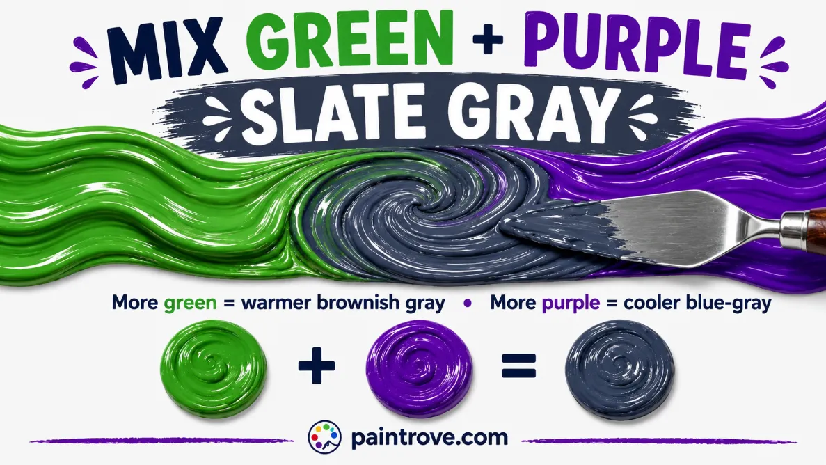
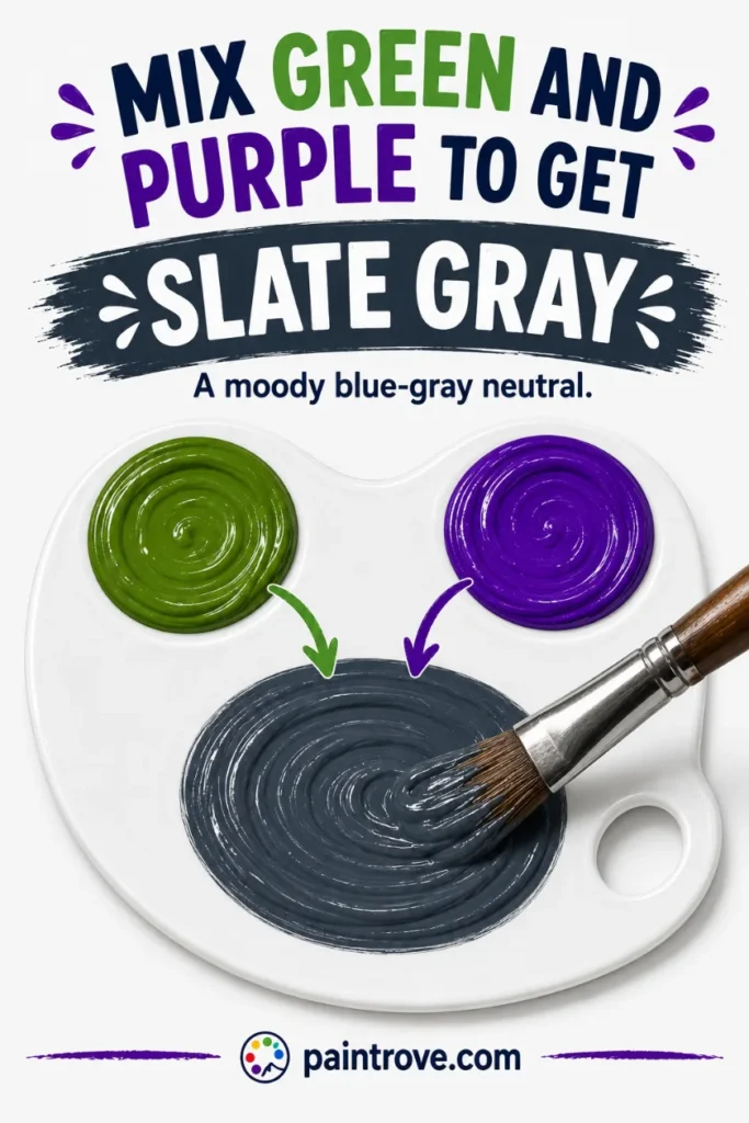
Green and purple make what color? Mix green and purple together and you get a murky slate gray or blue-gray, not a clean brown. A balanced mix lands on a dark, cool gray around hex #5F6470, leaning toward green gives a warmer, browner gray, and leaning toward purple gives a deeper, bluer slate. The result is a moody, desaturated neutral rather than the earthy brown you might expect from two secondary colors.
Here is the reason, and it is the detail most people get wrong: green and purple do not make a normal brown because the mix contains too much blue. Green is blue plus yellow, purple is blue plus red, so mixing them gives you two parts blue against one part each of red and yellow. That extra blue pulls the neutral toward gray and slate rather than warm brown.
This guide explains exactly why, the ratios and hex codes for every shade, how your pigments steer the result, and why this stormy blue-gray is more useful than it first appears.
Why Green and Purple Make Slate Gray
Both green and purple are secondary colors. Green is made from blue and yellow, as covered in what blue and yellow make, and purple is made from red and blue, as covered in what red and blue make.
So when you mix them, look at what you are really combining:
Green + Purple = (Blue + Yellow) + (Blue + Red) = Blue + Blue + Yellow + Red
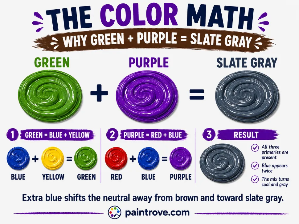
All three primaries are present, which is why the mix neutralizes, and mixing all three primaries normally makes brown, the basis of how to make brown. But notice the doubled blue. Where a standard brown has roughly equal red, yellow, and blue, this mix is blue-heavy. That extra blue cools and grays the result, pushing it away from warm brown and toward slate, blue-gray, and charcoal.
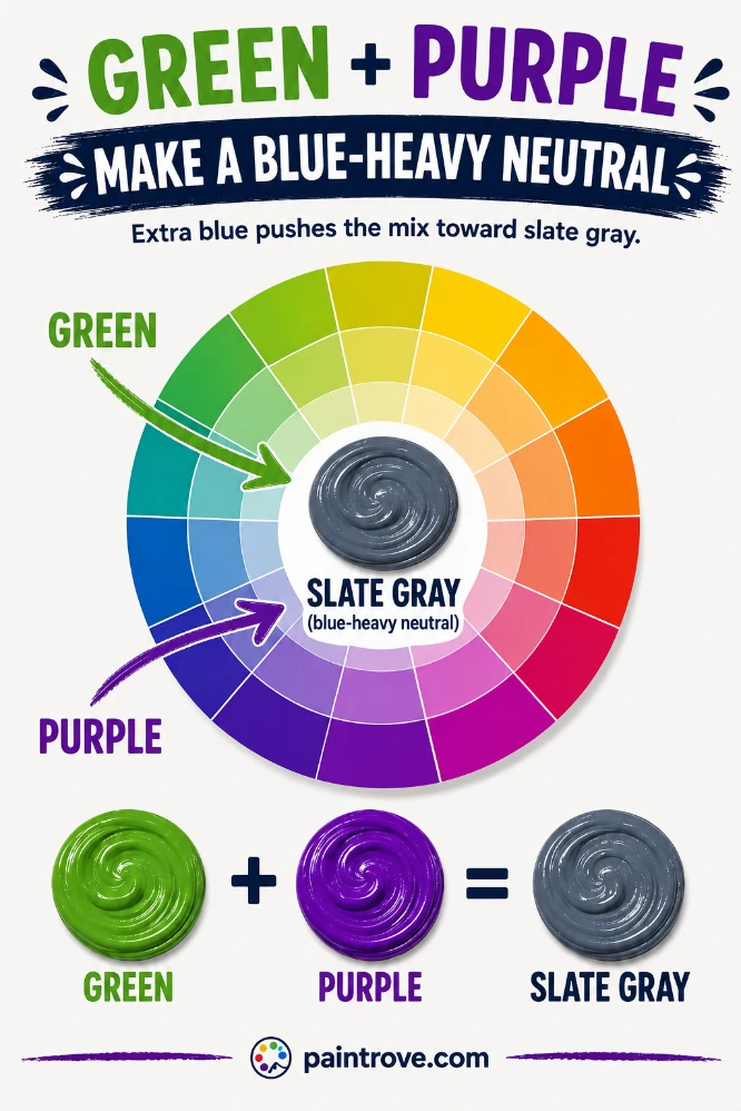
This is also why green and purple behave differently from the three classic complementary browns like purple and yellow or red and green. Green and purple are not true complements; they sit near each other on the color wheel rather than opposite. Their mix neutralizes because it still contains all three primaries, but the leftover blue gives it a distinctly cool, moody character the true complementary browns do not have.
What Shade You Get: Gray, Blue, or Brown
The SERP disagrees about this mix, and the disagreement is real, because the answer genuinely shifts with your pigments. Here is the honest breakdown:
| Your green and purple | Resulting neutral | Hex code |
|---|---|---|
| Balanced green + balanced purple | Dark slate gray | Hex #5F6470 |
| Green-heavy mix | Warmer brownish gray | Hex #6B6459 |
| Purple-heavy mix | Cool blue-gray, deeper | Hex #565165 |
| Lime green + purple | Muddy medium gray | Hex #74736C |
| Phthalo (blue-green) + purple | Dark blue-gray, near navy | Hex #414A5B |
| Green + violet (bluer purple) | Deep teal-slate | Hex #3E5259 |
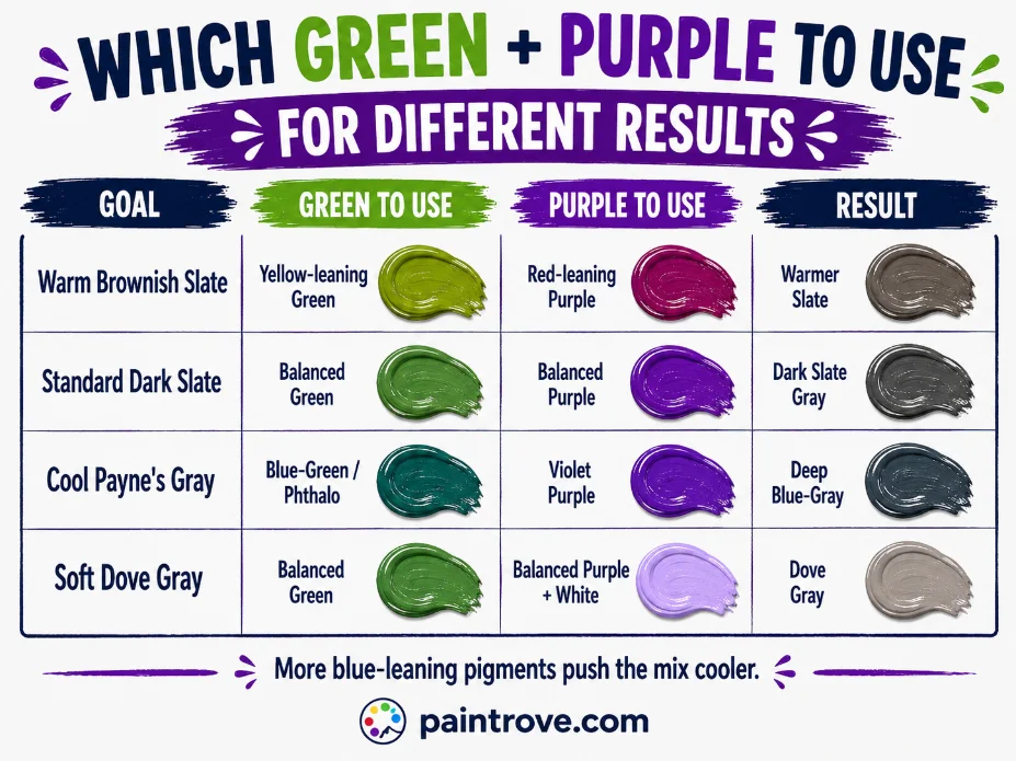
The pattern real-world testing confirms: more green warms and lightens the mix toward a brownish gray, while more purple cools and darkens it toward blue-gray. Using a blue-leaning green like phthalo, or a blue-leaning purple like violet, pushes the result strongly toward navy and teal-slate. Using a yellow-leaning green pulls it back toward brown.
So all three common answers, gray, blue-gray, and brownish, are correct depending on what you start with. What almost never happens is a clean, warm chocolate brown, because the blue is always in the way.
Green and Purple Mixing Ratios and Hex Codes
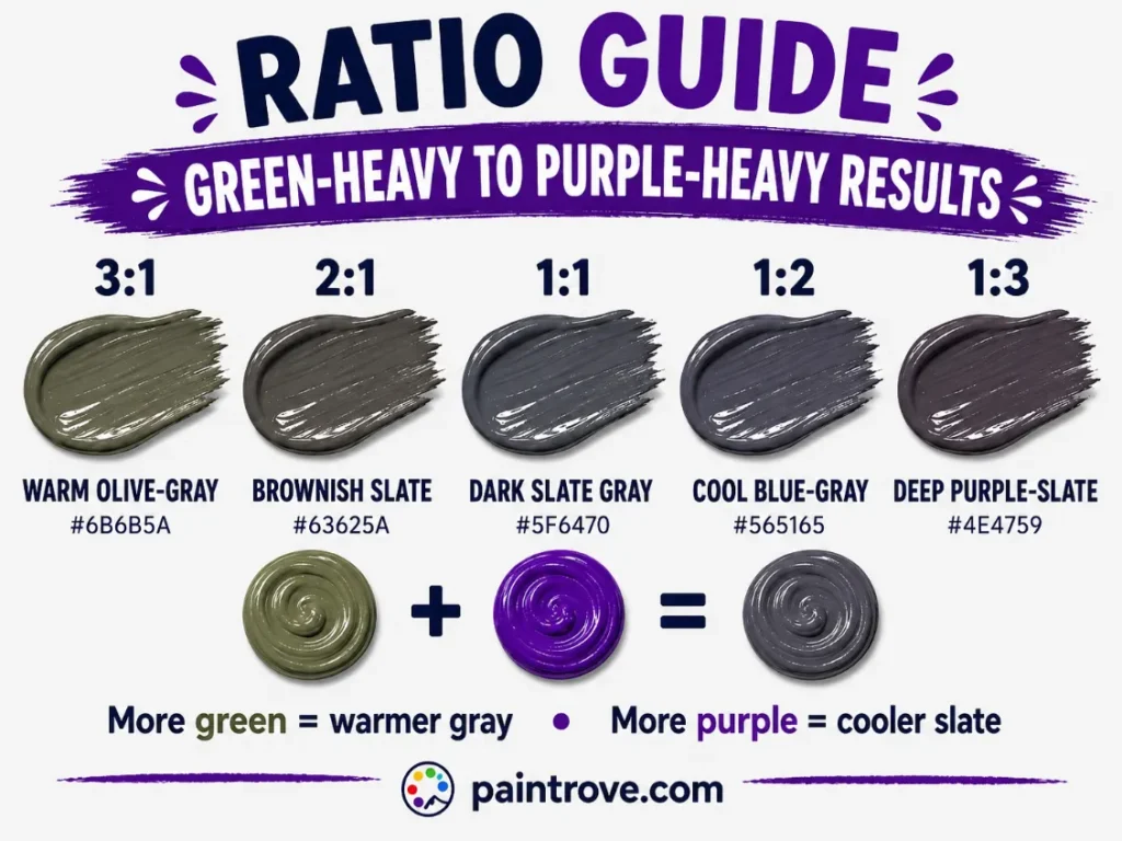
Here is the working ratio chart with hex targets in plain text:
| Ratio (Green : Purple) | Resulting shade | Hex code |
|---|---|---|
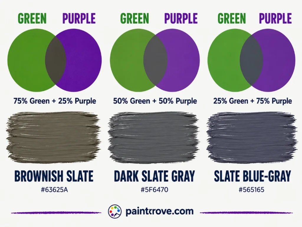
| 3 : 1 | Warm olive-gray | Hex #6B6B5A |
| 2 : 1 | Brownish slate | Hex #63625A |
| 1 : 1 | Dark slate gray | Hex #5F6470 |
| 1 : 2 | Cool blue-gray | Hex #565165 |
| 1 : 3 | Deep purple-slate | Hex #4E4759 |
| 1 : 1 plus white | Soft dove gray | Hex #A7A9AC |
| 1 : 1 plus black | Charcoal slate | Hex #383A40 |
| 1 : 1 with phthalo green | Dark blue-gray | Hex #414A5B |
Practical notes:
- Both colors are dark and strong, so this mix goes dark fast. Add the second color gradually and keep a little of each in reserve.
- Mix thoroughly before judging. A half-mixed blend looks streaky and darker than the finished color.
- Add white to a small test amount to reveal the true undertone, since these dark slates are hard to read otherwise. Acrylics dry darker still.
Every Shade You Can Make from Green and Purple
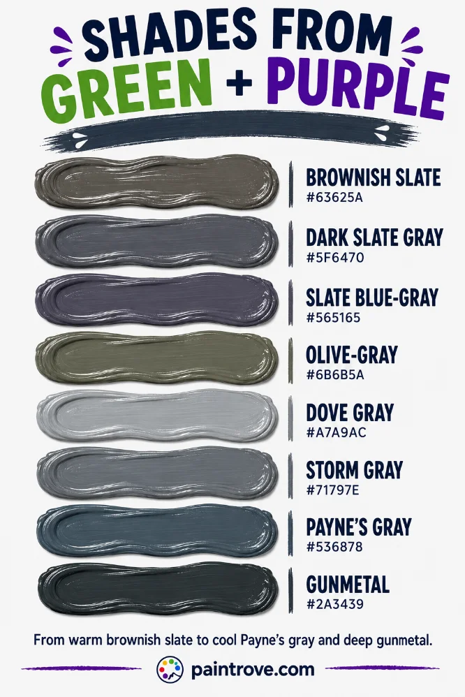
Between ratio, pigment choice, and additions of white or black, green and purple cover a moody band of grays and slates. The reference table:
| Shade | Hex code | How to mix it |
|---|---|---|
| Dark slate gray | Hex #5F6470 | Equal parts green and purple |
| Slate blue-gray | Hex #565165 | Purple-heavy mix |
| Brownish slate | Hex #63625A | Green-heavy mix |
| Charcoal slate | Hex #383A40 | Equal mix plus black |
| Dove gray | Hex #A7A9AC | Equal mix plus generous white |
| Storm gray | Hex #71797E | Equal mix plus white |
| Payne’s gray | Hex #536878 | Blue-leaning mix, deep |
| Gunmetal | Hex #2A3439 | Blue-green plus purple plus black |
| Olive-gray | Hex #6B6B5A | Yellow-green heavy mix |
| Teal-slate | Hex #3E5259 | Phthalo green plus violet |
| Muted plum-gray | Hex #5E5460 | Purple-heavy mix, red lean |
| Pewter | Hex #96979A | Balanced mix plus lots of white |
Lighter Versions (Tints)
Add white to lift the mix into dove gray, storm gray, and pewter, the soft, sophisticated grays used across modern interiors and menswear. Because the mix carries subtle color, these grays read as warmer and more interesting than a flat black-and-white gray. The lightening route in general is covered in green and white mixed and purple and white mixed.
Darker Versions (Shades)
Add a little black for charcoal slate and gunmetal, some of the moodiest darks you can mix. Because the base is already dark, black works quickly here, so add it sparingly. These deep slates make excellent alternatives to flat black in painting and design.
Comparing to Payne’s Gray
The blue-gray this mix produces is very close to Payne’s gray, a beloved artist’s color that is essentially a deep, slightly blue-violet gray. Many painters mix their own version of Payne’s gray from exactly these kinds of ingredients, using it as a softer, more atmospheric substitute for black in shadows and skies. If your green-purple mix lands on a deep blue-gray, you have essentially made a homemade Payne’s gray.
Green and Purple in Light
Everything above describes paint. In light, using the RGB model, the result is different and brighter.
Green is a primary color of light, and purple is made from red and blue light. Combine green light with purple light and you have red, green, and blue all present, which adds up toward a pale, light gray or white, not a dark slate. As with all mixes, light adds and brightens where paint subtracts and darkens.
| System | Type | Green + Purple makes | Result |
|---|---|---|---|
| RYB (paint) | Subtractive | Murky slate gray or blue-gray | Hex #5F6470 |
| RGB (light and screens) | Additive | Pale gray toward white | Light neutral |
| CMYK (printing) | Subtractive | Muddy slate gray | Varies |
Printing, covered in our guide to the CMYK color model, behaves like paint since it is subtractive, producing muddy slates from combined inks.
Troubleshooting Green and Purple Mixes
The mix is almost black. Two dark, strong colors in equal parts absorb nearly all light. Add white to a test amount to see the true hue, then adjust, or use lighter versions of both parents.
The mix is a flat, dead gray. It over-neutralized. Add a little more green for warmth or a little more purple for a cooler blue-gray, to give the neutral some direction.
You wanted brown and got gray. That is the extra blue at work, and it is unavoidable with green and purple. For a true warm brown, use red and green or blue and orange instead, which balance the primaries better.
The mix leans too blue or navy. Your green or purple leans blue (phthalo green or violet). Switch to a yellow-leaning green to warm it toward slate-brown.
It dried duller and darker. Standard acrylic behavior, pronounced with dark colors. Mix a step lighter and add white to judge.
what does green and purple make? Mixing Green and Purple in Different Mediums
This mix behaves noticeably differently across mediums, and testing shows the result shifts with each.
Acrylics give the most saturated result. Dioxazine purple with a green light produces a dark gray, while dioxazine with a blue-leaning phthalo green makes a distinctly dark blue-gray. Acrylics dry darker, so add white to judge the true tone.
Gouache and acrylic gouache often come in violet rather than true purple, and violet with green pushes the mix toward a grayer green or a dark blue, cooler than the acrylic version.
Watercolor is transparent and naturally duller, so green and purple washes tend to make pale, luminous grays and blue-green tints rather than dense slate. Letting the two washes meet on wet paper gives the softest, most atmospheric result, a favorite for stormy skies and distant hills.
Digital lightens toward gray rather than darkening, since screens add light, so a green-purple blend on screen reads paler and cooler than the same mix in paint.
Whichever medium you use, the guiding fact stays the same: the extra blue in this pair means you are mixing a slate, not a brown, so lean into the moody gray rather than fighting for an earthy tone that will not come.
Slate and Blue-Gray in Art, Fashion, and Design
The stormy slate that green and purple produce is far more useful than its humble origins suggest, and like all complementary-adjacent pairs, the two colors live a double life.
In Art
Slate and blue-gray are essential atmospheric colors: storm clouds, distant mountains, wet stone, twilight, and the cool shadows that make warm colors glow. Painters prize mixed grays like this over tube gray because they carry subtle color that harmonizes with the rest of a painting.
A homemade Payne’s gray from green and purple, or from similar ingredients, is a studio staple precisely because it reads as a living, atmospheric dark rather than a flat one. Used unmixed, green and purple are a vivid complementary-adjacent pairing beloved for their jewel-toned richness.
In Fashion
Slate gray and blue-gray are among the most sophisticated neutrals in fashion, reading as refined and versatile, the backbone of modern menswear and minimalist wardrobes. They pair with almost anything and flatter most skin tones.
The purple and green pairing worn unmixed, meanwhile, is a bold, artistic statement, from peacock-inspired palettes to the regal-plus-natural combinations that designers use when they want richness with an edge.
In Interiors and Branding
Slate and dove grays are cornerstone interior colors, calm and sophisticated, working beautifully with wood, brass, and both warm and cool accents. Deeper gunmetal and charcoal slates add drama to feature walls and cabinetry.
In branding, blue-grays signal calm, professionalism, and understated quality, appearing across tech, finance, and premium identities that want to feel dependable and refined rather than loud.
Quick Reference: Green + Purple Cheat Sheet
| Question | Answer |
|---|---|
| Green + purple in paint | Murky slate gray or blue-gray (hex #5F6470) |
| Green + purple in light | Pale gray toward white |
| Why not brown | The mix has extra blue, which grays it |
| More green | Warmer brownish gray |
| More purple | Cooler blue-gray |
| Blue-leaning pigments | Navy, teal-slate |
| Plus white | Dove gray, storm gray, pewter |
| Plus black | Charcoal slate, gunmetal |
| Close relative | Payne’s gray |
| For true brown instead | Use red and green, or blue and orange |
FAQs: green and purple make what color
what does purple and green make when mixed?
A murky slate gray or blue-gray. Because green is blue plus yellow and purple is blue plus red, the mix contains extra blue, which grays and cools the result rather than making a warm brown. The exact shade ranges from brownish gray to deep blue-gray depending on the pigments.
Do green and purple make brown?
Not a clean brown. They make a brownish gray at best, because the doubled blue in the mix pulls it toward slate and gray. For a true warm brown, mix red and green or blue and orange, which balance the three primaries more evenly.
Do green and purple make blue?
They can make a blue-gray or navy-leaning slate, especially if either parent leans blue, such as a phthalo green or a violet purple. It is not a pure blue, but a deep, desaturated blue-gray close to Payne’s gray.
Why is the green and purple mix so gray and muddy?
Because it contains two parts blue against one each of red and yellow. That imbalance neutralizes the mix and cools it, landing on gray or slate rather than a warm brown. It is one of the moodiest neutrals you can mix.
How do you make Payne’s gray from green and purple?
Use a deep, slightly blue-leaning green and purple in roughly equal parts, keeping the mix dark. The result is a deep, atmospheric blue-gray very close to Payne’s gray, which many painters use as a softer alternative to black.
How do you lighten the green and purple mix?
Add white to reach dove gray, storm gray, and pewter tones. Because the mix carries subtle color, these lightened grays read warmer and more interesting than a plain neutral gray.
Are green and purple a good color combination?
Side by side, yes, they are a rich, jewel-toned pairing popular in bold and artistic design. Mixed, they produce sophisticated slate grays. Both uses come from their near-complementary relationship on the color wheel.
Green and purple make a murky slate gray or blue-gray, cooled by the extra blue hiding in both colors, not the warm brown you might expect. It is one of the most atmospheric neutrals on the palette, close cousin to Payne’s gray, and far more useful than its muddy reputation suggests.